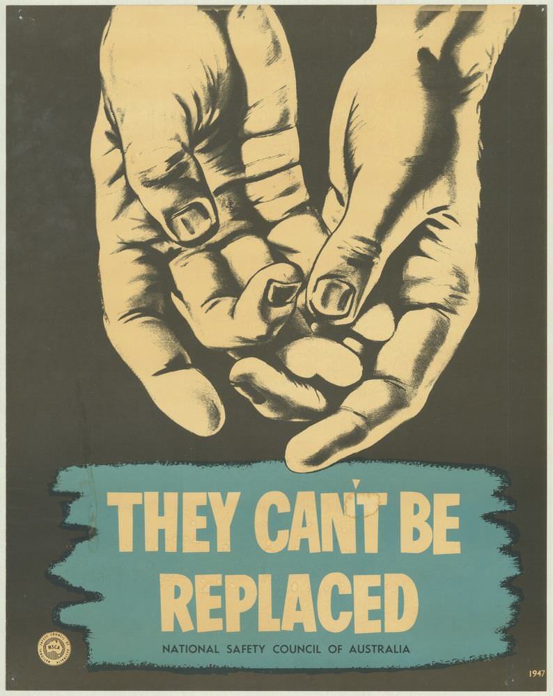
Dominating the cover art is a stark illustration of two hands, rendered in high-contrast tones that feel both intimate and urgent. Below them, the bold warning “THEY CAN’T BE REPLACED” lands like a headline you can’t ignore, set against a teal block that makes the message pop. The small line crediting the National Safety Council of Australia anchors the design in the world of public safety campaigning, where simple visuals had to carry big consequences.
There’s a clever ambiguity in those hands: they can suggest care and protection, but also vulnerability—fingers that might be injured, numbed, or lost in a moment of inattention. The poster’s restrained palette and dramatic shading give it a near-theatrical punch, turning a workplace safety reminder into something closer to a moral appeal. It’s a vivid example of how 1970s safety posters relied on direct language and memorable graphic design to influence everyday behaviour.
As part of a broader look at National Safety Council of Australia posters from the 1970s, this piece highlights the era’s emphasis on prevention and personal responsibility. The typography, the limited colour scheme, and the human-focused imagery are all tuned for instant comprehension on a wall in a workshop, factory, or staff area. For readers interested in Australian safety history, vintage poster design, or the visual culture of public health messaging, this cover offers a powerful entry point into how “keeping people safe and well” was communicated in a single, uncompromising statement.