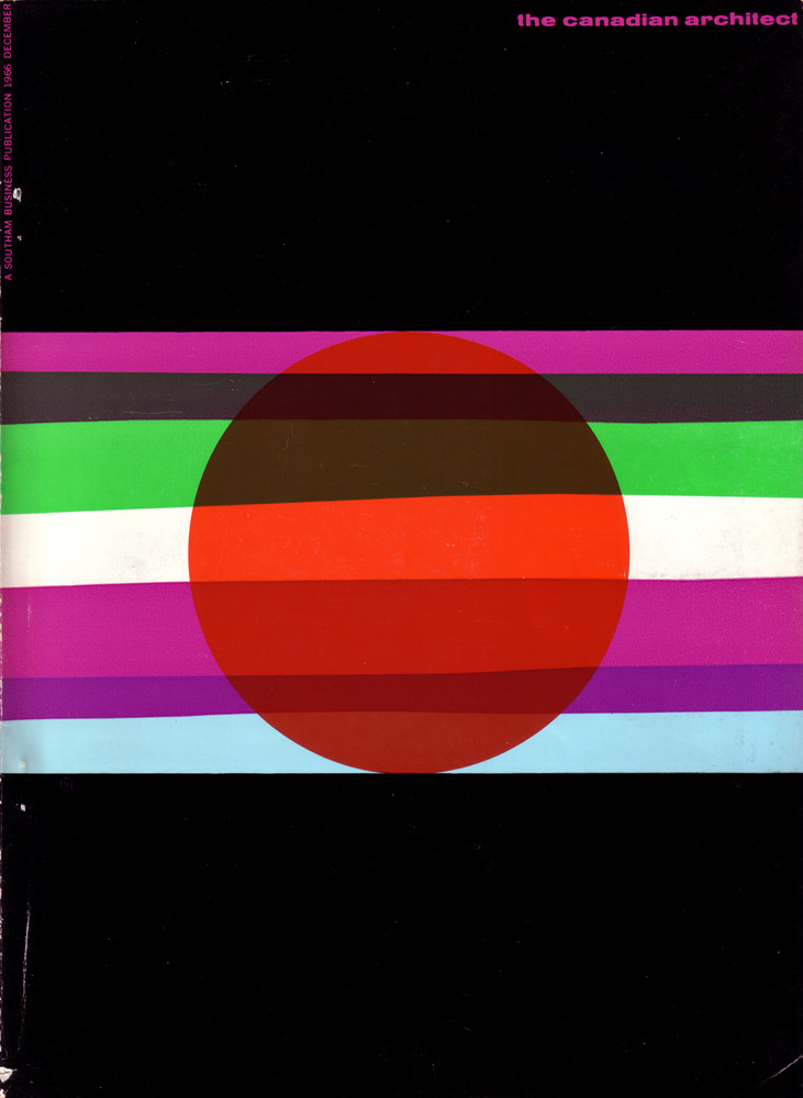
Bold stripes slice across a deep black field, anchoring a large red disc at the center in a design that feels both playful and rigorously modern. The palette—magenta, green, white, purple, and pale blue—reads like a 1960s graphic manifesto, using pure geometry rather than imagery to signal a forward-looking era. Even the worn edges and faint speckling add period texture, reminding viewers this was a printed object meant to be handled, shared, and archived.
At the top right, the title “the canadian architect” sits in bright lettering, while a vertical line of type along the left margin notes it as “a southam business publication” and marks the issue as “1966 december.” As cover art, it hints at the editorial confidence of the time: architecture presented not only through buildings, but through visual culture, typography, and the language of design itself. The composition’s strong horizontal bands echo ideas of structure and layering—concepts that resonate with architectural thinking.
For collectors of architectural magazines, Canadian design history, or mid-century modern graphic design, this December 1966 cover offers a compact snapshot of the period’s aesthetic ambition. Its abstract, poster-like approach makes it highly shareable for anyone researching vintage magazine covers, modernist layouts, and the visual identity of professional publications. Viewed today, it still feels strikingly contemporary, a reminder of how the 1960s reimagined what “architecture” could look like on the newsstand.