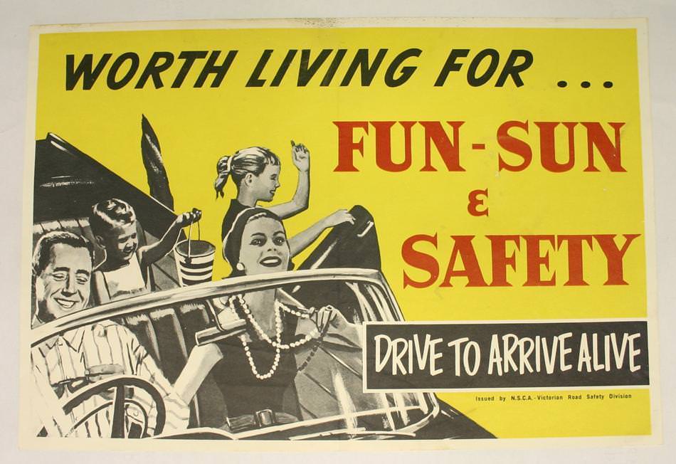
Bright yellow dominates this National Safety Council of Australia poster, where bold lettering promises “FUN-SUN & SAFETY” while reminding motorists to “DRIVE TO ARRIVE ALIVE.” A smiling family rides in an open-top car, their relaxed holiday mood framed by crisp illustration and high-contrast type. The design leans on optimism—sunshine, leisure, togetherness—while keeping the warning unmissable for anyone scanning a wall or roadside display.
Road safety messaging in the 1970s often relied on simple, memorable slogans, and this example turns prevention into a shared social value rather than a lecture. The mix of cheerful imagery with a stark call to action reflects an era when public campaigns increasingly targeted everyday drivers, not just professional road users. Even the typography feels purposeful: large, confident words that can be read quickly, echoing the split-second decisions made behind the wheel.
As cover art for a collection of National Safety Council of Australia posters from the 1970s, it offers a vivid snapshot of how visual communication shaped attitudes toward health and safety. The artwork’s retro palette and family-focused scene make it instantly recognizable as period design, yet the core message remains contemporary. For readers interested in Australian road safety history, graphic design, or public health advertising, this poster is a compelling starting point for exploring how safety was sold as part of a good life.