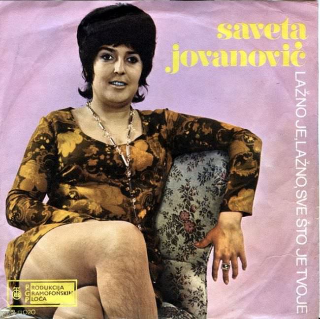
A lavender studio backdrop, a patterned armchair, and bold yellow lettering set the scene for an era when Yugoslav record sleeves often tried to look “modern” by sheer force of color and type. The singer is posed with the self-assurance of a TV variety show, framed like a living-room portrait yet packaged as commercial pop culture. Even before you parse the text, the cover’s visual priorities are clear: presence first, polish second.
Look closer and the design tells on itself in all the ways collectors love to argue about—flat lighting, awkward cropping, and typography that fights for attention rather than guiding the eye. The floral dress, oversized hair, and jewelry read as period markers, but the overall composition feels more like a quick promotional still than a carefully art-directed concept. That tension between aspiration and limitation is a big part of the “ugly truth” behind 1970s and 1980s Yugoslavian album art: it wanted glamour, yet often landed in a strange, memorable in-between.
For anyone searching for Yugoslav cover art, retro Balkan vinyl, or the history of graphic design behind socialist-era pop music, this photo is a compact lesson in how albums were sold visually as much as sonically. It’s not just kitsch; it’s evidence of budgets, printing constraints, and a local aesthetic that didn’t always mirror Western trends, even when it tried. In the end, the charm is inseparable from the rough edges, and that’s exactly why these sleeves remain so searchable—and so hard to forget.