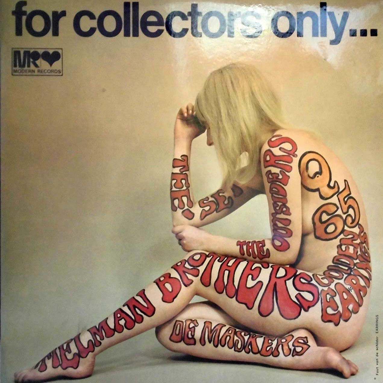
Across the top, the blunt promise “for collectors only…” sets the tone, while the small “MR Modern Records” mark hints at the record-industry machinery behind the provocation. Center stage is a nude figure seated in profile, used as a human canvas for oversized, bubbly typography in reds and oranges. The band name “The Allman Brothers Band” and “Eat a Peach” wrap around limbs and torso, turning lettering into costume and making the cover read as much as it is seen.
Nothing about this design is shy: it leans into the late-1960s and 1970s appetite for boundary-pushing album art, where marketing, psychedelia, and pop graphics collided. The pale background and sculptural pose leave plenty of negative space, letting the painted words do the shouting. Even the playful number-like marks on the back and the swirling letterforms echo the era’s poster aesthetics, when type itself became an image.
Collectors still chase covers like this because they capture a moment when the LP sleeve was a gallery wall, an advertisement, and a cultural dare all at once. For anyone exploring unusual and unconventional album cover designs from the 1960s and 1970s, this piece is a reminder that rock packaging often depended on shock, humor, and clever visual hooks as much as it did on music. Look closely and you can see how a single concept—body as billboard—could transform a record into an artifact of its time.