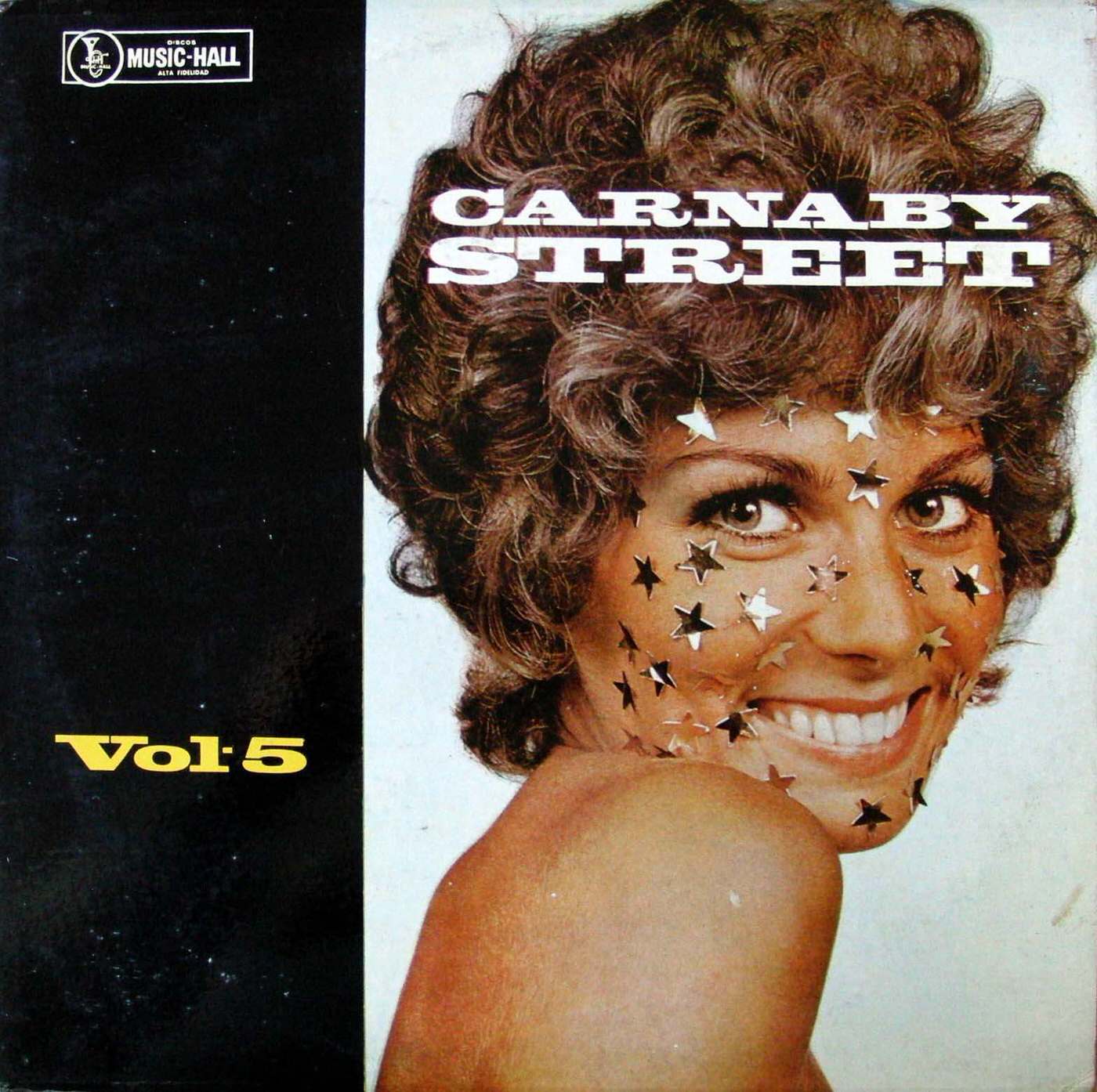
Bold type shouting “CARNABY STREET” stretches across a smiling portrait, instantly evoking the era when record sleeves doubled as fashion statements. Star-shaped confetti scattered over the subject’s face turns a simple studio shot into pop spectacle, while the cropped shoulder and direct gaze sell glamour more than biography. Even the clean, high-contrast layout—part black field, part bright portrait—feels engineered to stand out in a crowded bin of LPs.
On the left margin, the “Discos Music-Hall” mark and the plain “Vol 5” text sit like a catalog tag beside the exuberant imagery, a clash that only makes the design more memorable. That tension between commercial labeling and playful styling is part of what makes 1960s and 1970s album cover art so fascinating: it’s graphic design negotiating with youth culture in real time. The result is an unconventional cover that reads like a mini poster, meant to catch the eye from across the shop.
Collectors and design lovers alike can treat pieces like this as time capsules of typography, print color, and pop aesthetics—where a few stars and an oversized title could imply an entire scene. In a post about unusual album cover designs from the 1960s and 1970s, “Carnaby Street” works as a perfect example of how sleeves borrowed from street style, magazine layouts, and advertising to sell sound through image. Look closely and you’ll see how much history can hide in a single grin, a handful of metallic stars, and a loud, confident wordmark.