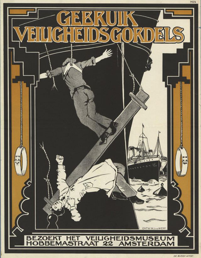
Bold Dutch lettering—“GEBRUIK VEILIGHEIDSGORDELS”—dominates this striking poster design by W. J. v.d. Werf, pairing a clear safety command with dramatic imagery. A stylized worker is shown mid-fall among ropes and rigging, the diagonal thrust of a heavy beam and the stark contrast of black, white, and ochre turning a workplace warning into an unforgettable visual narrative. The decorative border and crisp typography echo the graphic language of early-to-mid 20th-century poster art, where messages had to be grasped at a glance.
Drama drives the lesson: one figure tumbles helplessly while another appears secured, making the idea of a safety belt feel urgent rather than abstract. A ship at sea in the background hints at maritime or dockside labor, expanding the scene beyond a single incident into a broader world of industrial risk. The poster’s controlled composition—clean lines, simplified forms, and a limited palette—keeps the eye moving between danger and prevention, reinforcing the point through design as much as text.
At the bottom, the call to action invites viewers to “BEZOEK HET VEILIGHEIDSMUSEUM” and provides an address in Amsterdam, positioning the artwork as both public education and advertisement. For historians of design and social history alike, it offers a window into how institutions promoted workplace safety through compelling visual culture. This WordPress post explores the poster as an artifact of safety messaging, Dutch graphic design, and the everyday hazards of the working world suggested by its imagery.