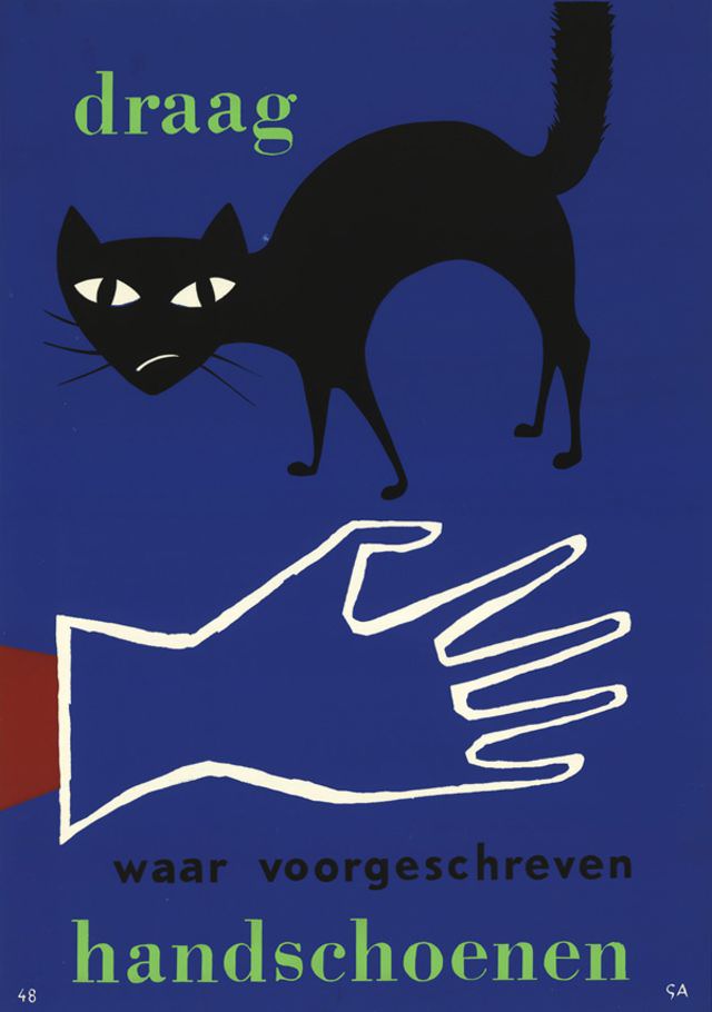
Against a deep, saturated blue field, a stark black cat arches its back, eyes narrowed into sharp white slits that feel equal parts wary and watchful. The simple shapes and high-contrast palette give the design an immediacy associated with mid-century graphic art, where bold silhouettes did more work than intricate detail. Above the animal, the word “draag” appears in green, setting a declarative tone that reads like a command or a reminder.
Below, a large white outline of a hand dominates the composition, extending from a red cuff and rendered with the same pared-down economy as the cat. The gesture is almost instructional, as if demonstrating how something should fit or be worn, while the Dutch text “waar voorgeschreven handschoenen” anchors the message in everyday rules and public guidance. The overall effect is both playful and slightly admonitory, using a familiar animal motif to pull the viewer in before delivering a practical point.
Dated 1959 and credited to an unknown designer, this artwork offers a crisp snapshot of how poster design could blend humor, clarity, and authority in a single frame. Its typography, color blocking, and iconic imagery make it highly shareable today for readers interested in vintage posters, modernist advertising, and European graphic design history. Whether viewed as a public information notice or an art object in its own right, it still communicates with the confident directness that defined much of the era’s visual culture.