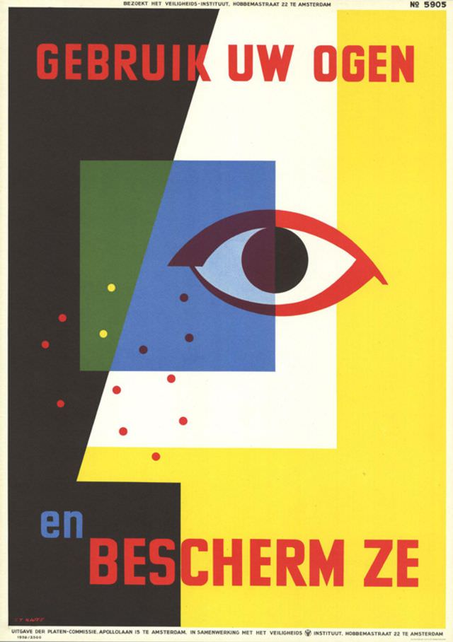
Bold Dutch lettering—“GEBRUIK UW OGEN” and “BESCHERM ZE”—commands attention across a striking field of black, white, and bright yellow, with an oversized, stylized eye anchoring the message. Geometric blocks of blue and green, punctuated by small red and yellow dots, create a sense of movement and alertness, as if vision itself is being tested. The design’s clean shapes and limited palette place it firmly in the modern graphic language of the late 1950s, where clarity and impact mattered most.
T.T. Kwee’s 1959 poster reads like a public-safety appeal distilled into pure form: use your eyes, and protect them. The central eye, split by strong diagonals and framed by color contrasts, suggests vigilance amid hazards—an everyday reminder that careful observation can prevent injury. Even without a depicted workplace scene, the visual cues evoke industrial and street safety culture, where posters served as constant, unavoidable guidance.
Small-print details reinforce its institutional purpose, with Dutch text referencing a safety institute and an Amsterdam address, situating the artwork in a broader network of organized prevention campaigns. For collectors and researchers of mid-century design, Dutch posters, and occupational safety history, this piece offers a vivid example of how typography and abstraction could communicate urgency without clutter. It’s both an artwork and a document of its era—graphic design pressed into service to change habits, one glance at a time.