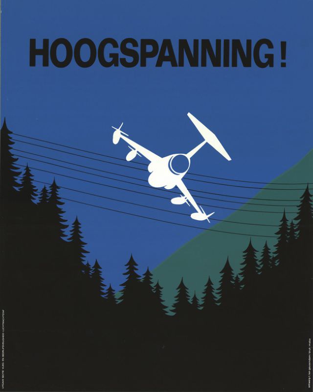
Bold letters shout “HOOGSPANNING!” across a deep blue field, turning a single word into an instant warning. Below it, a stark white aircraft tilts at an alarming angle, its clean silhouette contrasted against dark, simplified pines and a shadowed hillside. The design relies on minimal shapes and high contrast to deliver maximum urgency, making the message readable from a distance—exactly what a public-safety poster should do.
Power lines slice horizontally through the scene, deceptively calm until you notice how close they run to the plane’s path. That tension between the quiet landscape and the implied danger is the poster’s strength: one small misjudgment in altitude, and the consequences become obvious without any need for graphic detail. The restrained palette—blue sky, black forest, and a single green slope—keeps attention fixed on the hazard of high voltage while preserving a distinctly modern, mid-century look.
Created by T. ten Geusendam in 1960, this artwork sits at the intersection of graphic design history and industrial-era safety communication. It’s a compelling example for anyone interested in Dutch poster art, aviation-themed prints, or the evolution of warning imagery in the twentieth century. As a WordPress feature, it invites viewers to look closely at typography, composition, and the clever use of negative space that turns a simple scene into a memorable cautionary story.