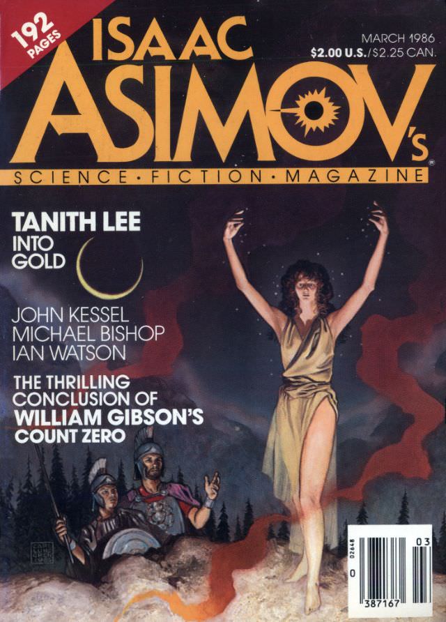
Bold gold lettering dominates the March 1986 cover of *Isaac Asimov’s Science Fiction Magazine*, a piece of cover art that wears its era proudly with high-contrast color and dramatic, cinematic framing. The masthead stretches across a night sky, while the corner copy calls out the issue’s page count and cover price, anchoring the artwork in the tangible world of print culture. Even at a glance, it reads like a newsstand invitation to step into speculative worlds.
Beneath the title, the illustration sets a moody scene: a star-speckled darkness, a thin crescent moon, and a central figure in a flowing, pale garment raising both arms as if in invocation or triumph. Down in the foreground, armored onlookers—suggestive of ancient soldiers—peer upward from rocky ground, their helmets and weapons catching small highlights against the gloom. The palette of deep blues, smoky reds, and bright skin tones adds tension, blending mythic imagery with science-fiction atmosphere.
Cover lines highlight major names and stories, including Tanith Lee’s “Into Gold” and the “thrilling conclusion” of William Gibson’s “Count Zero,” alongside John Kessel, Michael Bishop, and Ian Watson—clues to the issue’s literary mix for collectors and readers alike. For anyone searching “Asimov’s Science Fiction March 1986 cover,” this scan preserves both the design details and the period typography that made genre magazines such cultural touchstones. It’s a compact artifact of 1980s science fiction publishing, where bold art and author-driven marketing met on the rack.