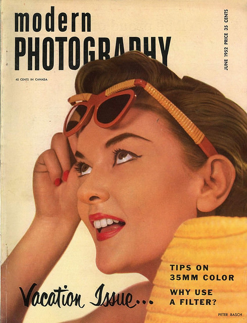
Bold, upbeat lettering announces *Modern Photography* across the top, framing a close-up illustration of a smiling woman lifting her sunglasses as if she’s just spotted something worth photographing. The warm palette, glossy styling, and confident graphic design evoke the optimism associated with mid-century magazine cover art, when photography culture was sold as both a hobby and a modern way of seeing. Even the small-print cover details—like the Canadian price and a clearly printed June issue line—anchor it in a consumer world where newsstands and mail subscriptions shaped visual taste.
Mid-century readers would have recognized the promise embedded in the cover copy: practical guidance for shooting with 35mm color and the perennial question of when to use a filter. Those phrases hint at a moment when color photography felt newly accessible, yet still technical enough to require advice from trusted publications. The “Vacation Issue…” tagline leans into leisure and mobility, tying photography to travel, sunshine, and the idea of documenting a life in motion.
For collectors, designers, and photographers, vintage *Modern Photography* magazine covers from the 1950s and 1960s remain a compact archive of how the era marketed cameras, expertise, and aspiration. This post looks back at that distinctive cover-art style—clean typography, idealized faces, and consumer-friendly tips—while celebrating the printed ephemera that helped popularize modern photographic practice. Whether you’re researching retro graphic design or simply admiring classic magazine illustration, the cover offers a vivid snapshot of mid-century visual culture.