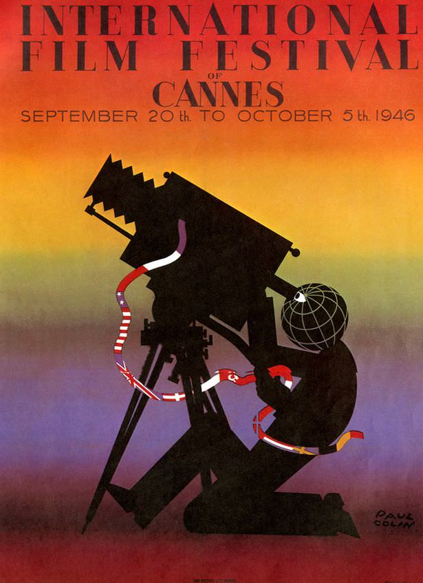
Bold typography crowns the poster with “International Film Festival of Cannes,” set against a warm-to-cool gradient that feels like a sunset spilling into twilight. The dates printed beneath—September 20th to October 5th, 1946—anchor it firmly in the first wave of postwar cultural rebuilding, when cinema was again being promoted as a shared international language. Even before you notice the details, the design reads like an announcement meant to travel: confident, modern, and impossible to ignore.
At the center, a silhouetted figure crouches behind an oversized film camera, the lens framed by a globe-like grid that hints at worldwide reach. Ribbons stream across the scene like strips of film, patterned with different national flags, suggesting a parade of countries feeding stories into a single machine. The title of this post—“1946 had two posters. Greedy”—adds a playful nudge: there’s so much visual storytelling here that the viewer wants more than one version, more than one emblem, more than one way to commemorate that inaugural moment.
Design lovers and film historians alike will appreciate how this Cannes cover art uses simple shapes and limited color to sell a big idea—international cinema as spectacle, craft, and diplomacy all at once. Its mix of crisp lettering, theatrical silhouette, and symbolic geography makes it highly searchable as a Cannes 1946 poster and an early film festival advertisement. Look closely and the poster becomes a compact history lesson: an industry pointing its camera outward again, inviting the world to step into the frame.