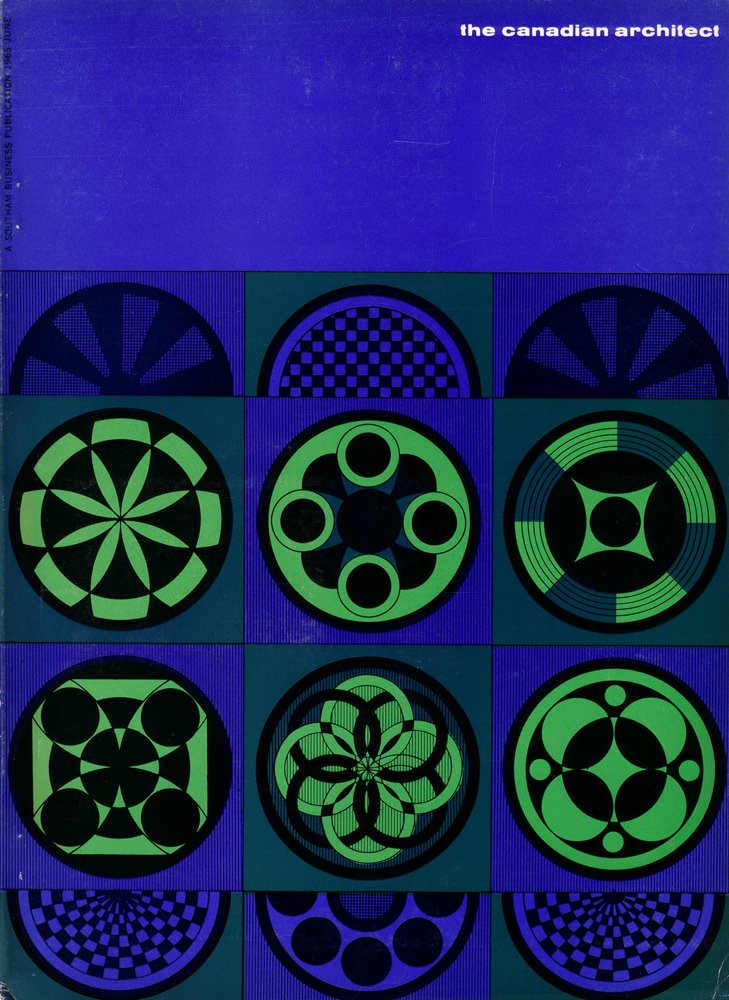
June 1965 arrives in a rush of saturated colour on the cover of *The Canadian Architect*, where deep ultramarine fields and luminous green circles turn the page into a study of rhythm. A tight grid organizes the design into repeated roundels, each one a different geometric experiment—pinwheel wedges, checkerboard domes, and petal-like rosettes that feel both playful and rigorously measured. Even before opening the issue, the cover art signals a profession fascinated by pattern, optics, and the power of pure form.
Across the squares, the eye keeps finding new relationships: concentric rings that suggest machinery or modern signage, interlocking arcs that read like abstract stained glass, and bold negative space that makes every motif snap into focus. The limited palette intensifies the effect, letting contrast do most of the storytelling while the precise linework hints at drafting-room discipline. It’s graphic design speaking the language of architecture—modular, repeatable, and tuned to structure.
For readers browsing Canadian architecture history, this cover offers a compact snapshot of mid-century modern taste as it appeared in professional media. The title in the corner—“the canadian architect”—anchors the composition while the patterned grid evokes the era’s confidence in systems, grids, and industrial clarity. As a WordPress post image, it works beautifully for anyone interested in vintage magazine covers, 1960s design, or the visual culture surrounding architectural practice in Canada.