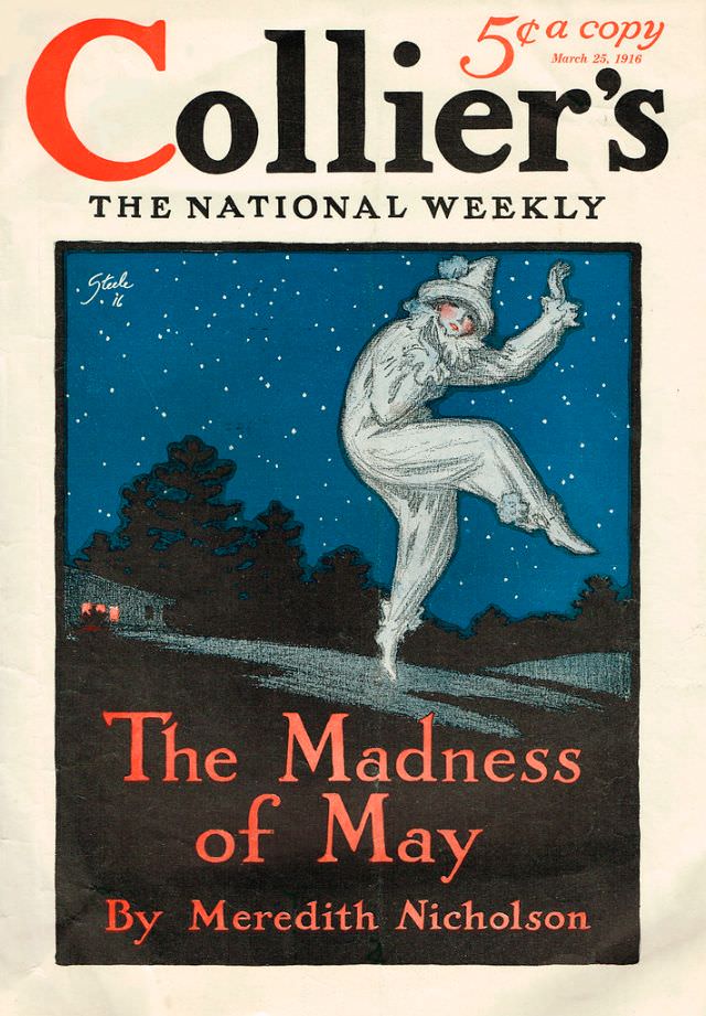
Bold typography and a punchy price line—“5¢ a copy”—set the tone on this Collier’s cover dated March 25, 1916, a time when weekly magazines competed fiercely for attention on crowded newsstands. The familiar masthead, “Collier’s: The National Weekly,” dominates the upper half, balancing strong black lettering with a striking red initial that still feels modern in its confidence. Even before the illustration comes into focus, the design signals a publication built for wide readership, quick browsing, and immediate impact.
Under a star-filled night sky, an eerie, pajama-clad figure lifts a knee and points upward in a frozen, dance-like gesture, as if caught mid-step on a quiet road. Dark trees and a small, lit structure recede into the background, while the figure’s pale clothing glows against the deep blue, creating a theatrical contrast that draws the eye to the center. The cover line “The Madness of May” (by Meredith Nicholson) anchors the scene in large, dramatic lettering, promising mystery and psychological tension in the issue’s featured story.
For collectors and history-minded readers, this March 1916 Collier’s magazine cover is a vivid example of early 20th-century American illustration and editorial marketing. The composition blends suspense, motion, and a hint of the uncanny—exactly the sort of visual storytelling that helped magazines sell fiction and shape popular taste. Whether you’re researching vintage periodicals, classic cover art, or Meredith Nicholson’s work, this piece offers a memorable window into the era’s print culture and graphic style.