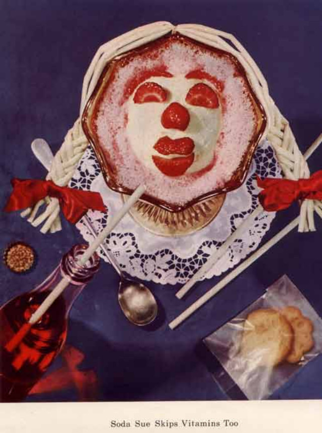
A candy-colored face stares up from a bowl, built from neatly arranged ingredients that turn nutrition into theater. The white “hair” reads like twisted strands laid in pigtails with red bows, while bold red accents form eyes, lips, and a round nose against a pale base. Around the centerpiece sit the props of the message—straws, a spoon, a glass of soda, and a packet of cookies—framing the scene as both playful and faintly unsettling.
Mid-century healthy-eating campaigns often leaned on mascots and gimmicks to make vitamins feel modern, memorable, and kid-friendly, even when the visuals bordered on the bizarre. Here, the design language mixes innocence with a slightly hellish, clownish grin, a reminder that “fun” nutrition messaging could also look uncanny when frozen in time. The vivid color palette and staged tabletop composition evoke the era’s advertising sensibility, when lessons about diet were packaged as eye-catching artworks meant to stop you cold.
Below the scene, the caption “Soda Sue Skips Vitamins Too” spells out the cautionary tale: sugary drinks and snack foods are cast as the villains that crowd out proper nourishment. That simple line, paired with the eerie edible portrait, makes this piece a perfect example of 1950s nutrition propaganda—part art project, part warning label. For readers interested in vintage health education, retro food advertising, and strange vitamin mascots, this image offers a rich snapshot of how a “healthy diet” was marketed with equal parts charm and menace.