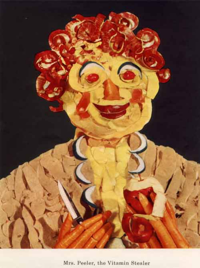
A riot of cut-paper textures and food-colored hues, the artwork introduces a grinning figure assembled from ingredients that look like peeled citrus, red slices, and other kitchen-bright scraps. The face is part doll, part collage, with a fixed stare that feels cheerful at first glance and then oddly unsettling—exactly the kind of “healthy” mascot that could tip into nightmare fuel. At the bottom, the caption reads “Mrs. Peeler, the Vitamin Stealer,” turning a playful craft aesthetic into a mini morality tale.
Mid-century nutrition campaigns often leaned on personification, and these bizarre “vitamin mascots” take that idea to an extreme: health is taught through characters, warning labels, and a dash of theatrical menace. The exaggerated features, vivid reds and yellows, and hand-made look suggest classroom posters or public health materials meant to stick in a viewer’s memory long after the lesson ended. Instead of a sterile chart of nutrients, the message arrives through storybook villains and unsettling humor—an approach that feels both ingenious and slightly “hellish,” as the title promises.
For readers interested in 1950s advertising art, diet propaganda, and the history of nutrition education, this image offers a fascinating window into how visual culture tried to shape everyday eating habits. The piece balances craft and caution, using collage-like food imagery to dramatize what happens when vitamins are “stolen” from the diet. It’s a reminder that the era’s push for a healthy diet wasn’t only about science; it was also about persuasion, spectacle, and characters you wouldn’t forget.