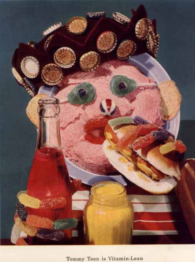
A plate of pink, whipped-looking “face” stares back with candied eyes and a tiny striped nose, crowned by a ring of cookies like an over-the-top hat. In front, a bright red drink in a glass bottle and a squat jar of yellow spread sit beside a stacked, sugary sandwich—part snack, part character design. The whole arrangement leans into mid-century food styling, where color, shine, and novelty mattered as much as the message.
Bizarre diet art and “healthy eating” promotion often met in the 1950s through mascots like this, built from everyday pantry items and photographed like a product ad. Candy becomes hair and eyebrows, bread turns into a mouthpiece, and vitamins are implied not through science but through playful excess, as if nutrition could be made irresistible by giving it a grin. The effect is both charming and unsettling, a reminder of how advertising sometimes used the uncanny to keep eyes on the page.
For WordPress readers interested in retro nutrition campaigns, vintage advertising art, and the strange history of vitamin mascots, this image offers a perfect snapshot of the era’s contradictions. It sells “health” with sugar-bright props and cartoon logic, making diet culture feel like a party while hinting at the anxieties underneath. Look closely at the textures and choices—processed spreads, sweets, and theatrical presentation—and you can see how mid-century food marketing tried to reinvent the very idea of a balanced diet.