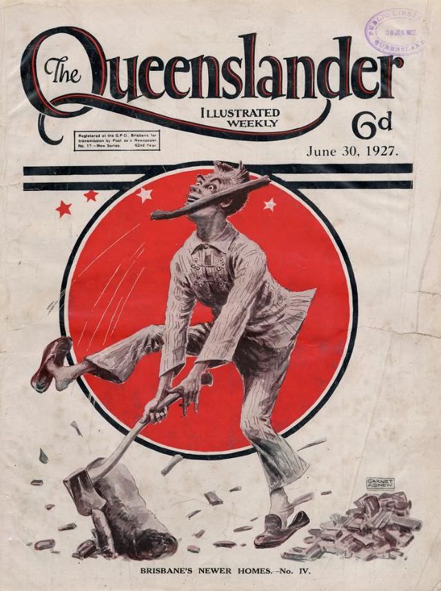
Bold typography announces *The Queenslander* as an “Illustrated Weekly,” priced at 6d and dated June 30, 1927, setting the tone for a lively magazine front page. A striking red circle framed by stars pulls the eye to the centre, where an energetic figure in work clothes dominates the composition. The design balances the clean, confident masthead with a dynamic scene meant to be read at a glance on a newsstand.
At the heart of the cover, a worker mid-swing drives a shovel into broken ground, the action frozen with flying fragments that suggest noise and momentum. The exaggerated pose and expressive face give the illustration a slightly comic, theatrical edge, while the limited palette—mostly black, white, and red—keeps the message punchy and modern. It’s a clever piece of cover art that uses movement and symbolism to sell a story about building and change.
Along the bottom margin, the caption “BRISBANE’S NEWER HOMES.—No. IV.” signals an ongoing feature focused on domestic development and the reshaping of city life. As a historical artefact, this *Queenslander* cover offers a window into 1920s visual culture in Australia: the era’s graphic style, the magazine’s marketing flair, and the public fascination with progress and new housing. For collectors and researchers, it’s both an attractive period illustration and a useful reference point for Australian newspaper and magazine history.