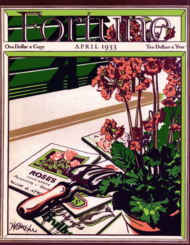
April 1933 arrives in bold, decorative lettering across the top of this Fortune magazine cover, paired with period pricing that instantly places it in its era: “One Dollar a Copy” and “Ten Dollars a Year.” The masthead’s strong, stylized typography frames a carefully composed scene below, where color blocks and crisp outlines give the design a confident, modern punch. Even at a glance, it reads like a statement of taste as much as a business publication.
In the foreground, a trowel rests over a packet labeled “ROSES,” surrounded by gardening notes and seed imagery, while a potted plant with tall stems and clustered blossoms rises at the right edge. The palette leans into greens, earthy browns, and warm pinks, suggesting growth and springtime renewal. Angled shadows and simplified shapes hint at an Art Deco sensibility, turning everyday tools and plants into graphic symbols.
For readers today, this Fortune cover art from April 1933 offers more than attractive illustration—it’s a window into how magazines used design to shape mood and meaning. Gardening motifs and orderly composition evoke patience, planning, and the promise of results, themes that resonate strongly in the early 1930s without needing any caption to explain them. As a piece of vintage magazine cover design, it stands out for its blend of commerce, craftsmanship, and optimism rendered in ink and color.