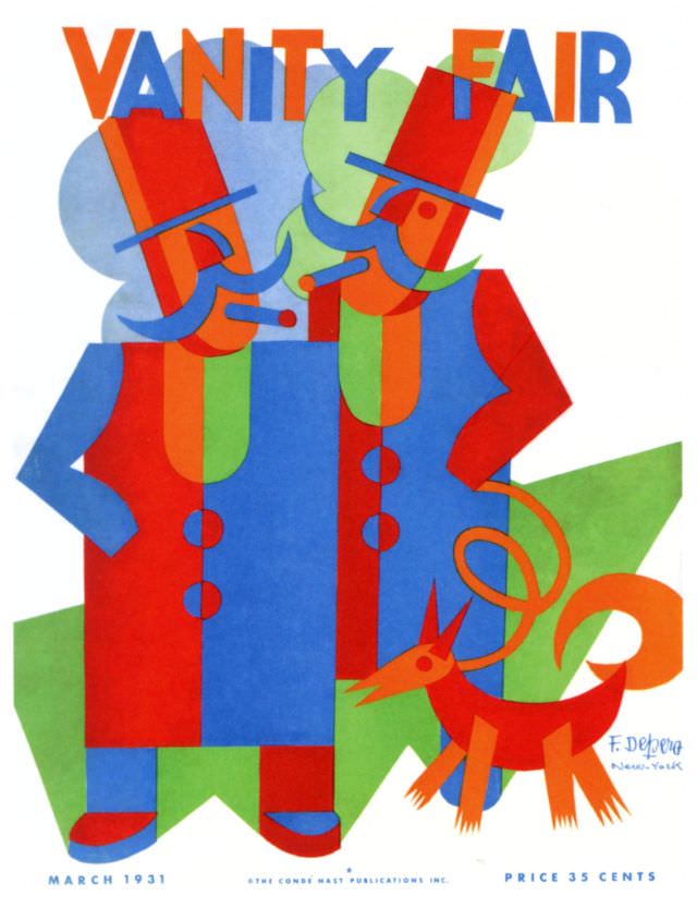
Bold blocks of red, blue, and green stack into two stylized figures beneath the towering VANITY FAIR masthead, turning the March 1931 cover into a small gallery wall moment. Top hats, long noses, and sharply angled silhouettes suggest a playful, modern caricature rather than a literal scene, while the crisp white field keeps every geometric shape vibrating with energy. Even before a reader turns a page, the design announces a magazine confident in graphic wit and contemporary taste.
At a time when Art Deco and modernist illustration were reshaping popular visual culture, this cover art leans hard into abstraction: flat color, simplified forms, and a sense of motion created by overlap and rhythm. The pair appear caught mid-conversation—or mid-performance—framed by a jaunty little dog rendered with the same angular flair, as if the entire tableau were cut from colored paper. The result feels simultaneously sophisticated and mischievous, a reminder that magazine covers once served as daring, collectible posters for the newsstand.
Collectors and design historians value pieces like the Vanity Fair March 1931 cover for how clearly they preserve the era’s graphic language and print aesthetics. From the prominent typography to the neatly printed issue details along the bottom margin, the page reads as both advertisement and artwork, built to stop passersby in their tracks. For anyone browsing vintage magazine cover art, early-20th-century illustration, or Vanity Fair history, this striking composition offers a vivid snapshot of style between the wars.