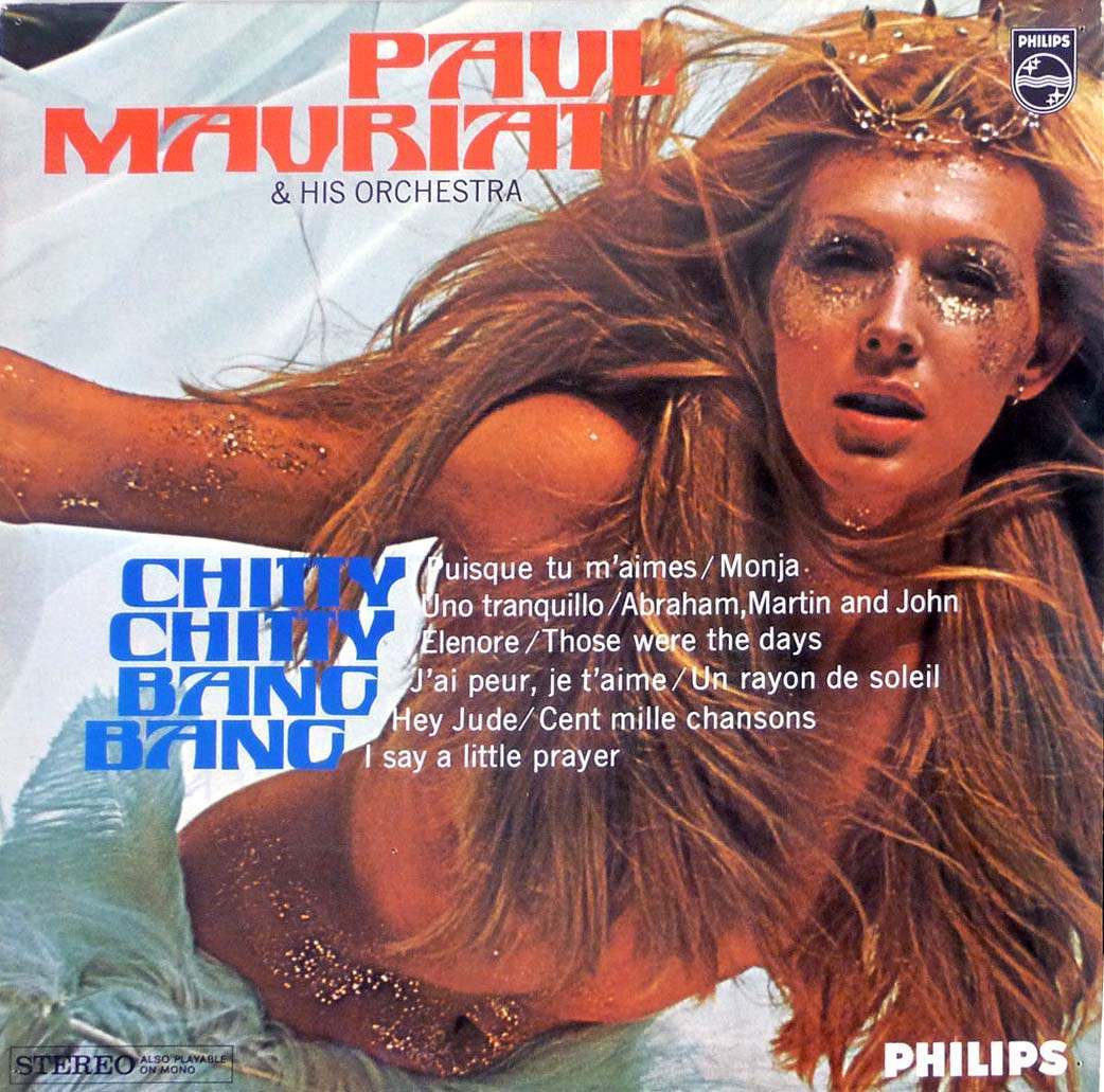
A rush of glitter, windblown hair, and bold typography sets the tone for this striking piece of 1960s–1970s-era album cover art, where pop spectacle and graphic design collide. The name “Paul Mauriat & His Orchestra” crowns the sleeve in chunky red lettering, while the title “Chitty Chitty Bang Bang” anchors the composition in cool blue—an attention-grabbing contrast that would have leapt from record-shop bins. The overall look is theatrical and sensual, embracing the era’s appetite for eye-catching, cinematic marketing.
Design choices here feel intentionally loud: an extreme close-up, a dramatic pose, and sparkly makeup that reads like stage lighting frozen in time. The Philips branding and “STEREO” label plant it firmly in the world of mass-market vinyl, when major labels used photography and daring layouts to promise a mood before the needle ever touched the groove. Even the track list—mixing French and English titles—adds to the international, lounge-pop atmosphere that orchestral releases often traded on.
Unusual and unconventional album cover designs from the 1960s and 1970s weren’t just decoration; they were a sales pitch, a fashion statement, and a tiny gallery wall for anyone with a turntable. This cover’s glamorous styling and high-impact color blocks show how record art could flirt with film posters and magazine spreads while still being instantly recognizable as a music product. For collectors and design lovers, it’s a vivid reminder of how the vinyl era turned packaging into part of the performance.