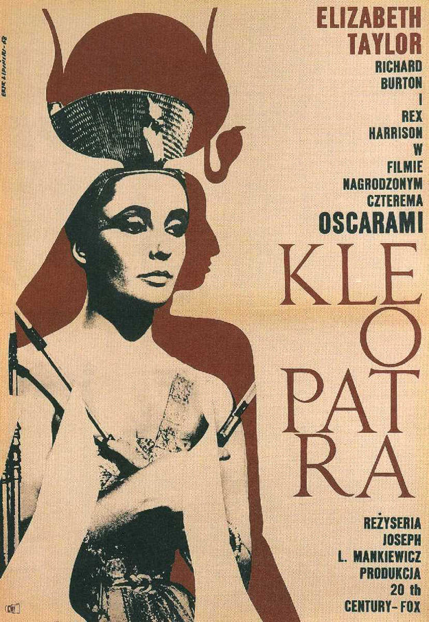
Bold, graphic simplicity defines Eryk Lipiński’s 1968 cover art for “Cleopatra,” where a stylized portrait dominates the page with the authority of an icon. The figure’s high, sculptural headdress and sharply rendered features evoke the familiar screen image of Cleopatra rather than an archaeological reconstruction, leaning into the mythic glamour that popular culture attached to the queen. A muted palette and strong contrasts pull the eye between face, silhouette, and costume, turning historical spectacle into striking modern design.
Along the right side, the typography stacks names and credits in a clean vertical column, balancing the heavy visual mass of the portrait. The large, split lettering of “KLEOPATRA” reads as both title and ornament, anchoring the composition like carved stone while remaining unmistakably mid-century in feel. Polish-language text and references to awards and production details situate this as a promotional cover, likely tied to a local release or program.
Seen today, Lipiński’s artwork offers a window into how the late 1960s continued to repackage antiquity through cinema, celebrity, and print. It’s a piece that speaks to poster and magazine-cover aesthetics of the era: economical shapes, strong negative space, and an emphasis on star power as historical storytelling. For collectors and researchers of film ephemera, graphic design history, or Cleopatra imagery, this cover art stands as a concise, memorable example of how one face could carry an entire empire of meaning.