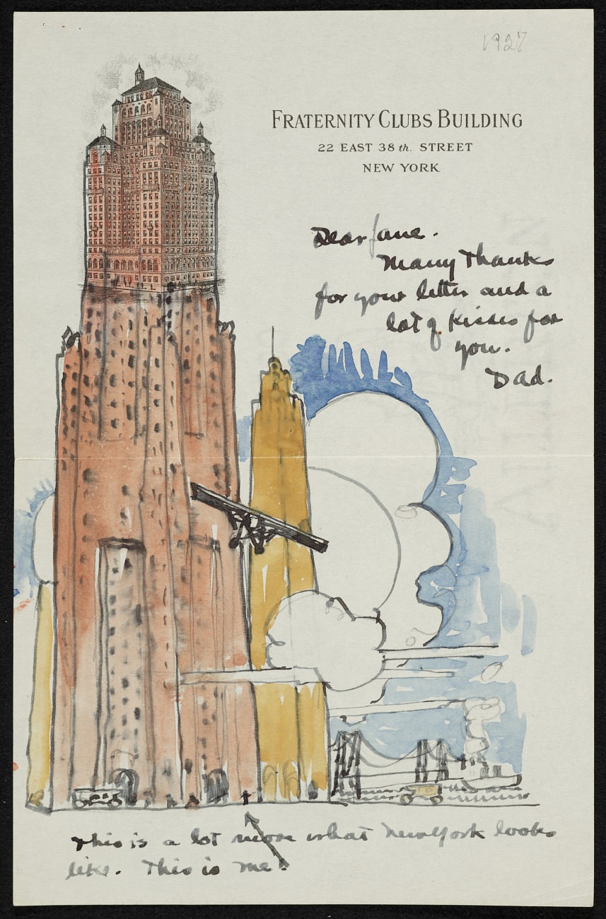
Perched near the top of the page, the letterhead reads “Fraternity Clubs Building, 22 East 38th Street, New York,” setting the scene in the vertical world of 1920s Manhattan. A hand-drawn tower rises in watercolor and ink, its windows stacked in rhythmic rows and its upper stories rendered with a careful, architectural pride. Below and behind it, a simplified skyline and curling cloud forms suggest the city’s constant motion, with broad washes of blue and warm ochre giving the sketch a lively, modern feel.
Alongside the illustration, a brief handwritten note turns the artwork into a personal keepsake: “Dear Jane. Many thanks for your letter and a lot of kisses for you. Dad.” The title, “Allen Tupper True to Jane True, 1927,” frames this as more than an urban sketch—it’s a small family message, preserved on stationery that itself advertises an address and a milieu. In the lower margin, the affectionate aside—“This is a lot nicer what New York looks like. This is me!”—adds a wink of personality, as if the cityscape doubles as a playful self-portrait.
In a single sheet, the piece blends ephemera, art, and everyday correspondence, making it especially rich for readers interested in New York history, early 20th-century illustration, and the intimate language of letters. The combination of printed corporate letterhead, casual handwriting, and watercolor skyline evokes how people carried the spectacle of the city into their private lives. As an artwork in miniature, it offers both a stylized view of New York architecture and a tender snapshot of a father writing home to Jane.