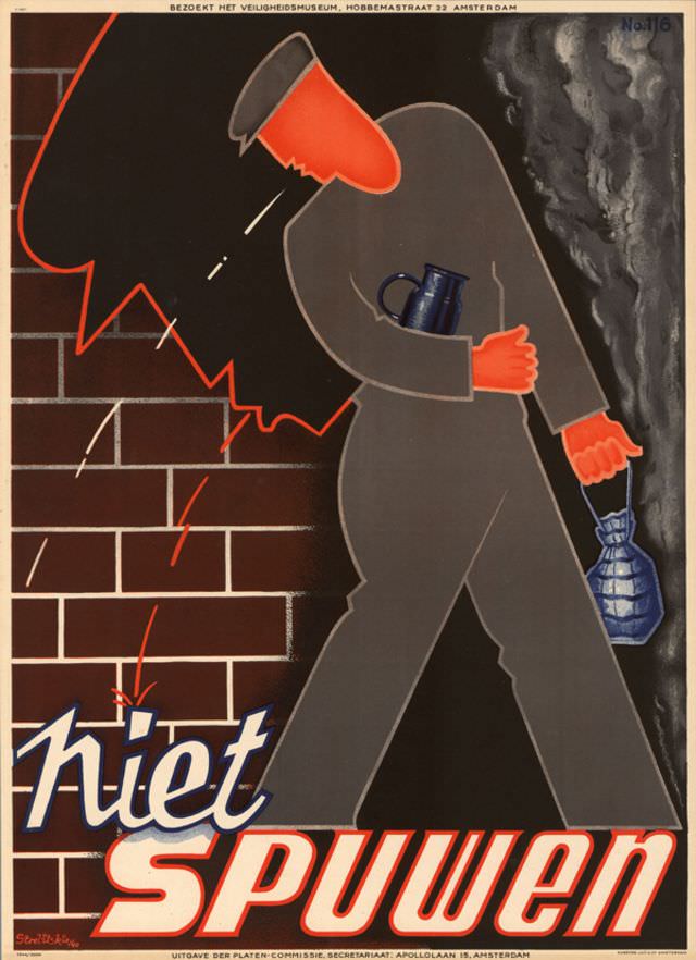
Bold geometry and urgent color contrasts define Strelitskie’s 1941 poster, where a simplified figure in grey strides past a brick wall with a bright orange helmet-like headpiece and matching gloves. The scene reads like a cautionary moment: white streaks arc across the dark background, red zigzags crackle near the wall, and a cloudy plume gathers at the right edge, suggesting hazard, impact, or contamination. A blue vessel tucked under the arm and another carried at the side add everyday detail to an otherwise stylized warning tableau.
Dutch text anchors the design’s message, with the large words “niet spuwen” (“do not spit”) dominating the lower half in slanted, emphatic lettering that feels built for quick recognition on a street or workplace noticeboard. Along the top margin, smaller print invites viewers to visit the Veiligheidsmuseum in Amsterdam, tying the artwork to public safety education and civic instruction. The visual language—flat shapes, sharp outlines, and limited palette—turns a simple behavioral rule into a dramatic, memorable command.
For readers interested in World War II–era graphic design, this historical poster offers a compact lesson in how public health and safety campaigns used modernist aesthetics to influence everyday conduct. It also makes a strong SEO-friendly example of 1941 propaganda-style poster art, Dutch safety messaging, and museum-linked educational printing. Even without naming a specific incident, the composition conveys a broader atmosphere of vigilance, where ordinary actions are framed as matters of collective responsibility.