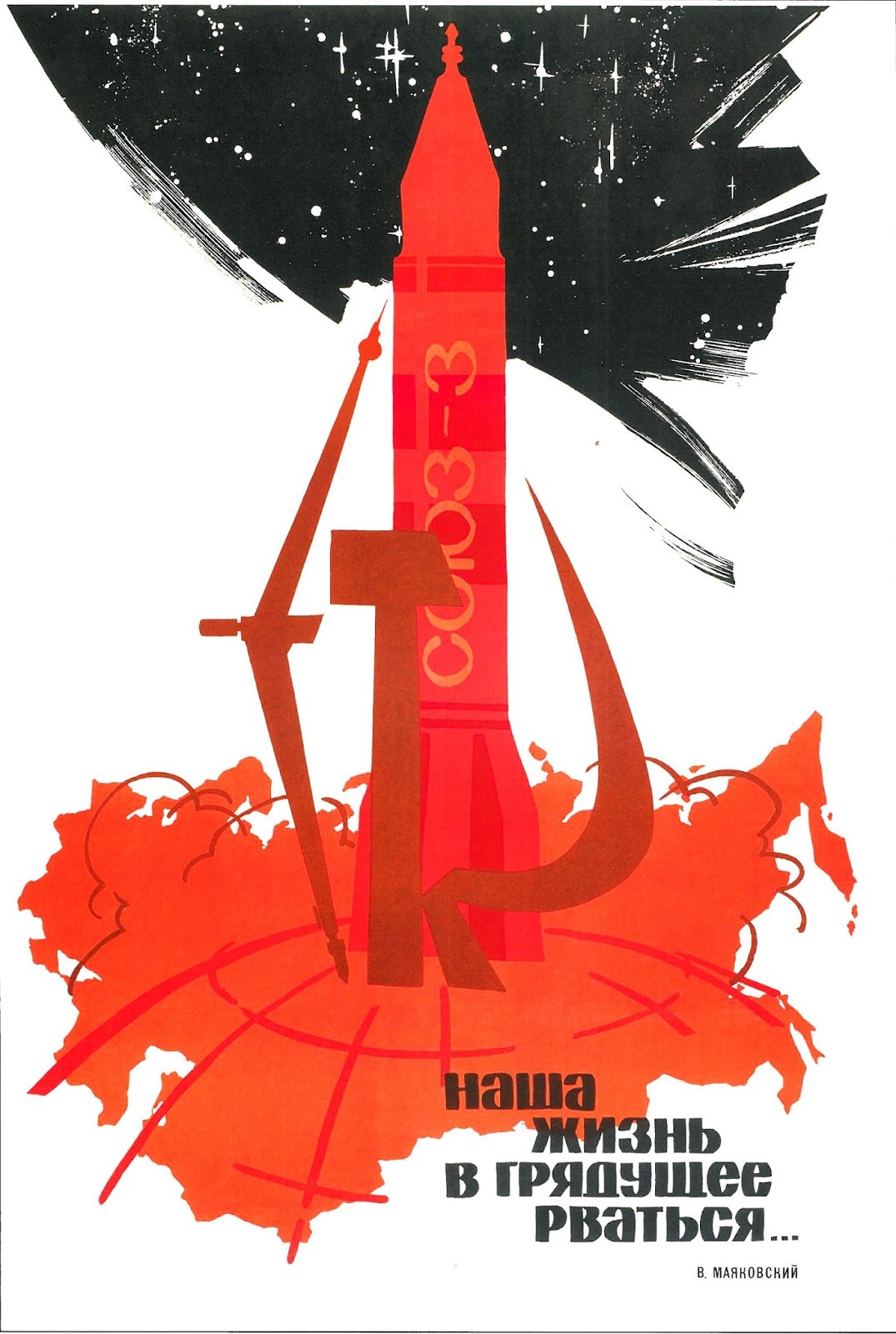
A towering red rocket rises like a monument against a star-speckled black sky, its body stamped with vertical Cyrillic lettering that reads “СССР.” Below, a sweeping orange-red silhouette of the Soviet landmass curves into view, scored with arcs that suggest global trajectories, radio paths, or the geometry of an expanding future. The stark palette—red, black, and white—turns the composition into a bold emblem of the space age and the graphic confidence of late-1960s poster art.
G. Illarionov’s “Being long for the future is our life” (1968) leans into the era’s language of aspiration, where rockets functioned as both machines and metaphors. The exaggerated scale of the spacecraft, the crisp, simplified shapes, and the dynamic diagonals convey momentum and inevitability, as if history itself is launching upward. Even the stars are rendered as sharp marks and spark-like specks, reinforcing a sense of engineered wonder rather than romantic night-sky reverie.
Set beside the Russian slogan at the bottom, the artwork reads as a visual manifesto: progress plotted across a map, direction drawn in lines, destiny framed by outer space. For readers exploring Soviet space propaganda, Cold War design, or 1960s graphic modernism, this image offers a compact lesson in how typography, symbolism, and color can mobilize a national narrative. It’s an arresting reminder that the future was once something to be announced—loudly, cleanly, and in red.