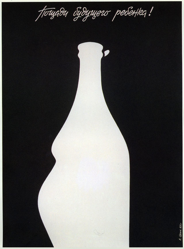
Against a deep black field, a stark white bottle dominates the frame, its silhouette unmistakably reshaped into the rounded profile of pregnancy. The spare composition feels more like a poster than a casual snapshot, using contrast and negative space to make the message land instantly. Above, a handwritten Cyrillic slogan adds urgency and a human touch, as if someone scrawled a warning across the night.
The title, “To health!”, reads like a toast turned inside out—what looks like a drink becomes a reminder of consequences. By merging a familiar vessel with the outline of an expectant body, the artwork points to how private habits can ripple into the future, especially where motherhood and infant well-being are concerned. Even without a crowd or a scene to set the context, the design speaks in the visual language of public health and social responsibility.
For WordPress readers interested in historical imagery, propaganda-style graphics, or medical and temperance themes, this piece offers a striking example of minimalist persuasion. It invites close reading: the bottle’s soft curves, the tight crop, the handwritten line overhead, all working together to turn a simple object into a moral argument. Whether approached as graphic art or social history, it remains a memorable artifact of how “health” was framed—and defended—in the public imagination.