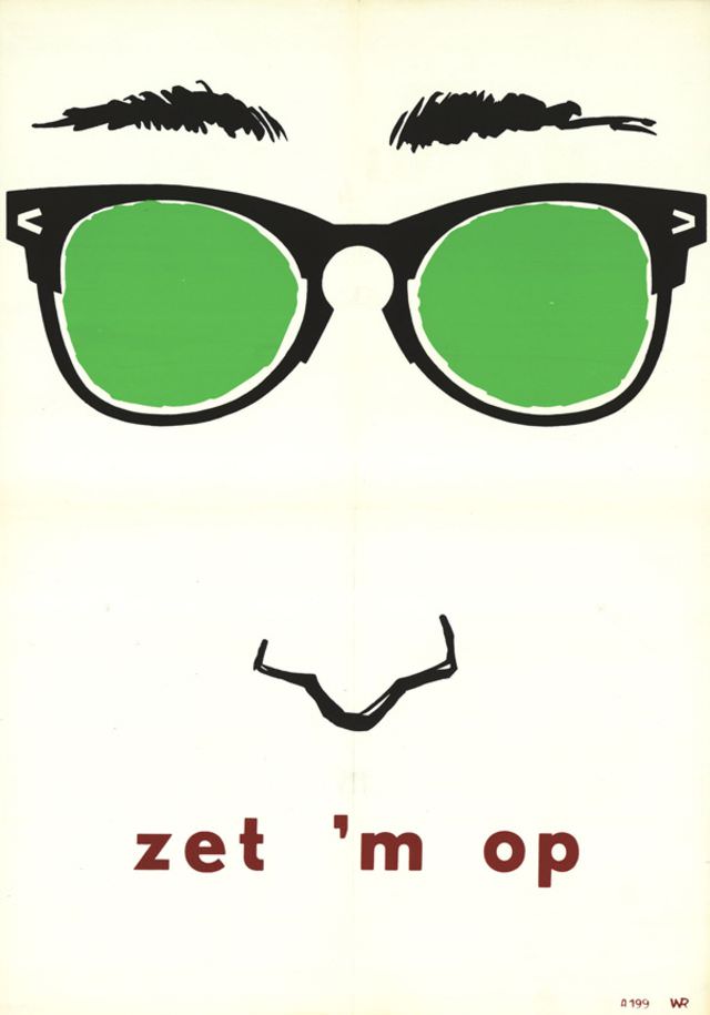
Bold, pared-down facial features—arched brows, a simple nose line, and oversized glasses—dominate this striking piece of graphic design from the period 1959–1965. The bright green lenses pop against a pale ground, while heavy black outlines keep the composition crisp and instantly readable. Even without a credited designer, the work feels confidently modern, leaning on contrast and negative space to do the storytelling.
At the bottom, the printed phrase “zet ’m op” anchors the artwork with a punchy, poster-like voice. The typography is straightforward and sturdy, set in lowercase red letters that balance the cool green above, creating a tight color triad that reads well at a distance. A subtle fold line down the center hints at its life as a handled, circulated object—something made to be seen, carried, or displayed rather than merely archived.
Within mid-century visual culture, this kind of minimalist illustration points to an era fascinated by identity, style, and the power of simple symbols. The anonymous authorship only adds to its intrigue, inviting viewers to focus on form, message, and the design language of the early 1960s. For collectors and researchers browsing artworks, vintage posters, and mid-century graphic design, it offers a clean, memorable example of how a few shapes and two colors can deliver maximum impact.