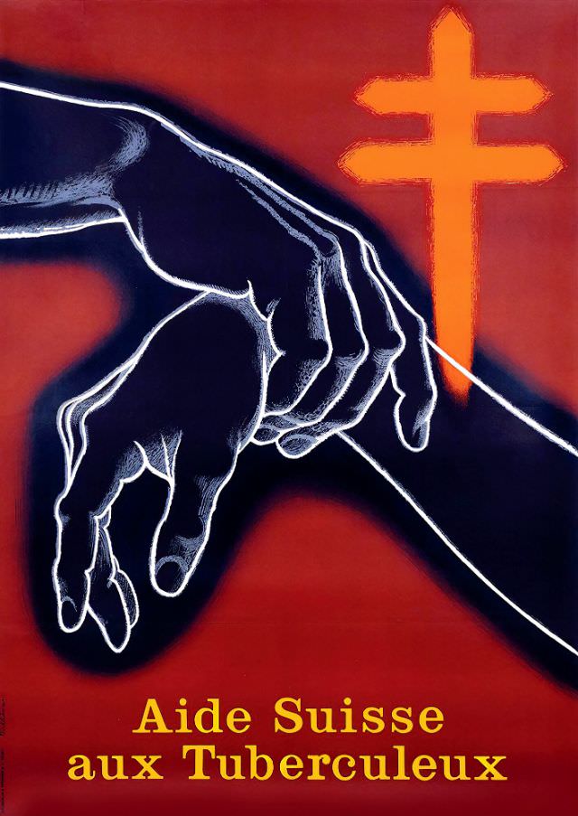
Against a deep red field, two hands meet in midair—one rendered in dark shadow, the other outlined in pale light—forming a quiet, urgent pledge of support. Behind them rises a bold cross-like emblem, its warm glow echoing the poster’s message and pulling the viewer’s eye toward the act of assistance at the center. The strong contrasts and simplified shapes give the design the directness of wartime-era public health graphics, where clarity mattered as much as emotion.
“Aide Suisse aux Tuberculeux, 1943” reads like both a title and a call, situating the artwork within a period when tuberculosis remained a feared, widespread illness. Rather than depicting hospital wards or medical equipment, the composition leans on symbolism: help offered, help received, and a humanitarian presence standing watch. The result is an image that communicates care and solidarity while still carrying the tension of a disease that could isolate patients from their communities.
For readers interested in Swiss social history, vintage poster art, and the visual language of public health campaigns, this piece offers a striking example of how design could rally compassion. The limited palette, dramatic lighting, and elegant French typography make it memorable and highly shareable for those researching tuberculosis awareness, charitable aid, or mid-20th-century graphic communication. Seen today, it remains a reminder that disease control has always depended not only on medicine, but on people reaching for one another.