Category: Cover Art
Dive into a gallery of vintage cover art from books, magazines, and albums. Discover how graphic design and illustration reflected the moods of their times.
These covers capture the essence of cultural evolution — from bold propaganda to elegant minimalism.
-
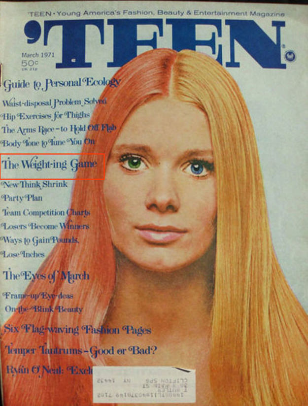
#8 A Blast from the Past: Exploring the World of Vintage Teen Magazine Covers #8 Cover Art
Bold, blocky lettering spells out **TEEN** across the top, framing a striking close-up portrait that does all the talking. The cover’s palette—cool blues in the masthead, warm honey-blonde hair, and a softly lit face—feels like a time capsule of magazine design when airbrushed polish and direct eye contact were the surest way to stop a…
-
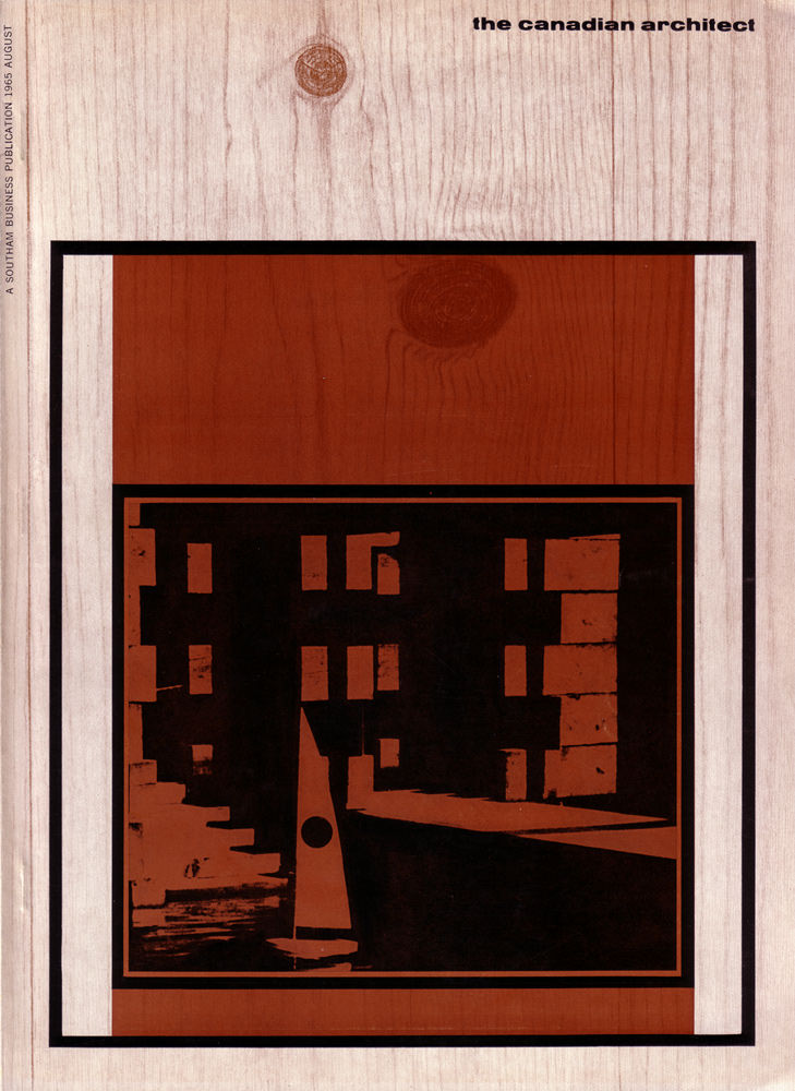
#13 The Canadian architect – August 1965
Set against a pale woodgrain field, the August 1965 cover of *The Canadian Architect* leans into the era’s fascination with material honesty and graphic restraint. A bold, framed rectangle anchors the design, its warm reddish-brown banding echoing stained timber while a deep black panel draws the eye inward. The masthead sits quietly at the top,…
-

#2 So Bad, They’re Good: Vintage Album Covers That Will Make You Laugh #2 Cover Art
Front and center, a wide‑eyed woman clutches an orange towel like a lifeline, her expression staged somewhere between shock and punchline. Behind her, the steamy bath setting is reduced to a soft-focus backdrop of towel-wrapped figures, creating that unmistakable mid-century “suggestive but safe” comedy vibe. Even the bold, oversized typography—“GIRL in a HOT Steam Bath”…
-
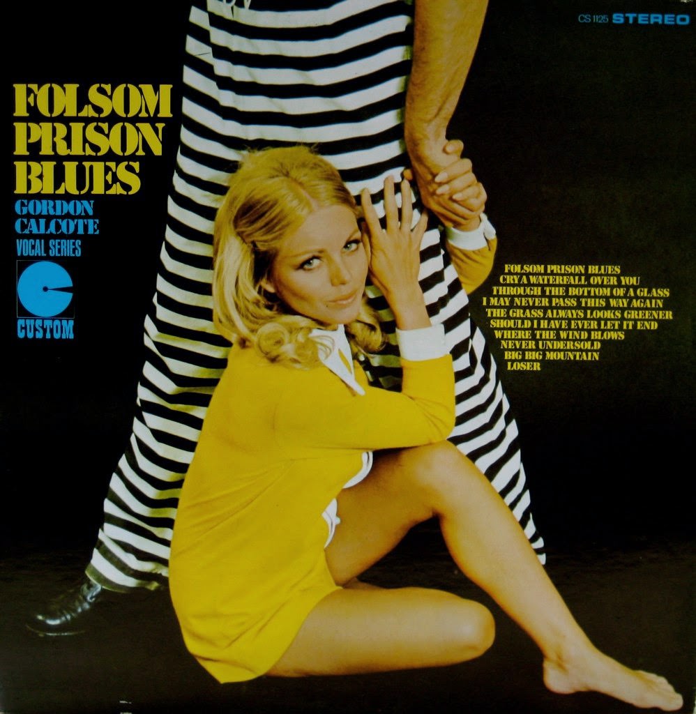
#18 So Bad, They’re Good: Vintage Album Covers That Will Make You Laugh #18 Cover Art
Front and center is a perfect slice of “so bad it’s good” album-cover theater: bold lettering, a deep black backdrop, and a model in a bright yellow outfit clinging dramatically to a pair of black-and-white prison stripes. The contrast is intentionally loud, pushing the eye from the oversized title to the staged pose, as if…
-

#9 Heavy Metal Magazine Covers: A 1970s Blast of Sci-Fi and Fantasy #9 Cover Art
Bold, blocky lettering shouting “HEAVY METAL” dominates the top of this cover, with “February 1978” and a $1.50 price marking it as a true slice of late-1970s pop culture. Beneath the masthead, the tagline “The adult illustrated fantasy magazine” signals the publication’s boundary-pushing intent, where comics and illustration were aimed squarely at grown-up readers hungry…
-

#25 Heavy Metal Magazine Covers: A 1970s Blast of Sci-Fi and Fantasy #25 Cover Art
Bold red lettering screams “HEAVY METAL” across a sky of rolling clouds, setting the stage for the magazine’s signature collision of science fiction spectacle and fantasy attitude. A formation of sleek spacecraft surges upward on burning thrusters, their exhaust painting the air with orange streaks that pull your eye into the depth of the scene.…
-
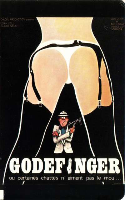
#16 The A-Frame’s Influence: How This Iconic Pose Continues to Shape Modern Fashion, Art, and Movie Posters #16
Bold graphic design meets cinematic mischief in this cover art for “Goldfinger,” where a stark A‑frame silhouette frames the entire composition. Heavy black fields, clean curves, and high-contrast negative space pull the eye inward, turning a provocative outline into a visual doorway that guides attention to the figure below. Even without a literal runway or…
-

#9 Moonshine County Express (1977)
Billed as *Moonshine County Express (1977)*, this cover art leans hard into the rowdy, backroads energy that defined a lot of late-1970s drive-in entertainment. A square-jawed figure in a racing-style jacket anchors the composition, flanked by two women in denim overalls—one with a long gun slung with casual confidence, the other tilting a jug as…
-

#8 The Psychological Appeal of Women Running from Houses on Gothic Romance Covers #8 Cover Art
Midcentury Gothic romance cover art thrived on motion and menace, and few motifs are more instantly legible than a woman fleeing a looming house. In the spread shown here, stormy skies, hard architectural angles, and a grand, shadowed mansion set the stage for peril before a single page is turned. The typography shouts melodrama while…
-
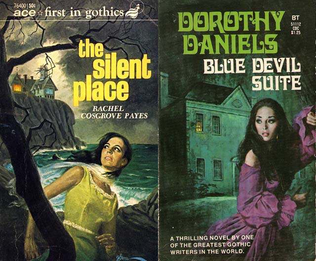
#24 The Psychological Appeal of Women Running from Houses on Gothic Romance Covers #24 Cover Art
A woman glances back over her shoulder, caught between flight and fascination, while a looming house and jagged shoreline press in around her—an instantly recognizable visual language of gothic romance cover art. On one side, the title “the silent place” sits beside stormy water, twisted branches, and a distant building lit like a warning beacon.…