Category: Cover Art
Dive into a gallery of vintage cover art from books, magazines, and albums. Discover how graphic design and illustration reflected the moods of their times.
These covers capture the essence of cultural evolution — from bold propaganda to elegant minimalism.
-
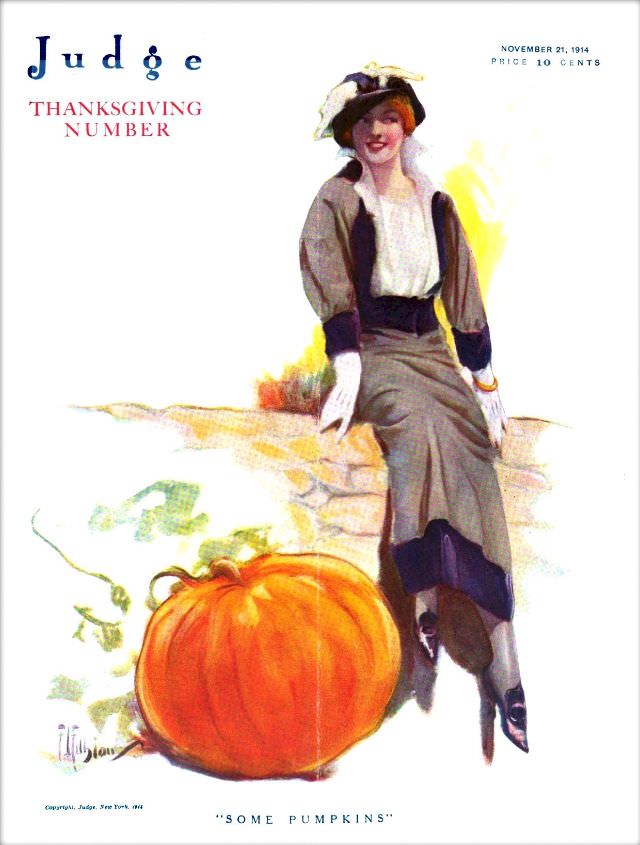
#17 Judge magazine, November, 21, 1914
Bold lettering spells out *Judge* alongside the words “Thanksgiving Number,” setting an unmistakably seasonal tone for the magazine cover dated November 21, 1914. The composition is airy and elegant, with generous white space that draws the eye to a stylish figure posed at ease, as if pausing during an autumn outing. A price of 10…
-
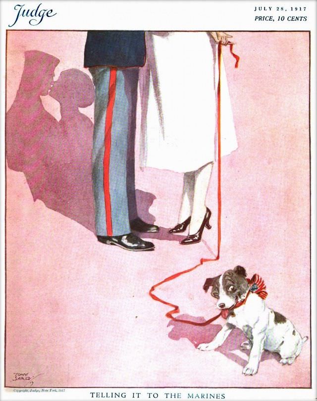
#33 Judge magazine, July 28, 1917
Judge magazine’s July 28, 1917 cover distills a whole mood into a few deft lines and a wash of rosy color. At the top, the familiar masthead and the small-print “Price, 10 cents” frame an illustration that keeps faces out of view, letting posture and costume do the talking. The scene is set low to…
-

#8 Pianos, Pin-Ups, and Party Tunes: Exploring the Wild World of Honky-Tonk Records #8 Cover Art
Neon-green lettering shouts “BLONDES PREFER…” across a smoky, nightclub-like scene, while a glamorous blonde woman holds a cigarette and looks out with a practiced, pin-up poise. Behind her, the soft blur of stage lights suggests a late-night set where the music runs loud and the jokes run louder—exactly the atmosphere honky-tonk cover art loved to…
-
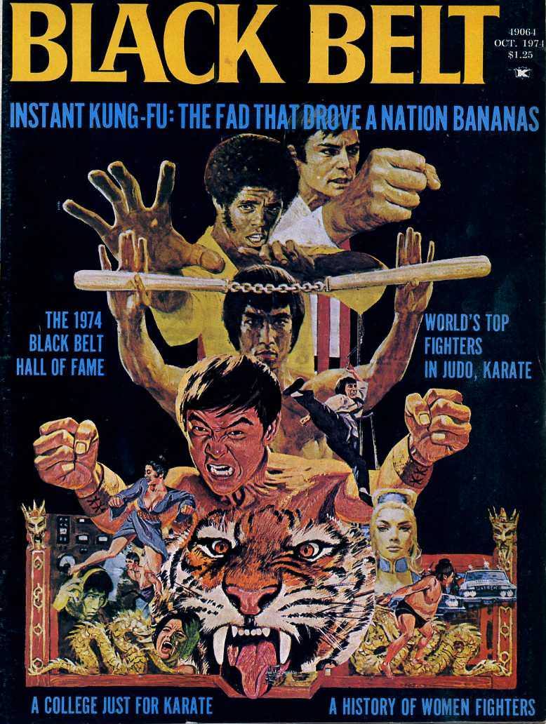
#4 Everybody Was Kung Fu Fighting: Exploring the Heyday of Martial Arts Mags in the 1970s and 1980s #4 Cov
Bold block letters shouting “BLACK BELT” dominate this explosive magazine cover, backed by a midnight field that makes every punch, palm strike, and flying kick feel larger than life. Across the top, the teaser “Instant Kung-Fu: The fad that drove a nation bananas” reads like a time capsule from the martial arts boom, when dojos,…
-
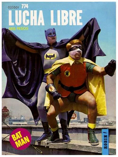
#8 Blood, Masks, and Glory: A Visual Tour Through Lucha Libre Magazine Covers of the 1970s #8 Cover Art
Lucha Libre magazine cover art from the 1970s had a flair for the outrageous, and this issue leans into it with full theatrical confidence. Under a bold “LUCHA LIBRE” masthead and a price marked “SEIS PESOS,” two costumed figures strike a rooftop pose against a hazy city skyline, turning the everyday urban horizon into a…
-
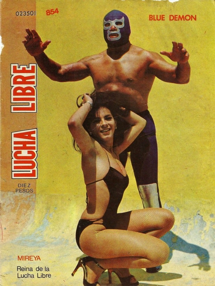
#24 Blood, Masks, and Glory: A Visual Tour Through Lucha Libre Magazine Covers of the 1970s #24 Cover Art
Lucha Libre erupts from this 1970s-era cover in bold blocks of color and attitude, with the masked wrestler “Blue Demon” towering against a sun-faded yellow background. The design leans into high drama: arms raised in a ready stance, the iconic mask rendered in deep blue and white, and the magazine’s vertical “LUCHA LIBRE” title screaming…
-
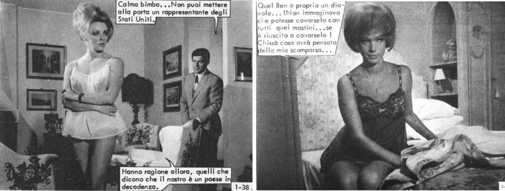
#2 The World of Spanish and Italian Crime Comics (Fotonovelas) from the 1960s-70s: Stories Told with Sensational Photogr
Glamour and danger collide in this striking slice of Italian-language fotonovela cover art, where staged photography does the work of inked panels. On the left, a tense domestic interior—framed pictures, heavy furniture, and a sharply dressed man in the background—sets up a classic crime-comic mood of suspicion and confrontation. The speech balloons, printed directly over…
-
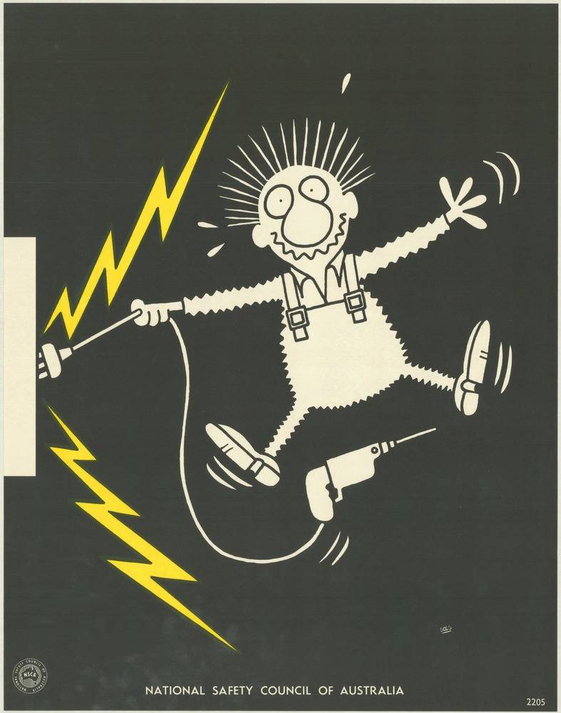
#6 National Safety Council of Australia Posters from the 1970s: Visual Messages for Keeping People Safe and Well
Bold cartoon drama does the talking on this cover art from the National Safety Council of Australia’s 1970s safety poster campaign. Against a deep black field, a wide-eyed worker in overalls flails mid-step as jagged yellow lightning bolts crackle nearby, turning a simple scene into an instant warning about electrical danger. The pared-back palette and…
-
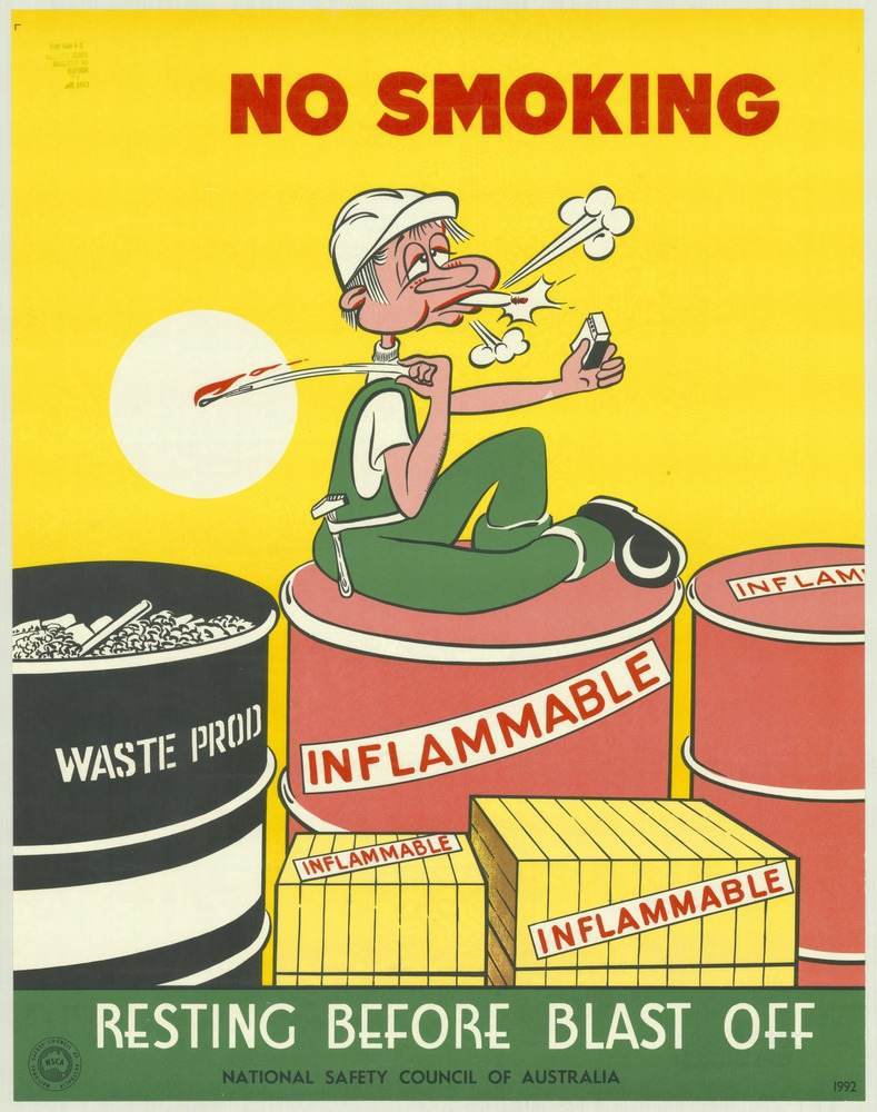
#22 National Safety Council of Australia Posters from the 1970s: Visual Messages for Keeping People Safe and Well
Bold red letters declare “NO SMOKING” against a flat yellow field, setting the tone for a safety message that doesn’t waste time. At the centre, a cartoon worker lounges casually atop a drum marked “FLAMMABLE,” cigarette in hand, while sparks and smoke burst from his face as if the next breath could trigger disaster. Nearby,…
-
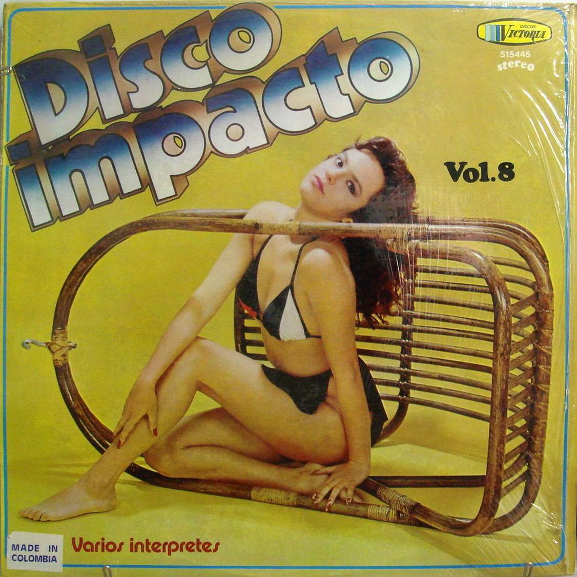
#7 The Unusual and Unconventional Album Cover Designs From the 1960s and 1970s #7 Cover Art
Bold lettering reading “Disco Impacto” leans across a mustard-yellow field, setting a loud, playful tone before your eye even reaches the model posed inside a toppled wicker chair. The composition turns everyday furniture into a graphic frame, with the figure’s relaxed gaze and angular pose doing as much design work as the typography. It’s the…