Category: Cover Art
Dive into a gallery of vintage cover art from books, magazines, and albums. Discover how graphic design and illustration reflected the moods of their times.
These covers capture the essence of cultural evolution — from bold propaganda to elegant minimalism.
-
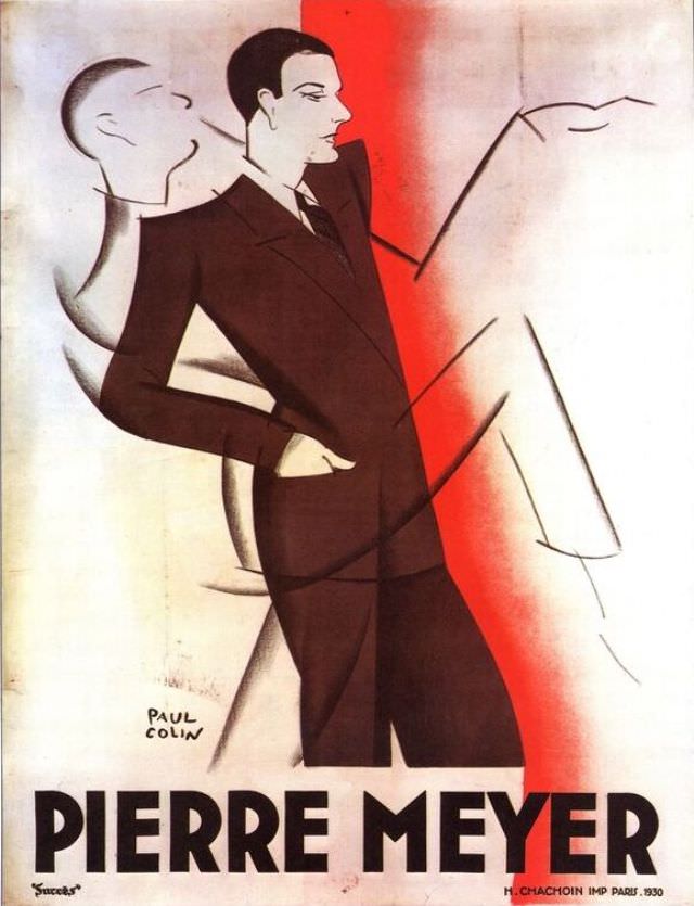
#25 Pierre Meyer, 1930
Strikingly modern for 1930, the cover art for “Pierre Meyer” leans into bold geometry and theatrical poise: a sharply dressed man in a dark suit stands with one hand in his pocket, his profile turned toward a sweeping, simplified figure rendered in pale tones. A vertical band of red slices through the composition, acting like…
-
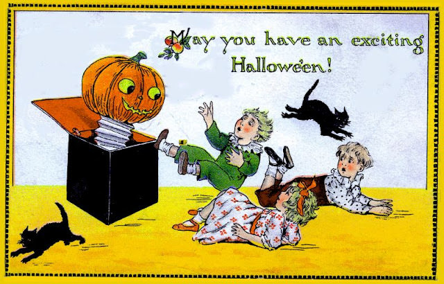
#1 May you have an exciting Halloween!
Bright autumn color and playful fright set the tone in this Halloween cover art, where a jack-o’-lantern clown springs from a black box like a classic “Jack-in-the-box.” The pumpkin head grins under wide, glowing eyes, its spring-loaded body and ruffled collar leaning into the era’s love of bold, cartoonish holiday spectacle. Above the scene, the…
-
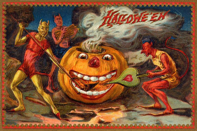
#17 Hallowe’en
Across a scalloped red border, the word “Hallowe’en” curls through a plume of smoke, setting the tone like a carnival banner over a midnight stage. At the center grins an oversized jack-o’-lantern with wide, cartoon eyes and a mouthful of big teeth, half mischievous and half menacing. The saturated colors and exaggerated expressions mark this…
-
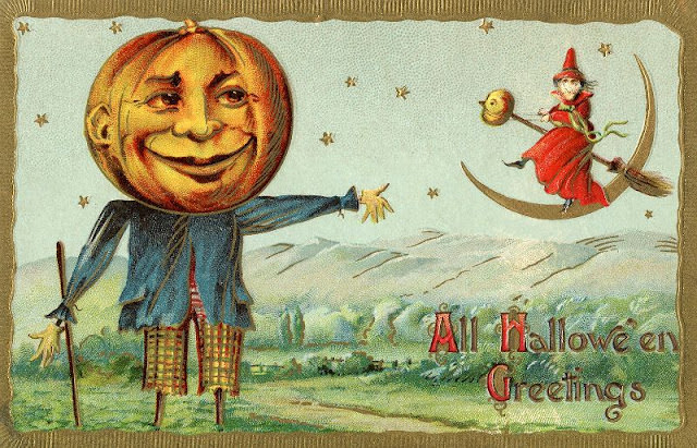
#33 Pumpkin Scarecrow and Witch
A grinning pumpkin-headed scarecrow dominates the scene, dressed in a rumpled blue jacket and patterned trousers as it stands like a friendly guardian over a rolling countryside. The oversized jack-o’-lantern face leans into the playful mood, part harvest mascot and part folk-creature, rendered in bright, storybook colors that feel meant for a mantel or scrapbook.
-
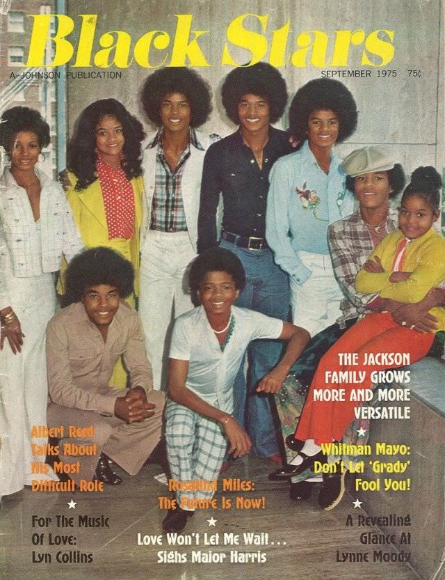
#9 The Jackson Family, September 1975
Bold yellow “Black Stars” lettering crowns the September 1975 cover, where the Jackson family gathers in a staged-yet-warm portrait that feels like a snapshot of pop culture mid-stride. Afros, wide collars, denim, and patterned shirts anchor the look firmly in the 1970s, while relaxed smiles and casual poses create a sense of closeness rather than…
-

#25 Peaches and Herb, July 1979
Bold yellow lettering for *Black Stars* spreads across the top of this July 1979 cover, framing a close, affectionate portrait of Peaches and Herb. Their pose reads like a slow-song moment frozen in time: her beaded braids cascading over a satin-like blouse, his open-collared shirt and neat mustache finishing a look that’s equal parts polished…
-
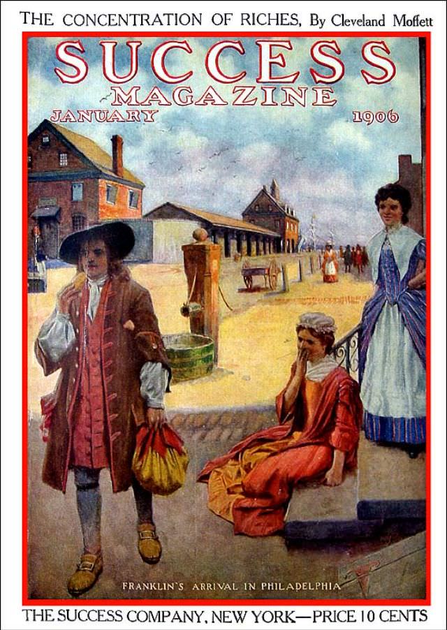
#15 Success magazine, January 1906
Bold lettering announces **SUCCESS MAGAZINE** for **January 1906**, framed by an illustration that reads like a scene from the early American past. Along the top, the issue teases a feature titled “The Concentration of Riches,” credited to Cleveland Moffett, signaling the era’s fascination with money, power, and modern life. At the bottom, the publisher line—**The…
-
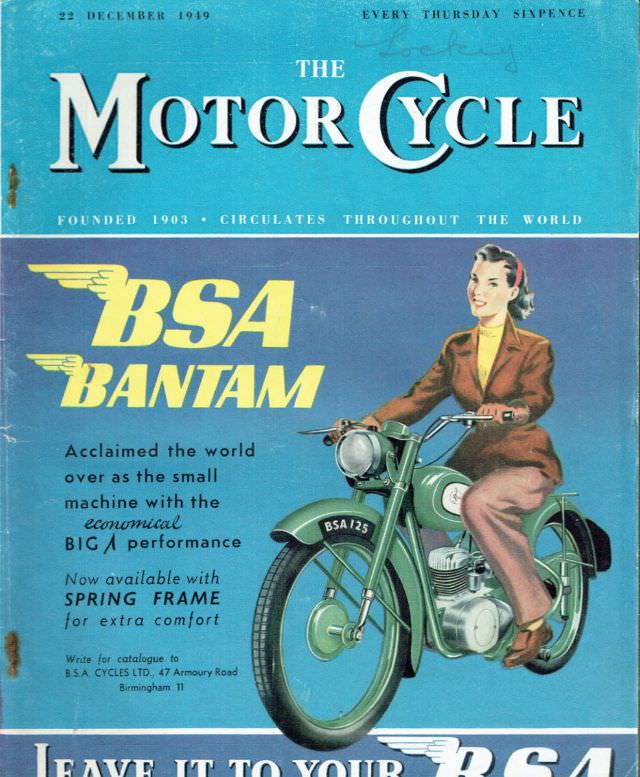
#5 The Motor Cycle magazine, December 22, 1949
Bold lettering across a bright blue field announces **The Motor Cycle** with the issue date printed at the top: **22 December 1949**, priced at **sixpence** and billed as appearing **every Thursday**. The cover carries that confident mid-century promise—“founded 1903” and “circulates throughout the world”—positioning the magazine as both an authority and a companion for riders…
-
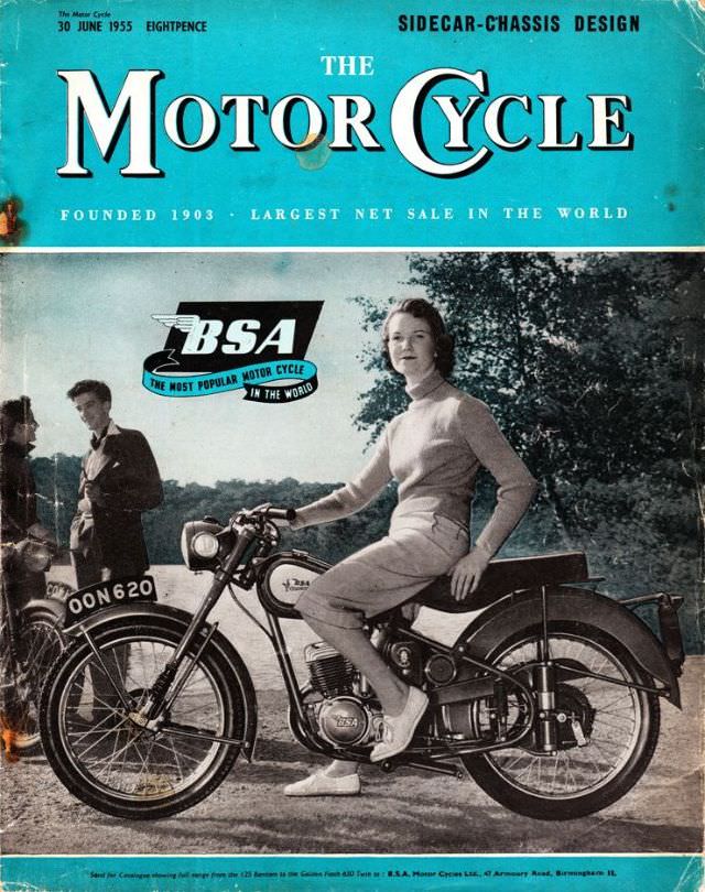
#21 The Motor Cycle magazine, June 30, 1955
June 30, 1955, arrives on the cover of *The Motor Cycle* in bold turquoise and cream, a design that instantly signals mid-century confidence and modernity. The masthead proclaims the magazine’s long pedigree—“Founded 1903”—while the cover line “Sidecar-Chassis Design” hints at the practical engineering focus inside. Even the small price mark (“Eightpence”) grounds it in the…
-
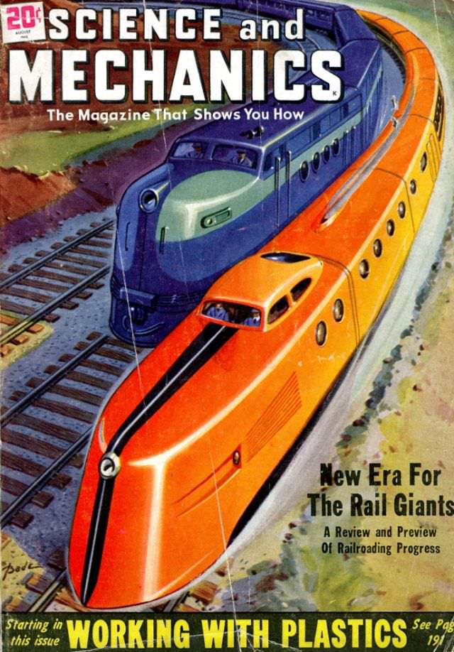
#2 Popular Mechanics magazine cover, August 1948
Bold color and streamlined motion dominate the Popular Mechanics magazine cover from August 1948, where two sleek locomotives—one in vivid orange and yellow, the other in cool blue-gray—lean into a curve of track. The masthead reads “Science and Mechanics,” paired with the promise, “The Magazine That Shows You How,” a slogan that neatly sums up…