Category: Cover Art
Dive into a gallery of vintage cover art from books, magazines, and albums. Discover how graphic design and illustration reflected the moods of their times.
These covers capture the essence of cultural evolution — from bold propaganda to elegant minimalism.
-
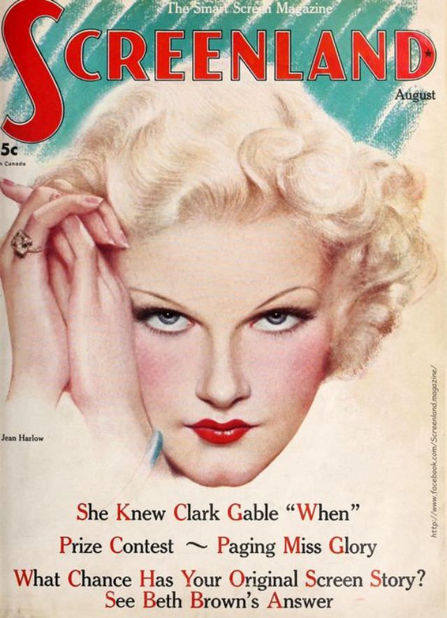
#23 Screenland magazine cover, August 1935
Bold, lacquer-red lettering spells “SCREENLAND” across the top of this August 1935 cover, a punchy masthead set against a cool, painterly turquoise backdrop. Centered beneath it is a glamorous studio-portrait illustration of a platinum-blonde star with sculpted waves, arched brows, and a direct, icy gaze, her clasped hands and prominent ring posed like a carefully…
-

#4 The Ugly Truth About Yugoslavian Album Art in the 1970s and 1980s #4 Cover Art
A close-cropped portrait dominates the sleeve, pushing the singer’s face and heavy sideburns right up to the edge as if the designer feared any empty space. The background is a flat, bright blue that makes the skin tones feel even starker, while the serious gaze and stiff pose lean into that unmistakable “studio promo” mood.…
-

#20 The Ugly Truth About Yugoslavian Album Art in the 1970s and 1980s #20 Cover Art
Neon-blue backdrops and blunt, billboard typography set the tone for a corner of Yugoslav pop culture where design choices often felt louder than the music itself. On this cover, a lineup of band members stands posed like a promotional poster, while an oversized eagle stretches across the top in a symbolic flourish that reads as…
-

#36 The Ugly Truth About Yugoslavian Album Art in the 1970s and 1980s #36 Cover Art
Red lettering splashes across the top like a warning, framing a close, confrontational portrait that refuses to be merely decorative. The man’s stern gaze, thick facial hair, and exaggerated curly hairstyle dominate the composition, while the blurred outdoor background and the hard crop push every ounce of attention back onto attitude. Even without context, the…
-
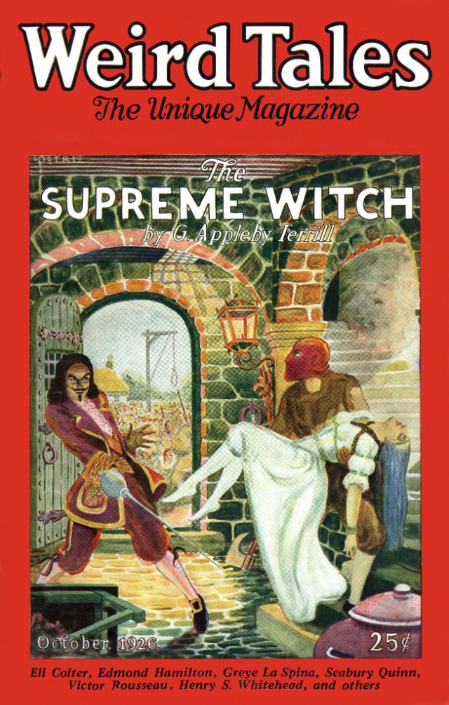
#12 Weird Tales cover, October 1926
Bold red lettering announces *Weird Tales* as “The Unique Magazine,” and the October 1926 cover wastes no time plunging into danger. Beneath the masthead, the featured story title “The Supreme Witch” stands out against a shadowy stone-arched setting where a cloaked figure seems to recoil mid-spell, hands flung wide in alarm. The scene is staged…
-
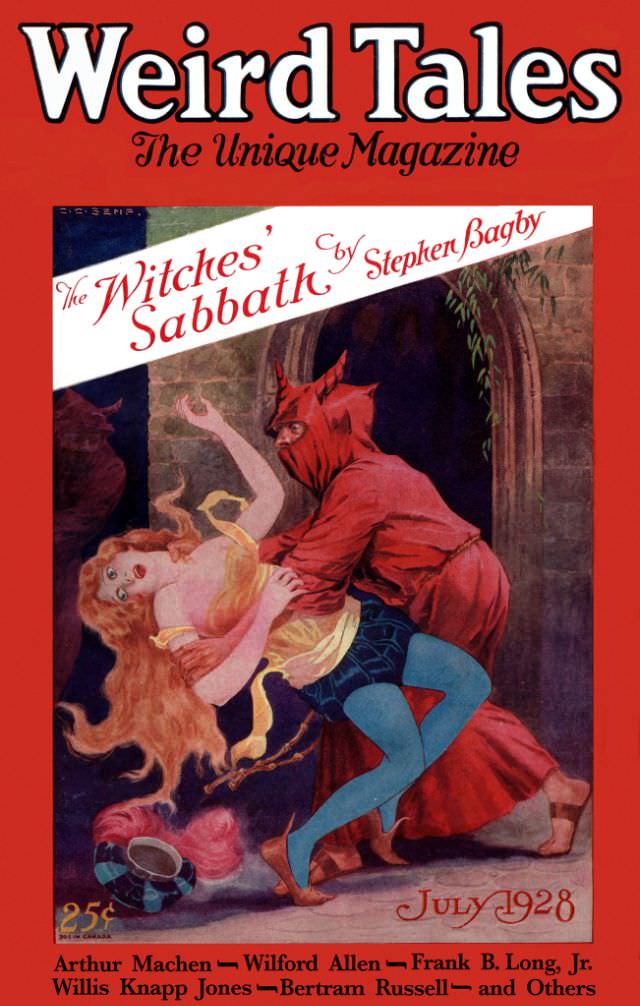
#28 Weird Tales cover, July 1928
Bold red borders and towering white lettering announce *Weird Tales* as “The Unique Magazine,” and the July 1928 issue wastes no time plunging the reader into melodrama. A slashing diagonal banner promotes “The Witches’ Sabbath” by Stephen Bagby, an eye-catching bit of typography that feels like a poster pasted across the scene. Even the small…
-
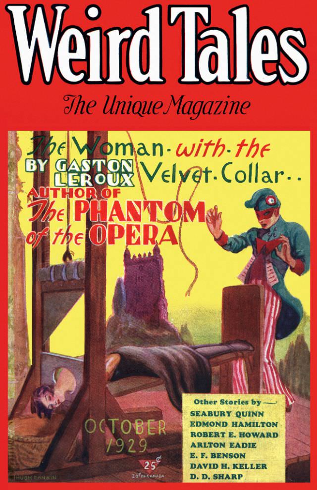
#44 Weird Tales cover, October 1929
Bold typography and lurid color announce an October 1929 issue of *Weird Tales*, the pulp magazine that helped define American weird fiction and horror. The masthead crowns the page in dramatic lettering, while the tagline “The Unique Magazine” promises readers something outside the ordinary, a key selling point in a crowded newsstand era. Even at…
-

#2 Gun Crazy (1950).
Bold, tabloid-style lettering splashes “GUN CRAZY” across the center of this 1950 cover art, surrounding a glamorous blonde figure posed with a handgun and a trail of smoke curling upward like a warning. The layout leans into mid-century suspense: a confident stance, bright color blocks, and a spotlighted silhouette that turns the heroine into both…
-

#18 Satan in High Heels (1962).
Loud typography and stark contrast set the tone for *Satan in High Heels (1962)*, a piece of cover art that leans hard into the era’s appetite for provocation. A towering, lingerie-clad figure dominates the composition, rendered in bold black-and-white while blocks of red and orange isolate male faces like lurid snapshots. The jagged title lettering…
-
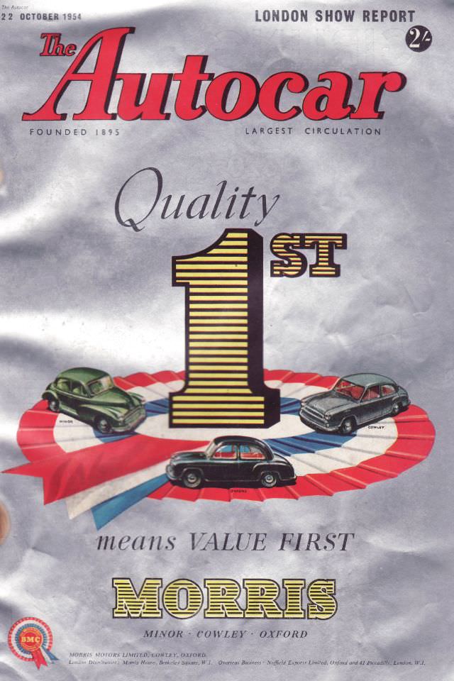
#14 The Autocar magazine cover, October 22, 1954
Bold red lettering announces *The Autocar* while the top line flags a “London Show Report,” setting the tone for an issue steeped in mid-century motoring excitement. The cover is dated 22 October 1954, with the magazine’s long pedigree hinted at by the small “Founded 1895” note, a reminder that this was already an established authority…