Category: Cover Art
Dive into a gallery of vintage cover art from books, magazines, and albums. Discover how graphic design and illustration reflected the moods of their times.
These covers capture the essence of cultural evolution — from bold propaganda to elegant minimalism.
-
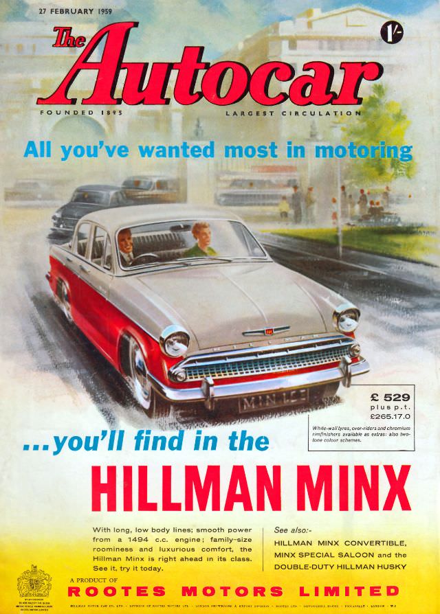
#30 The Autocar magazine cover, February 27, 1959
Bold red lettering spells out “The Autocar” above the cover date, 27 February 1959, setting an unmistakably late‑1950s tone. The illustration leans into optimistic motoring modernity, with a bright slogan promising “All you’ve wanted most in motoring” and a scene that feels like a busy suburban approach road, softened into painterly color.
-
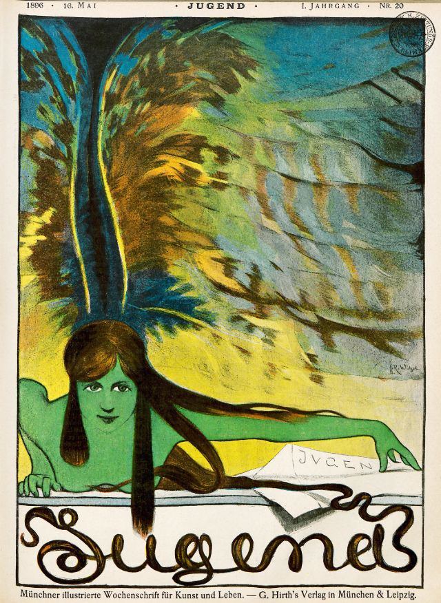
#9 Jugend, May 1896
A rush of blue and gold sweeps across the cover of *Jugend*, May 1896, where a stylized young woman leans forward as if emerging from the page itself. Her long dark hair trails across the design and into the ornate lettering below, while a plume-like flourish behind her head turns the background into something between…
-
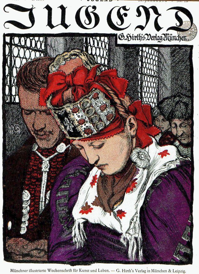
#25 Jugend, 1899
Bold Gothic lettering spells out “Jugend” across the top, framing a richly colored cover design that immediately signals late‑19th‑century German graphic art. At center, a young woman lowers her gaze, her braided hair and elaborate headdress tied with vivid red ribbons, while a deep purple garment and a white shawl patterned with small red motifs…
-
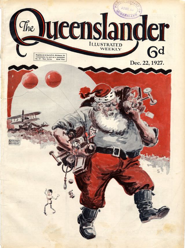
#5 Illustrated front cover from The Queenslander, December 22, 1927
Bold lettering and crisp layout announce *The Queenslander* as an “Illustrated Weekly,” priced at 6d, with the issue date clearly printed as Dec. 22, 1927. The cover design balances a formal masthead with a lively field of colour, making it instantly readable as a late-1920s magazine front page. Even the library stamp at the top…
-
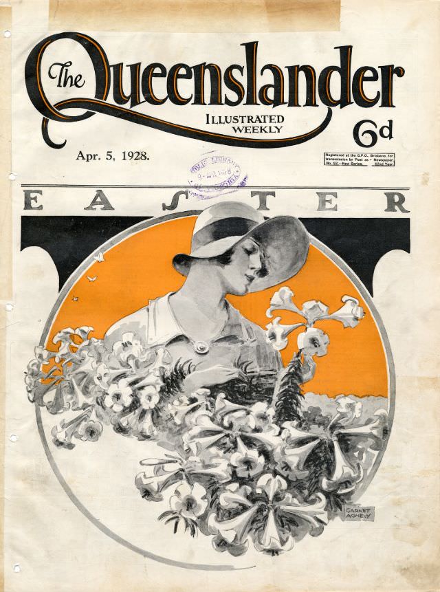
#21 Illustrated front cover from The Queenslander, April 5, 1928
Bold lettering crowns the page with “The Queenslander” and “Illustrated Weekly,” immediately placing the reader in the magazine culture of early twentieth-century Australia. Dated April 5, 1928, and marked with a price of “6d,” the front cover balances confident typography with generous white space, leaving room for the artwork to dominate. Even the faint handling…
-
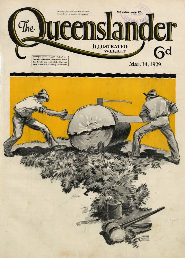
#37 Illustrated front cover from The Queenslander, March 14, 1929
Bold lettering for “The Queenslander” crowns this illustrated weekly cover dated Mar. 14, 1929, with a clean, magazine-stand confidence typical of late-1920s print design. A warm ochre panel draws the eye to a rural work scene beneath the masthead, while small notices and the price mark the publication as both practical reading and a collectible…
-
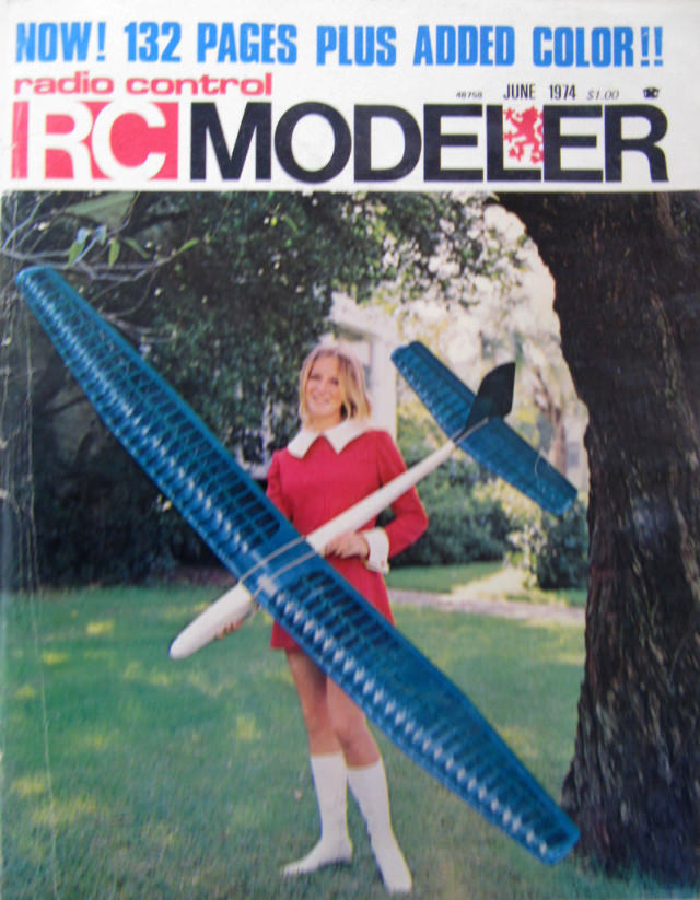
#13 Sensual Cover Photos of Radio Control Modeler Magazines that featured beautiful women from the 1970s and 1980s
Bright headline type shouts “NOW! 132 PAGES PLUS ADDED COLOR!!” across the top of a Radio Control RC Modeler cover, setting the tone for a hobby magazine eager to look modern and mainstream. The masthead dominates in bold blocks of red and black, while smaller cover text notes “June 1974” and a price of “$1.00,”…
-

#29 Sensual Cover Photos of Radio Control Modeler Magazines that featured beautiful women from the 1970s and 1980s
Bold “RCM” lettering and a glossy studio-blue backdrop set the tone on this Radio Control Modeler cover, where hobby engineering meets pin-up-era presentation. A smiling model in an off-the-shoulder red dress poses behind a large radio-controlled biplane finished in patriotic red, white, and blue striping, turning the aircraft into both centerpiece and prop. The masthead…
-
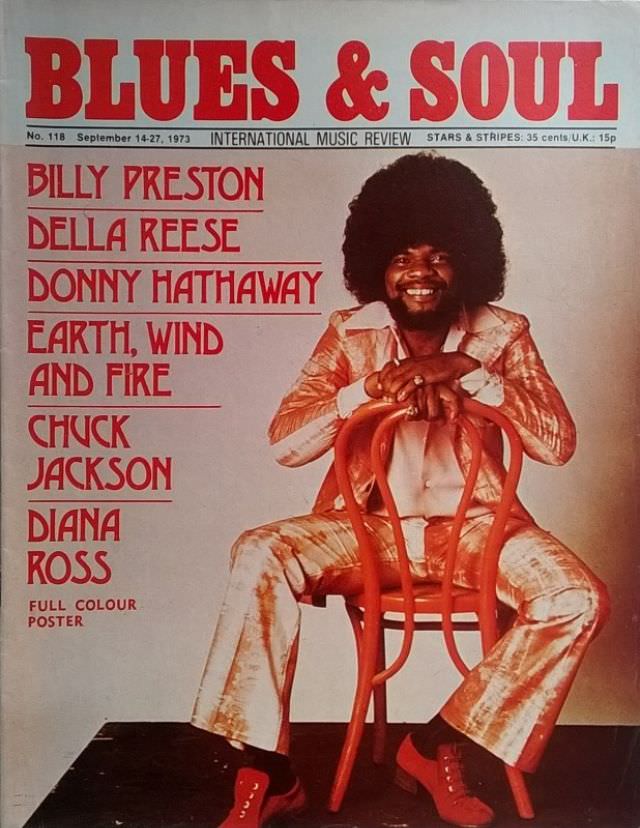
#15 Billy Preston, September 14-27, 1973
Bold red masthead lettering announces *Blues & Soul* as an “International Music Review,” and the issue is clearly marked September 14–27, 1973. Center stage on the cover, Billy Preston beams with an easy confidence, perched backward on a bentwood-style chair in a patterned suit and bright shoes that pop against the clean studio backdrop. The…
-
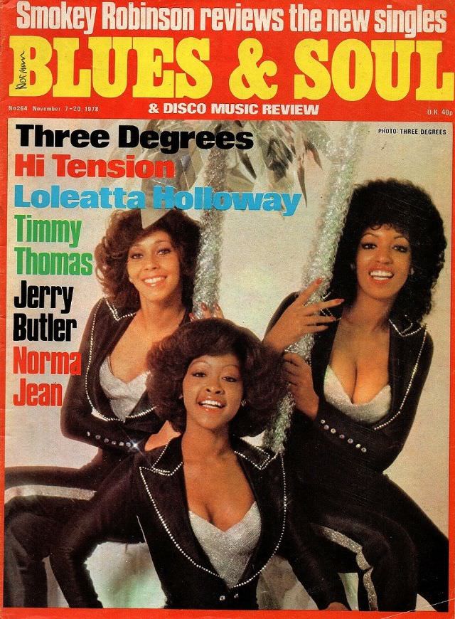
#31 The Three Degrees, November 7-20, 1978
Bold, oversized lettering for “BLUES & SOUL” towers over a glossy cover that instantly places you in the late-1970s marketplace where music journalism, fashion, and nightlife sold the same promise. The issue dated November 7–20, 1978 frames the era’s energy with a mix of bright color blocks, punchy typography, and the confident editorial claim that…