Category: Cover Art
Dive into a gallery of vintage cover art from books, magazines, and albums. Discover how graphic design and illustration reflected the moods of their times.
These covers capture the essence of cultural evolution — from bold propaganda to elegant minimalism.
-

#7 The World of Spanish and Italian Crime Comics (Fotonovelas) from the 1960s-70s: Stories Told with Sensational Photogr
Bold color and even bolder type scream off these Italian fotonovela covers, where “Le avventure di DON ARCHER” promises danger before a page is turned. The titles—“La morte ebbra” and “Spie della morte”—lean into the pulp tradition of crime, espionage, and fatal romance, using oversized lettering and high-contrast design to sell urgency. Everything here is…
-
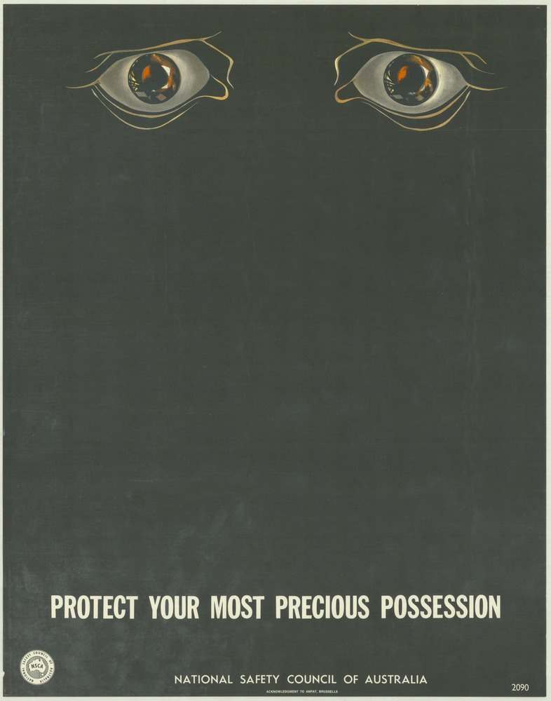
#11 National Safety Council of Australia Posters from the 1970s: Visual Messages for Keeping People Safe and Well
Two watchful eyes float near the top of a dark, minimalist field, their glossy highlights pulling you in before you even reach the message below. That stark emptiness is the point: it creates a pause, a moment of unease, and then delivers the blunt command in bold type—“PROTECT YOUR MOST PRECIOUS POSSESSION”—as if the poster…
-
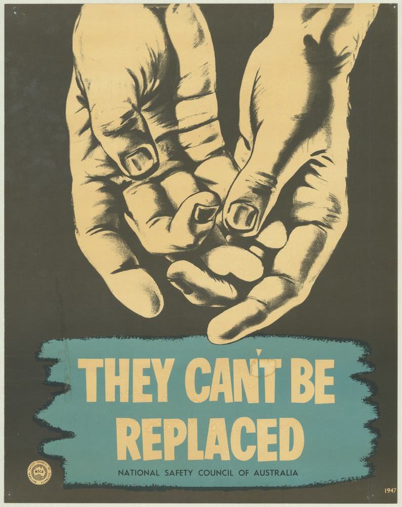
#27 National Safety Council of Australia Posters from the 1970s: Visual Messages for Keeping People Safe and Well
Dominating the cover art is a stark illustration of two hands, rendered in high-contrast tones that feel both intimate and urgent. Below them, the bold warning “THEY CAN’T BE REPLACED” lands like a headline you can’t ignore, set against a teal block that makes the message pop. The small line crediting the National Safety Council…
-
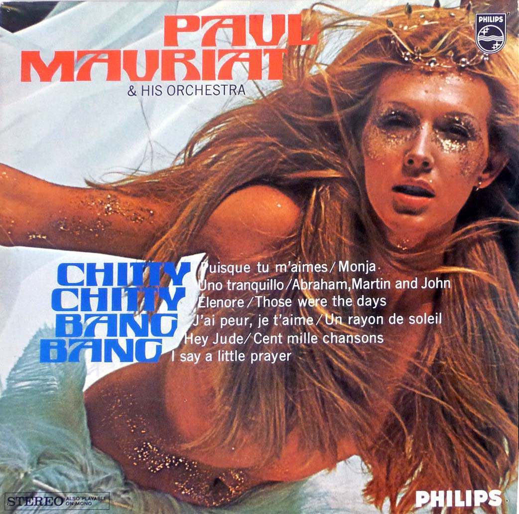
#12 The Unusual and Unconventional Album Cover Designs From the 1960s and 1970s #12 Cover Art
A rush of glitter, windblown hair, and bold typography sets the tone for this striking piece of 1960s–1970s-era album cover art, where pop spectacle and graphic design collide. The name “Paul Mauriat & His Orchestra” crowns the sleeve in chunky red lettering, while the title “Chitty Chitty Bang Bang” anchors the composition in cool blue—an…
-
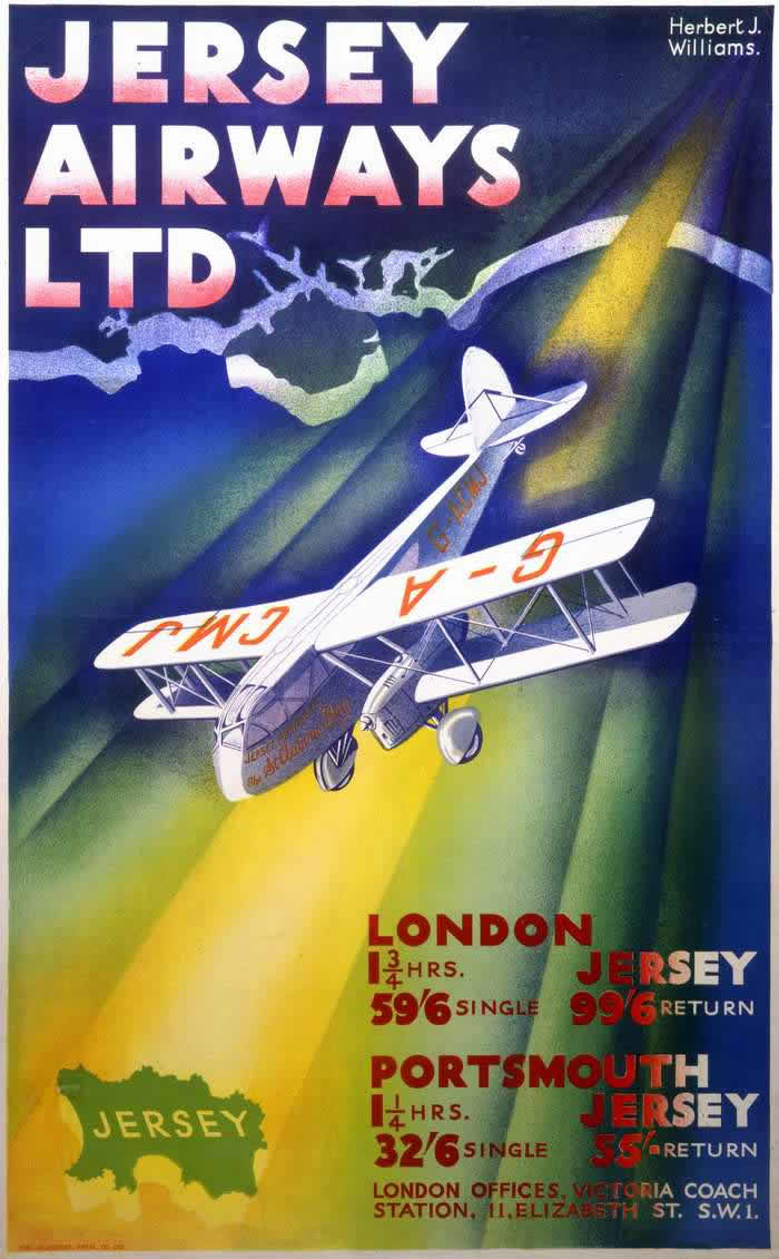
#14 Advertising the Skies: A Look at Imperial Airways Posters Promoting Early Air Travel in the 1920s and 1930s #1
Bold lettering and saturated color announce “Jersey Airways Ltd,” turning the act of booking a flight into something modern, legible, and thrilling. A stylized map outline of Jersey hovers against deep blues and greens, while a small aircraft banks across the composition under a dramatic beam of light. The designer credit, “Herbert J. Williams,” tucked…
-
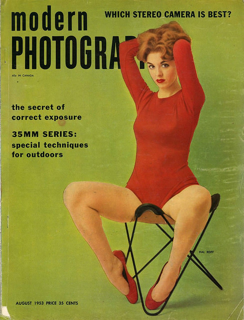
#7 A Look Back at Vintage Modern Photography Magazine Covers from the 1950s and 1960s #7 Cover Art
Modern Photography splashes across a bold green field, the kind of confident typography that once promised readers the newest tricks and tools in camera culture. Cover lines tease practical know-how—“the secret of correct exposure,” “35mm series,” and “special techniques for outdoors”—while a headline asks, “Which stereo camera is best?” At the bottom, “August 1953” and…
-
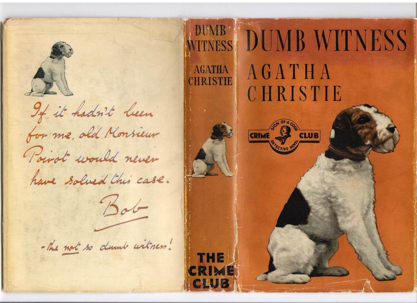
#3 Dumb Witness, first UK edition, 1937
Warm orange boards and a watchful little dog set the tone on the cover of **Dumb Witness**, the first UK edition from 1937. The design is boldly typographic—“DUMB WITNESS” and “AGATHA CHRISTIE” in stark black—balanced by the seated terrier that hints at clues, loyalty, and misdirection. A “Crime Club” emblem sits proudly at centre, anchoring…
-
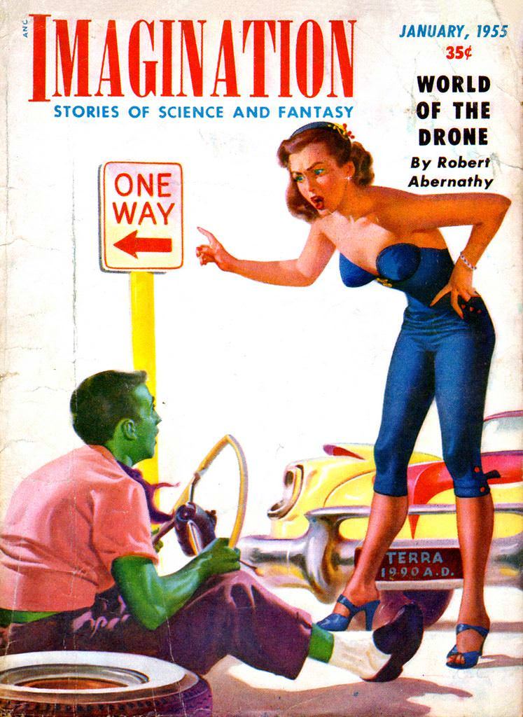
#8 Imagination, 1955
Bold lettering at the top announces *Imagination: Stories of Science and Fantasy*, and the cover immediately stages a slice of mid-century pulp drama: a “ONE WAY” street sign, a startled woman in blue, and a green-skinned man sitting low with a steering wheel in hand. The palette is loud and clean—reds, yellows, and cobalt—leaning into…
-
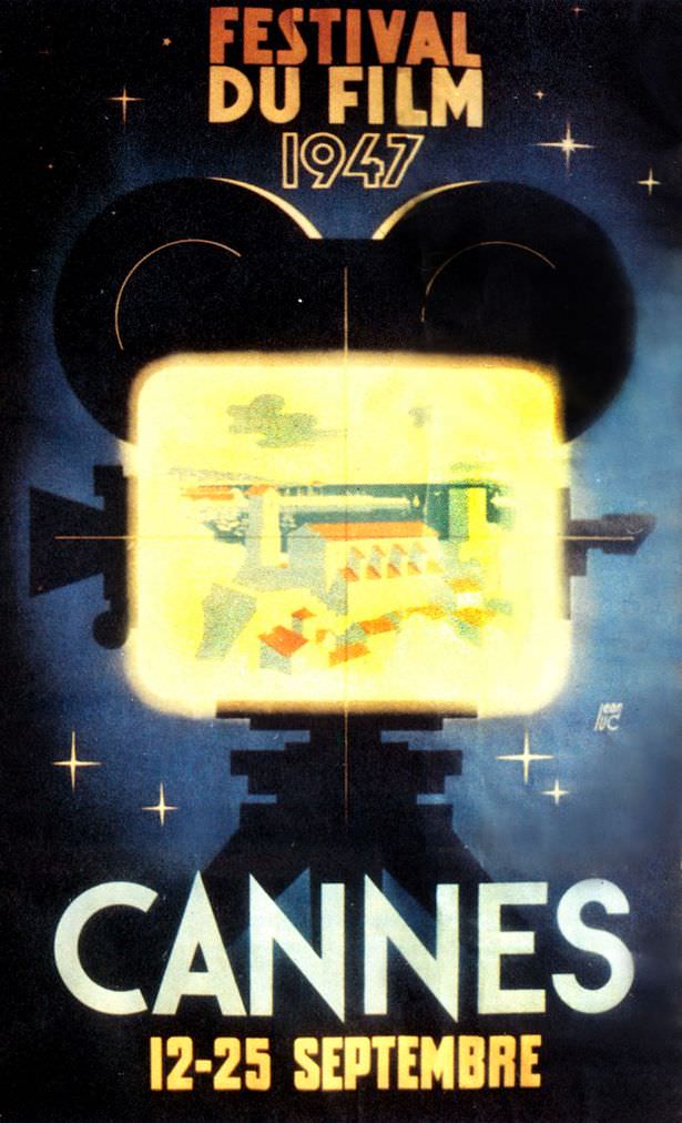
#4 1947: Films were still nominated for awards by their respective countries which basically meant everyone won something. Organisers didn’t want to upset anybody so everyone left happy.
Bold lettering announces “Festival du Film 1947” above a stylized camera silhouette, its glowing screen spilling light across a deep, star-speckled background. The design leans into mid-century optimism: a night-sky palette, crisp typography, and a sense that cinema itself is a kind of beacon. At the bottom, “CANNES” dominates the poster, with “12–25 Septembre” grounding…
-

#20 1968: This poster is more excited about the fact it’s the 21st anniversary than that it’s about films.
Bold typography and swirling ribbon-like shapes turn this cover art into a celebration of a number as much as a celebration of cinema. The oversized “21e” dominates the composition, curling across the page in warm reds and yellows, while the festival title sits below in dense black lettering. Even at a glance, the design feels…