Category: Cover Art
Dive into a gallery of vintage cover art from books, magazines, and albums. Discover how graphic design and illustration reflected the moods of their times.
These covers capture the essence of cultural evolution — from bold propaganda to elegant minimalism.
-
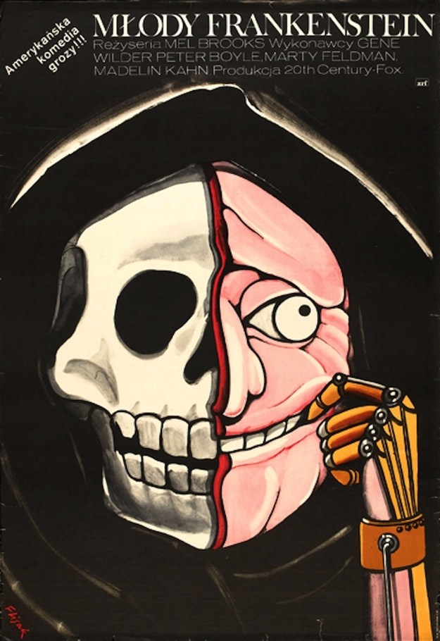
#12 Young Frankenstein. Artist: Jerzy Flisak. Year: 1979
A stark, theatrical face fills the frame on Jerzy Flisak’s 1979 cover art for “Young Frankenstein,” rendered with the punchy contrasts and sly wit that suit a horror-comedy classic. The design splits a grinning visage down the middle: one side a skull-like mask of death, the other a fleshy, wide-eyed caricature edged by a sharp…
-
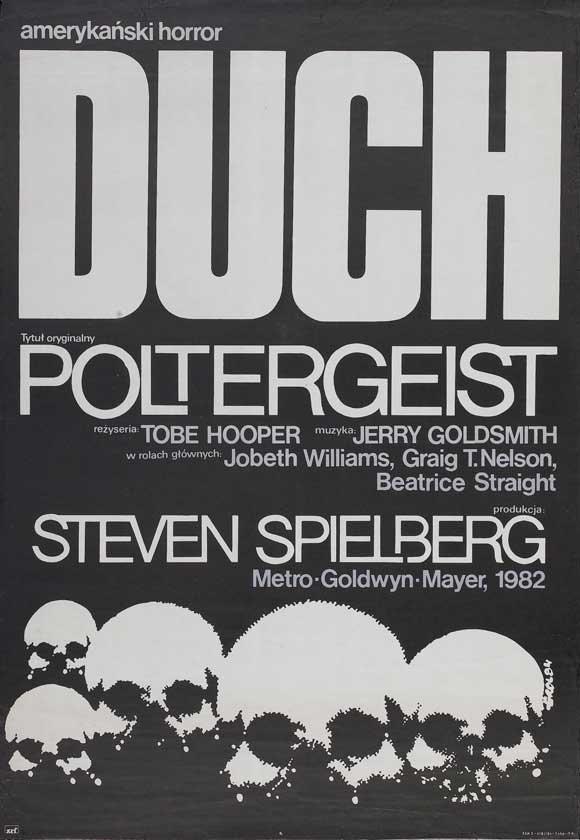
#28 Poltergeist. Artist: Jakub Erol. Year: 1984
Bold typography dominates Jakub Erol’s 1984 cover art for “Poltergeist,” turning the word “DUCH” into a looming slab of white against deep black. The design announces itself as “amerikánski horror,” while the original title appears beneath, creating an immediate bridge between languages and audiences. Even before any imagery takes hold, the stark contrast and oversized…
-
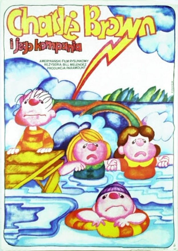
#44 Race for Your Life, Charlie Brown. Artist: Hanna Bodnar. Year: 1978
Bold, candy-colored lettering crowns Hanna Bodnar’s 1978 cover art for “Race for Your Life, Charlie Brown,” immediately setting a playful tone even as trouble brews below. Billowy blue clouds fill the upper half, split by a jagged lightning bolt that cuts diagonally through the sky. The title’s exuberant typography contrasts with the scene’s uneasy weather,…
-

#15 Around the World in Posters: A Look at Vintage Travel Advertising #15 Cover Art
Bold letters spelling “GRECE” crown a sunlit harbor scene, instantly placing the viewer in the dreamy world of vintage travel advertising. Below the title, the artwork opens onto a sweeping bay filled with sailboats and small craft, their masts rising like a forest against deep blue water. Onshore, pale buildings step along the hillside, while…
-
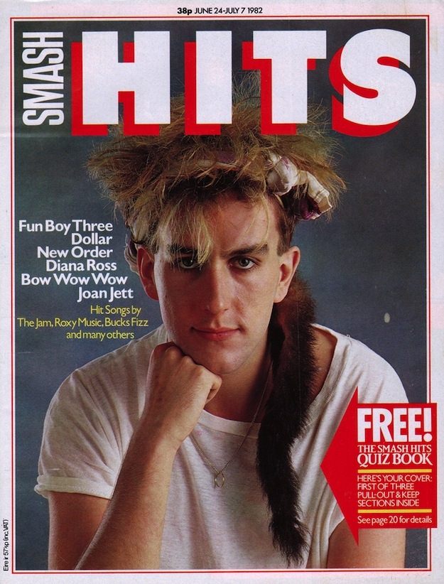
#4 Inside Smash Hits: The Iconic Magazine Covers of the 1980s #4 Cover Art
Bold, blocky lettering shouts “SMASH HITS” across the top of this classic 1980s magazine cover, framed by a crisp border and anchored by a close-up portrait that feels both intimate and deliberately posed. The styling—tousled hair, a simple T‑shirt, and a strong, direct gaze—signals the era’s pop press knack for turning a single face into…
-
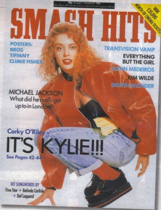
#20 Inside Smash Hits: The Iconic Magazine Covers of the 1980s #20 Cover Art
Bold block lettering shouts “SMASH HITS” across the top of this 1980s cover, setting the tone for a decade when pop culture felt loud, glossy, and immediate. At the center, Kylie is posed low to the ground in a red jacket, black top, light denim, and chunky boots—styling that reads as equal parts streetwise and…
-

#2 The Canadian architect – December 1964
December 1964 arrives in bold, graphic form on the cover of *The Canadian Architect*, where a stark monochrome palette turns texture into terrain. A sweeping, fan-like burst dominates the upper field, its radiating lines suggesting movement and structure at once. Across the lower half, repeating zigzag bands stack into angular masses, like stylized rooftops or…
-
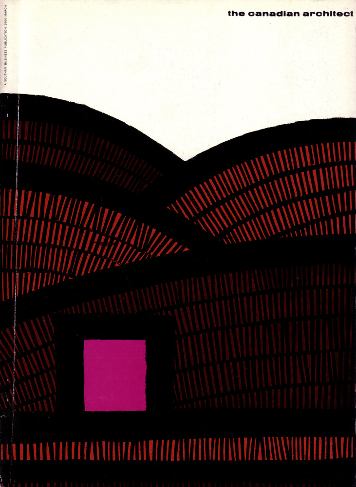
#18 The Canadian architect – March 1966
Bold typography and spare space set the tone on the March 1966 cover of *The Canadian Architect*, where the title sits quietly at the top and lets the artwork do the talking. Sweeping black arcs span the page like overlapping vaults or ribs, while a field of fine red marks suggests structure, rhythm, and repetition—an…
-
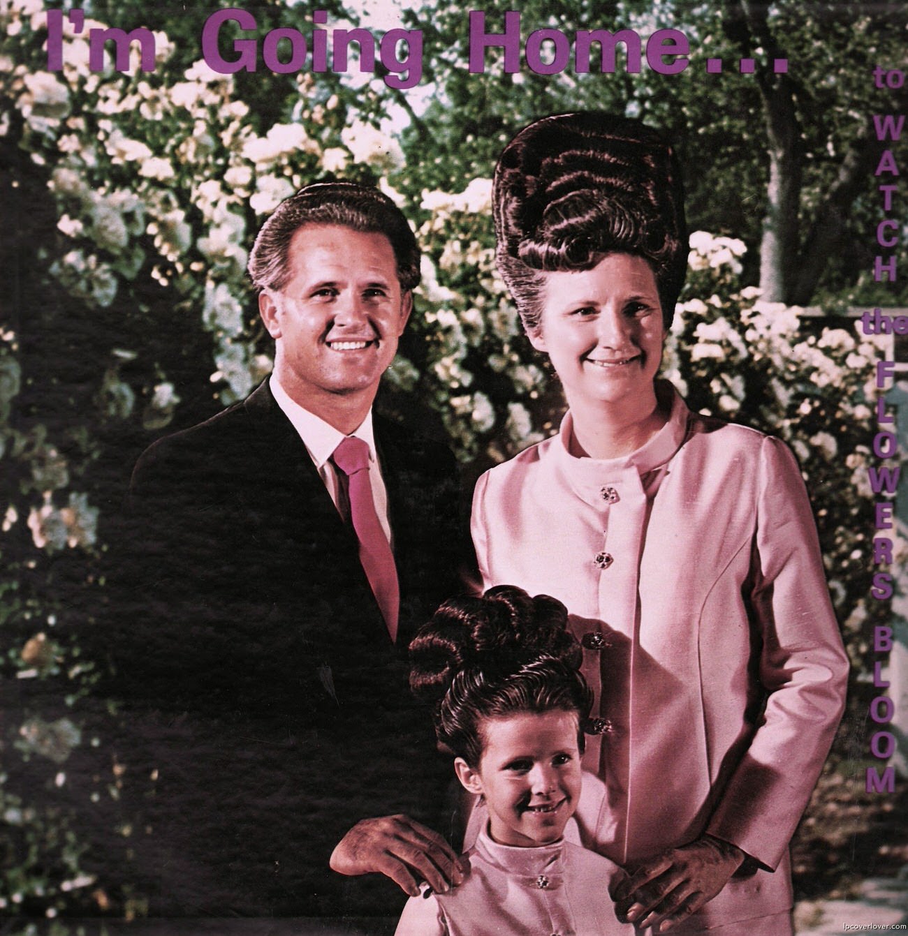
#7 So Bad, They’re Good: Vintage Album Covers That Will Make You Laugh #7 Cover Art
Purple lettering declares “I’m Going Home…” across the top, setting an earnest tone that the portrait beneath immediately undercuts in the best way. A neatly dressed couple stands outdoors in front of leafy trees, smiling with the practiced confidence of classic studio publicity shots—except the styling pushes the moment into comedy. The man’s dark suit…
-

#23 So Bad, They’re Good: Vintage Album Covers That Will Make You Laugh #23 Cover Art
Orange dominates the sleeve like a stage light, leaving plenty of room for the punchline: oversized lime-green lettering declaring “she had a taste for music.” Off to the right, a posed figure in a short black dress leans into the frame with hands behind the head, a classic promotional stance that feels half glamorous, half…