Category: Cover Art
Dive into a gallery of vintage cover art from books, magazines, and albums. Discover how graphic design and illustration reflected the moods of their times.
These covers capture the essence of cultural evolution — from bold propaganda to elegant minimalism.
-
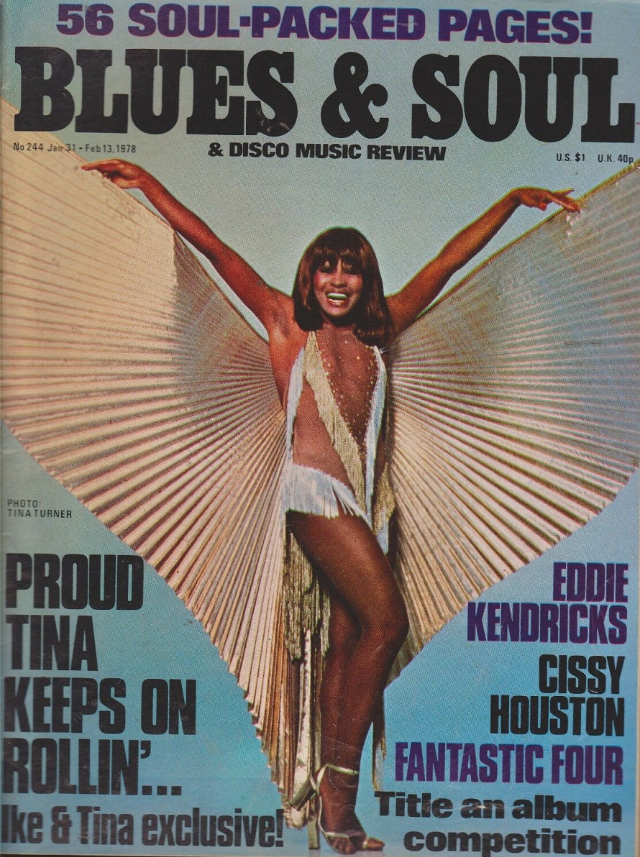
#32 Tina Turner, January 31-February 13, 1978
Electric and unapologetic, the cover of *Blues & Soul* (Jan 31–Feb 13, 1978) puts Tina Turner front and center in full performance mode, arms thrown wide like a spotlight cue. Draped in a glittering stage outfit and framed by pleated, wing-like fabric, she’s presented not as a guest in the magazine but as its headline…
-
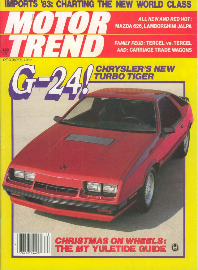
#11 Motor Trend, December 1982
December 1982 arrives in loud color on this Motor Trend cover, where a red Chrysler’s new “Turbo Tiger” takes center stage under the bold G-24! headline. The magazine’s unmistakable masthead sits against a bright yellow field, a classic early-’80s design choice that makes the typography feel as energetic as the car itself. With its sharp…
-

#27 Motor Trend, October 1984
Bold typography and bigger-than-life promises spill across the October 1984 cover of Motor Trend, a snapshot of how mid-1980s car culture sold speed, technology, and optimism in one glossy package. The banner “USA ’85: ALL THE NEW CARS” frames the issue as a forward-looking guide, while the main tease—“F-FASTER FANTASIES”—signals that performance was the story…
-
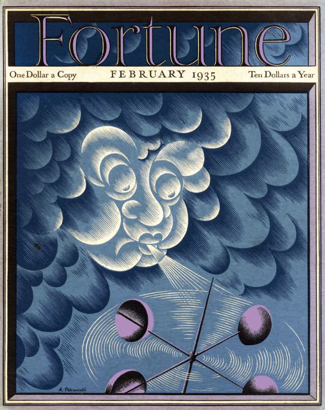
#16 Cover of Fortune Magazine, February 1935
Fortune’s February 1935 cover leans into allegory rather than reportage, greeting readers with a stylized face emerging from a roiling field of blue clouds. The magazine’s distinctive masthead crowns the composition, while the period pricing line—“One Dollar a Copy” and “Ten Dollars a Year”—anchors the artwork firmly in the early 1930s publishing world. Even at…
-
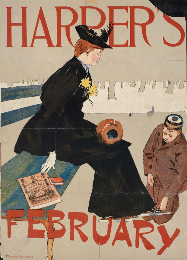
#10 A woman sits on a bench while a man puts ice skates on her shoes, Harper’s February, 1894
Harper’s fills the page in bold red letters, framing a winter moment poised between stillness and motion. A fashionable woman rests on a striped bench, her dark coat and feathered hat set off by a bright spray of yellow flowers, while a man crouches to fasten ice skates onto her shoes. The pale, open background…
-

#26 A woman holds two cats, Harper’s May, 1896
A poised young woman in an off-the-shoulder white gown stands against a muted gray field, her calm expression contrasting with the unruly charm of the two cats draped in her arms. One cat is a warm calico, the other a sleek black-and-white, each held upright so their long tails fall in elegant curves that echo…
-
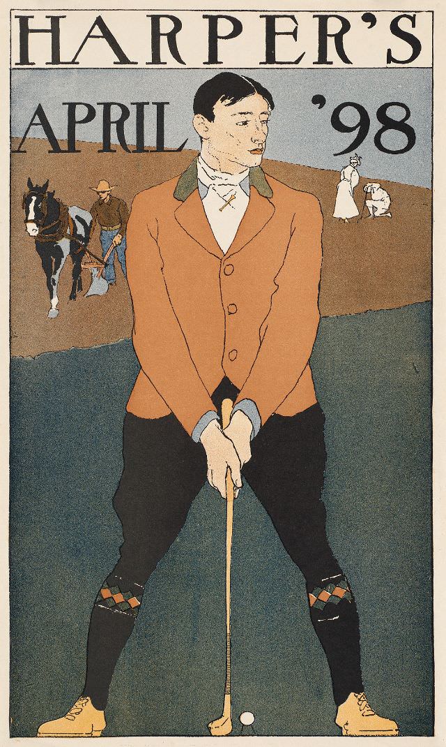
#42 A man stands ready to hit a golf ball, Harper’s April ’98, 1898
Harper’s April ’98 cover art places a golfer front and center, poised in a wide, deliberate stance as he sizes up the ball at his feet. The illustrator emphasizes fashion as much as sport: a tailored jacket, high collar, and eye-catching patterned socks lend a sense of leisure-class confidence, while the long club becomes a…
-

#13 4Science Fights Famine, Picture Post, May 18th, 1946
Bright, modern typography frames the May 18th, 1946 cover of *Picture Post*, where the bold promise “Science Fights Famine” meets the direct warmth of a smiling young woman in a broad-brimmed hat. Her casual, practical clothing and relaxed pose evoke work in the open air, while the close crop keeps attention on expression and texture…
-
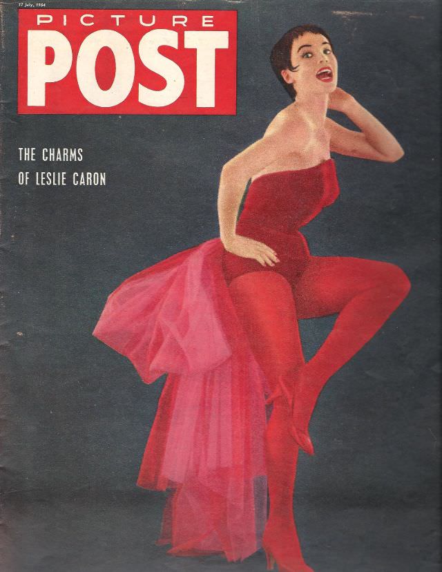
#29 Leslie Caron, Picture Post, July 17th, 1954
Bold typography and a dramatic sweep of red announce the July 17th, 1954 cover of Picture Post, where the headline promises “The Charms of Leslie Caron.” Against a dark, textured backdrop, the design leans into striking color contrast, letting the figure’s poised movement and vivid costume carry the eye across the page. The result feels…
-
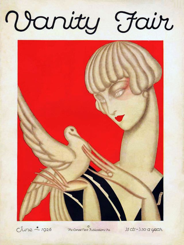
#10 Vanity Fair cover, June 1926
Vanity Fair’s June 1926 cover leans into bold simplicity: the magazine’s looping masthead floats above a vivid red field where a stylized figure turns in profile, lips painted a sharp scarlet. Her sculpted bob and elongated neck evoke the fashionable modernity of the 1920s, while the limited palette and smooth shading give the illustration an…