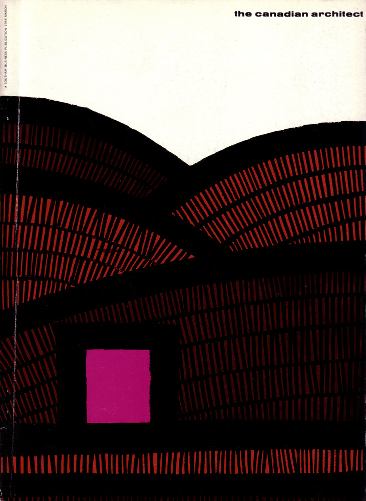
Bold typography and spare space set the tone on the March 1966 cover of *The Canadian Architect*, where the title sits quietly at the top and lets the artwork do the talking. Sweeping black arcs span the page like overlapping vaults or ribs, while a field of fine red marks suggests structure, rhythm, and repetition—an abstract nod to the language of modern architecture.
A single magenta square punctuates the lower portion of the composition, reading like a window, a portal, or a concentrated burst of color against the heavier forms. The contrast between the dense, patterned red-and-black sections and the calm white upper half creates a sense of scale and atmosphere, as if the viewer is looking up into a lofty interior or across a stylized landscape of built form.
Posted here as cover art for a historical design magazine, this image is a compact time capsule of 1960s graphic design in Canada—confident, minimal, and unmistakably modern. For readers interested in architectural history, Canadian modernism, and mid-century print culture, it offers a striking example of how professional journals used visual abstraction to frame the era’s ideas about space, structure, and progress.