Category: Cover Art
Dive into a gallery of vintage cover art from books, magazines, and albums. Discover how graphic design and illustration reflected the moods of their times.
These covers capture the essence of cultural evolution — from bold propaganda to elegant minimalism.
-
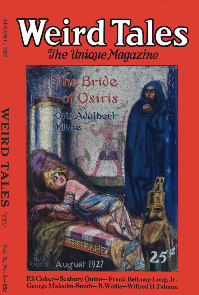
#14 Weird Tales cover, August 1927
Bold red borders and oversized lettering announce *Weird Tales* as “The Unique Magazine,” and the August 1927 issue wastes no time plunging into pulp-era menace. At the center, a richly painted scene evokes an ancient, ritualistic chamber: a jeweled woman reclines on a couch, while a hooded figure stands nearby, half concealed in shadow. The…
-
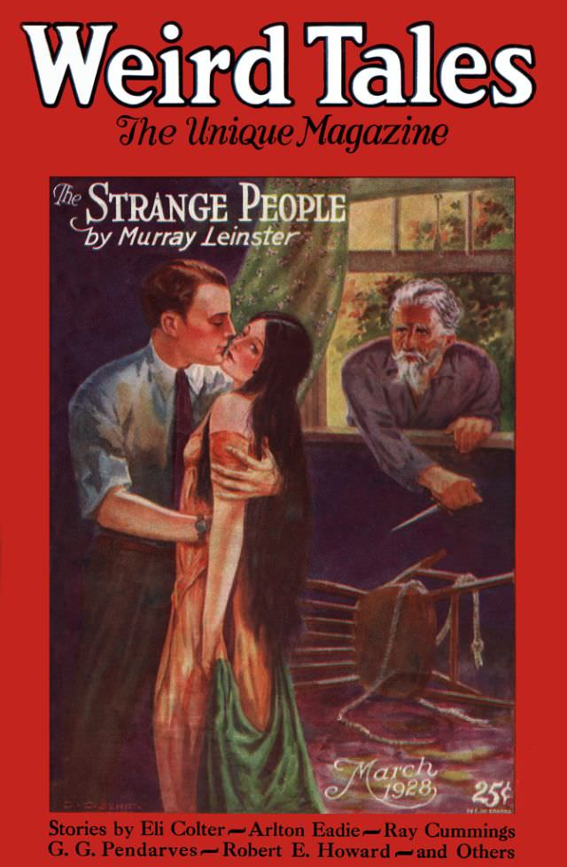
#30 Weird Tales cover, March 1928
Bold red lettering announces *Weird Tales* at the top, with the promise of “The Unique Magazine” framing a cover designed to stop passersby in their tracks. The March 1928 issue spotlights “The Strange People” by Murray Leinster, and the illustration immediately leans into pulp-era suspense: a couple locked in an intimate kiss, rendered with theatrical…
-
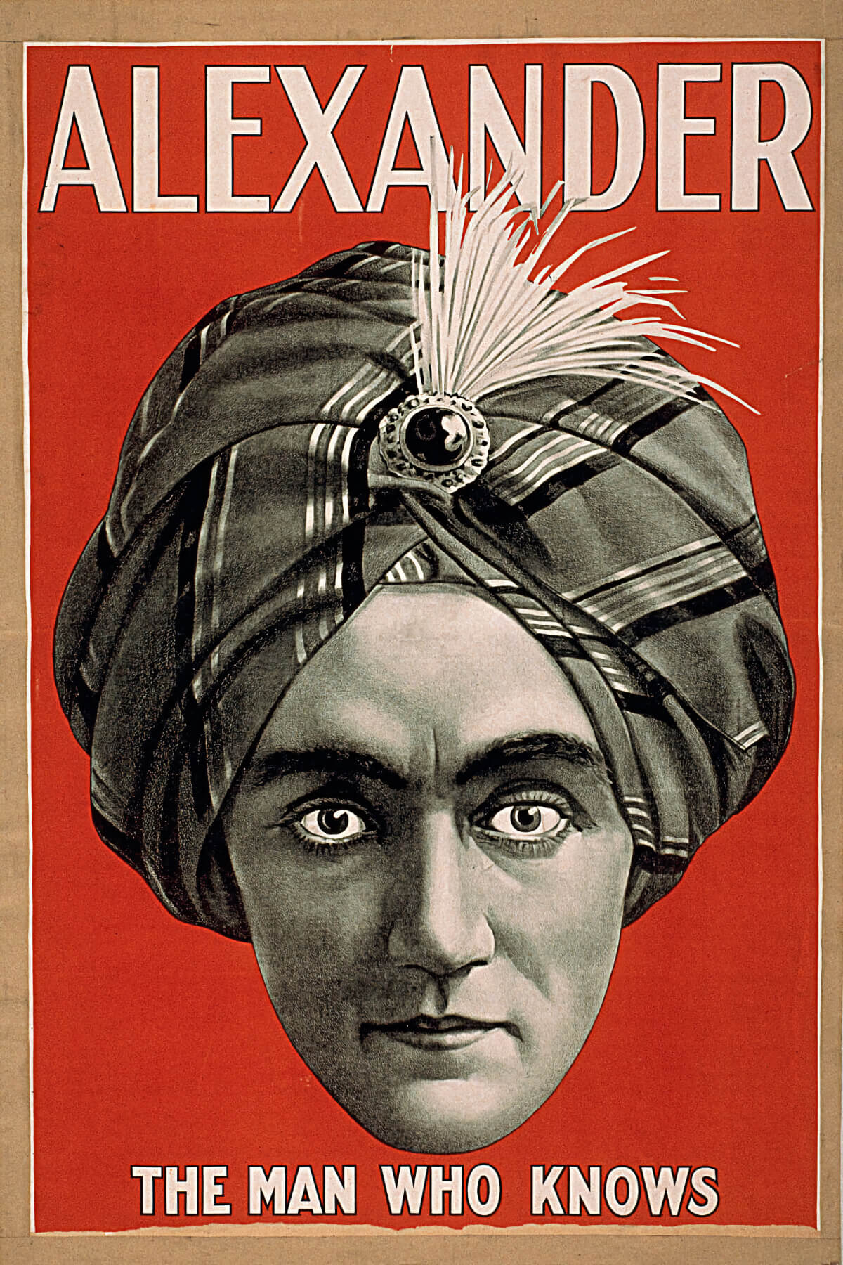
#1 Alexander the Man Who Knows II, Magician poster, 1915
Bold lettering shouts “ALEXANDER” across a fiery red field, immediately framing the stern, hypnotic gaze of a stage magician billed as “THE MAN WHO KNOWS.” The design relies on a single, commanding head-and-turban portrait, rendered with careful shading to make the face feel almost sculptural. A jeweled ornament and white plume at the turban’s center…
-
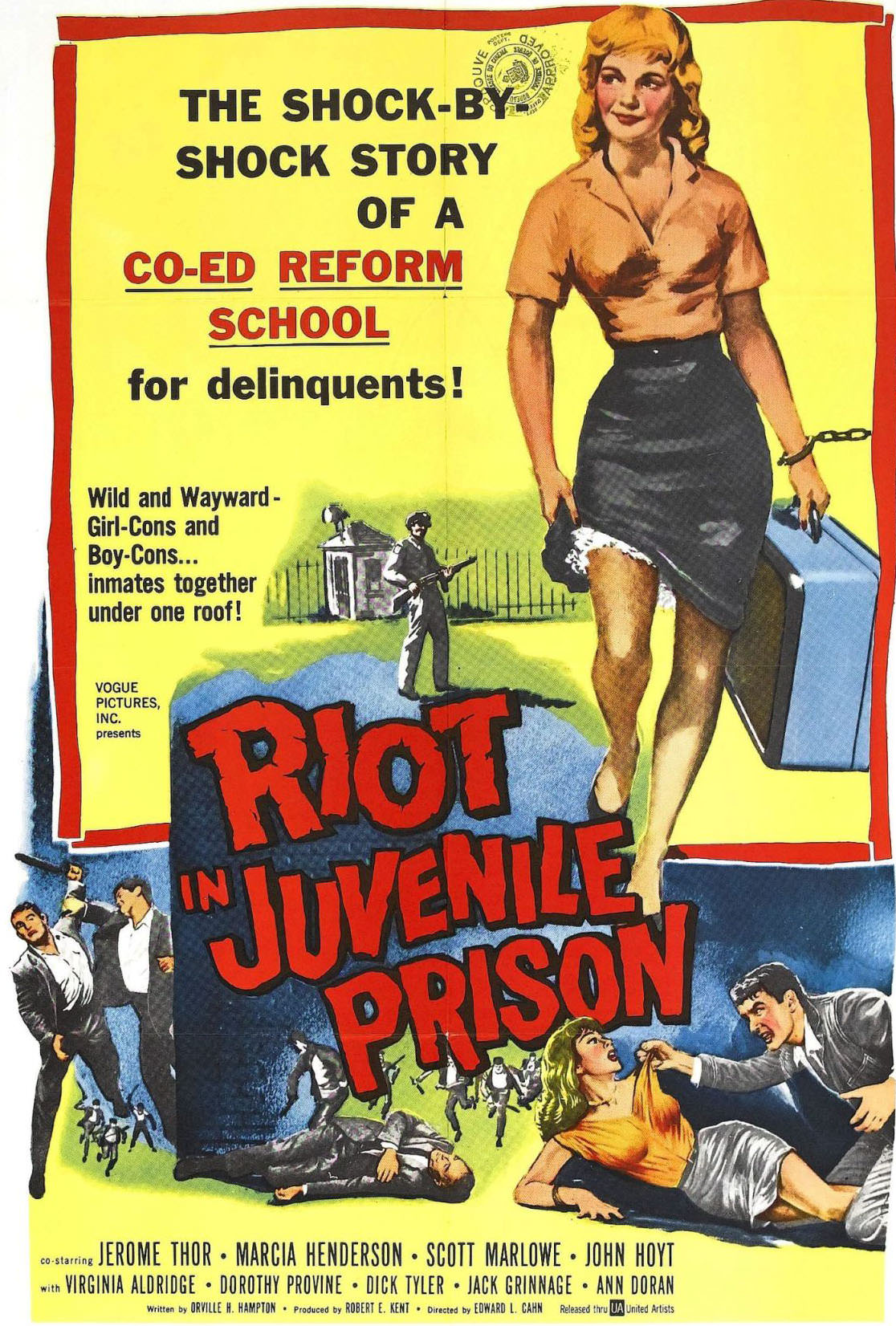
#4 Riot in Juvenile Prison (1959).
Pulp-era design and moral panic collide on this 1959 cover art for “Riot in Juvenile Prison,” where bold typography and lurid color blocks promise a “shock-by-shock” exposé of a co-ed reform school. The central figure—a stylized young woman in uniform, suitcase in hand and a chain at her wrist—signals the era’s fascination with institutional control,…
-
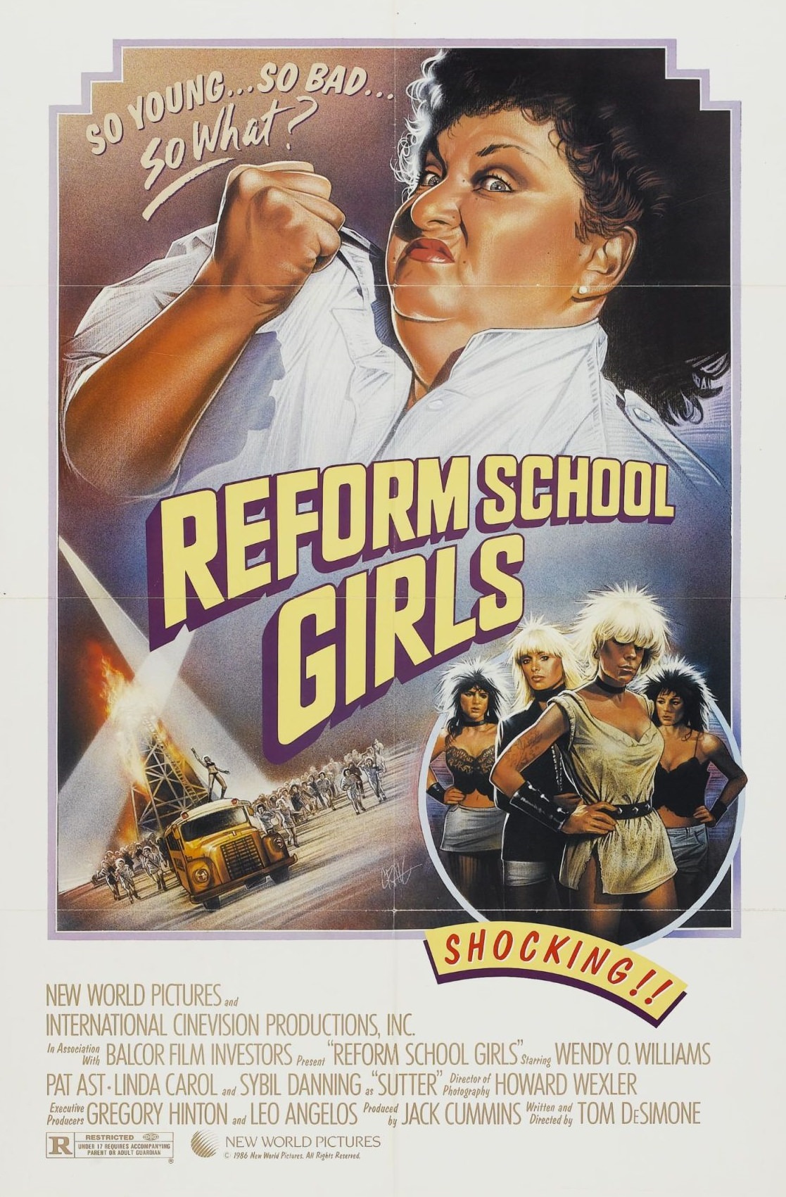
#20 Reform School Girls (1986).
A snarling authority figure dominates the artwork for “Reform School Girls (1986),” gripping a white uniform as if daring anyone to challenge the rules. Above her, the taunting tagline “So young… so bad… so what?” sets the tone, while the oversized, slanted title lettering charges across the center in loud, pulp-style color. Even before you…
-
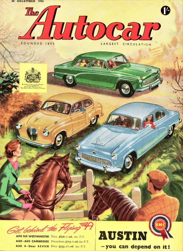
#16 The Autocar magazine cover, December 30, 1955
December 30, 1955 lands with a burst of mid-century optimism on the cover of *The Autocar*, where bold red lettering crowns a pastoral scene made newly modern by three glossy saloons. The artwork balances countryside calm—hedgerows, bare winter branches, and a soft, watercolor sky—with the confident presence of British cars presented as everyday luxuries. Even…
-
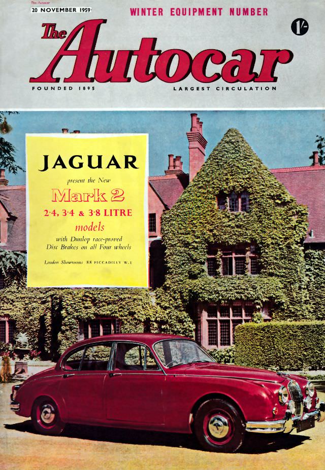
#32 The Autocar magazine cover, November 20, 1959
Bold crimson lettering crowns the November 20, 1959 cover of *The Autocar*, flagged as a “Winter Equipment Number” and priced at one shilling and sixpence. The design leans into confidence and clarity: a clean masthead, plenty of breathing space, and a full-colour scene that signals how mainstream motoring culture had become by the late 1950s.…
-
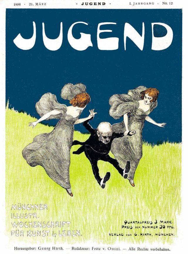
#11 Jugend, Nr. 12, March 21, 1896
Bold, hand-drawn lettering spells “JUGEND” across a deep, twilight-blue sky, instantly setting a modern, poster-like tone for the magazine’s cover art. The top margin reads “1896 • 21. März” and “I. Jahrgang • Nr. 12,” anchoring the piece to its issue information while keeping the composition airy and striking. Against that calm field of color,…
-
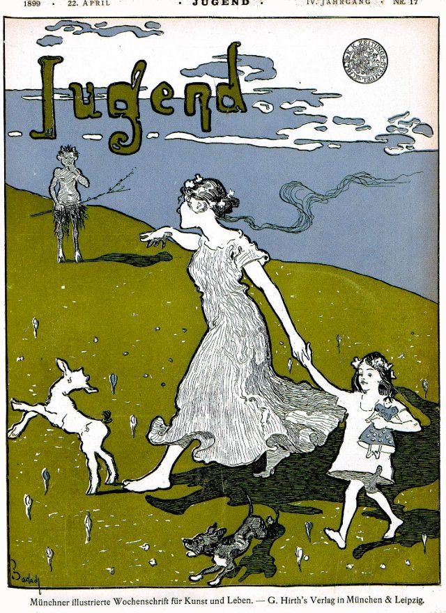
#27 Jugend, April 22, 1899
Across a breezy hillside, the ornate “Jugend” masthead floats above a scene that feels equal parts poster and fairy tale, announcing the April 22, 1899 issue with confident, Art Nouveau flair. Curving letterforms, simplified color fields, and the strong outline work create a graphic rhythm typical of fin-de-siècle magazine cover art. Even before the figures…
-
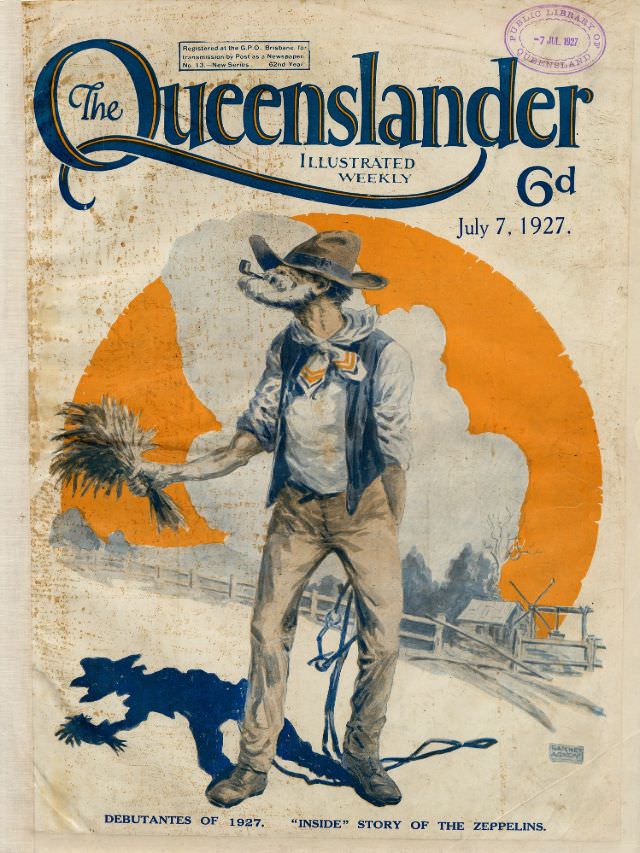
#7 Illustrated front cover from The Queenslander, July 7, 1927
Bold lettering for “The Queenslander” crowns this illustrated weekly’s front cover, dated July 7, 1927 and priced at 6d, with a library stamp still visible at the top edge. Age marks and handling wear add an archival feel, reminding readers that magazines were working objects—passed from hand to hand, posted, filed, and eventually preserved.