Category: Cover Art
Dive into a gallery of vintage cover art from books, magazines, and albums. Discover how graphic design and illustration reflected the moods of their times.
These covers capture the essence of cultural evolution — from bold propaganda to elegant minimalism.
-
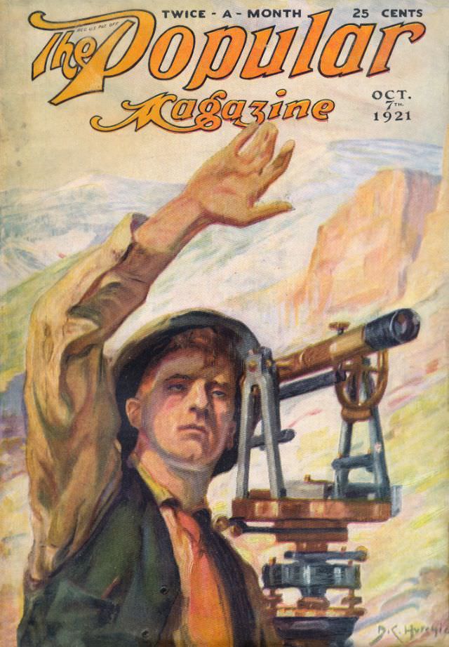
#9 Popular magazine cover, October 7, 1921
Bold hand-lettering announces *The Popular Magazine* across the top, paired with the crisp promise of “TWICE-A-MONTH” and a 25-cent price that speaks to early 20th-century mass readership. The issue is clearly dated “OCT. 7th 1921,” making the cover an easy anchor point for collectors and researchers tracking periodicals of the era. Even before you study…
-
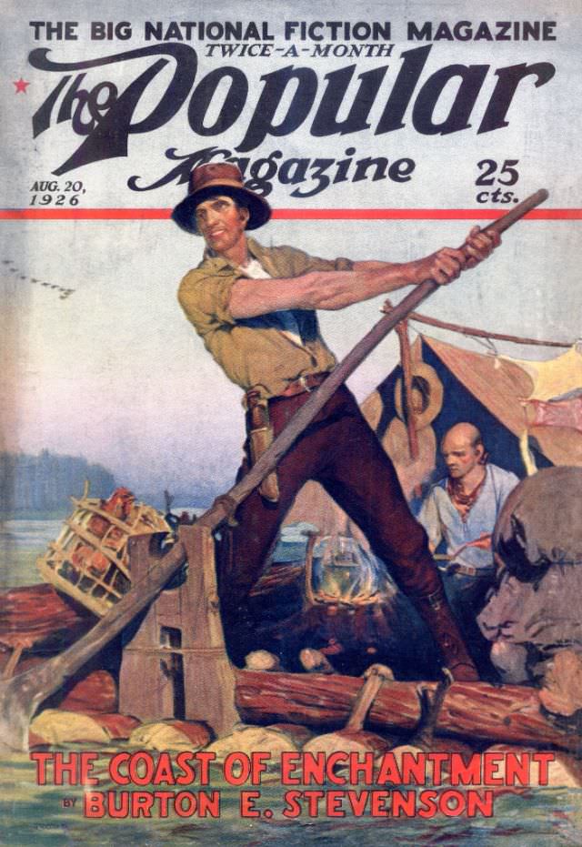
#25 Popular magazine cover, August 20, 1926
Bold lettering announces “The Big National Fiction Magazine” across the top of this Popular magazine cover dated Aug. 20, 1926, priced at 25 cents, with sweeping typography that instantly signals pulpy adventure. The composition centers on a rugged figure braced wide on a log raft, arms straining as he drives a long pole into the…
-

#41 Popular magazine cover, May 12, 1928
Bold lettering across a deep green masthead announces *The Popular Weekly*, dated May 12, 1928, priced at 15¢ (with a note of 20¢ in Canada). Beneath the title, the cover art leans hard into motion and drama: a rider in military-style clothing grips the reins as his horse rears, hooves cutting through dust and light.…
-
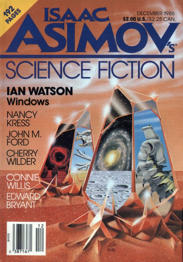
#12 Asimov’s Science Fiction cover, December 1986
Bold typography and warm, coppery tones announce the December 1986 issue of *Isaac Asimov’s Science Fiction*, a moment when print magazines were still the primary gateway to new speculative worlds. The masthead dominates the upper half, with “Science Fiction” set beneath it and the cover’s practical details—“192 pages” and the $2.00 U.S./$2.25 Can. price—anchoring the…
-

#28 Asimov’s Science Fiction cover, February 1988
Bold typography and a warm, gold-toned background announce the February 1988 issue of Isaac Asimov’s Science Fiction with the confidence of a magazine that knew its audience. The cover’s design balances big, readable masthead lettering with clear period details—“192 pages” in a red corner burst and a price line marked $2.00 U.S./$2.50 CAN—small clues that…
-
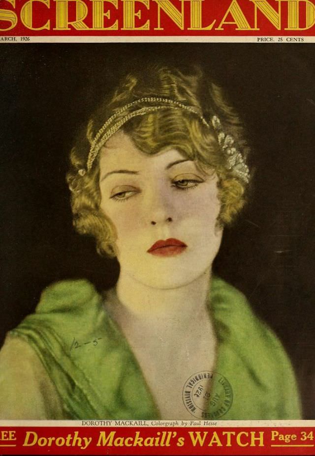
#9 Screenland magazine cover, March 1926
Bold “SCREENLAND” lettering crowns this March 1926 magazine cover, a classic piece of silent-era Hollywood ephemera priced at 25 cents. At center is a carefully staged color portrait—soft lighting, a dark backdrop, and a poised three-quarter gaze that feels both glamorous and slightly distant. The period styling is unmistakable: short waved hair, a delicate headband…
-
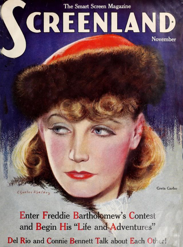
#25 Screenland magazine cover, November 1935
Bold lettering and deep, saturated color announce the November 1935 cover of Screenland, billed as “The Smart Screen Magazine.” At the center is a glamorous painted portrait of a woman in a fur-trimmed hat, her auburn curls and cool, sidelong gaze rendered with the soft gradients and polished finish typical of 1930s magazine illustration. The…
-
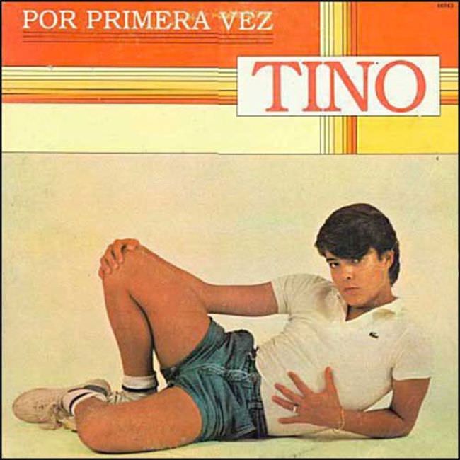
#6 The Ugly Truth About Yugoslavian Album Art in the 1970s and 1980s #6 Cover Art
Loud typography and a grid of stripes set the stage for an album sleeve that seems determined to shout before a single note is heard. The words “POR PRIMERA VEZ” and the oversized “TINO” dominate the upper half, leaving little room for subtlety and leaning into that unmistakable late-70s/early-80s bargain-bin bravado. It’s the kind of…
-
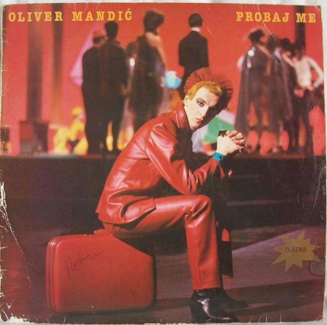
#22 The Ugly Truth About Yugoslavian Album Art in the 1970s and 1980s #22 Cover Art
Red dominates the sleeve like a warning light, from the lacquered jacket and matching trousers to the saturated, stage-like background. The seated figure poses on a suitcase, angled toward the viewer with a stylized stare that leans into glam-rock theatricality rather than naturalism. Across the top, the typography is blunt and direct—“OLIVER MANDIĆ” on the…
-
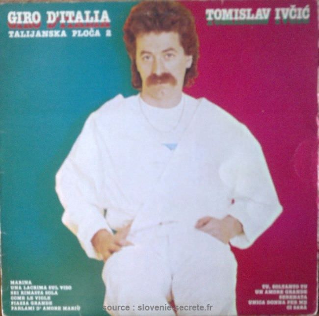
#38 The Ugly Truth About Yugoslavian Album Art in the 1970s and 1980s #38 Cover Art
Neon blocks of teal and magenta clash behind a casually posed man in an all-white outfit, complete with a chain necklace and a neatly groomed moustache, creating the kind of blunt, studio-cutout aesthetic that defined plenty of Yugoslavian record sleeves in the late 20th century. The typography is loud and declarative—“Giro d’Italia” on one side…