Category: Cover Art
Dive into a gallery of vintage cover art from books, magazines, and albums. Discover how graphic design and illustration reflected the moods of their times.
These covers capture the essence of cultural evolution — from bold propaganda to elegant minimalism.
-

#16 Sensual Cover Photos of Radio Control Modeler Magazines that featured beautiful women from the 1970s and 1980s
Glossy hobby magazines of the 1970s and 1980s often sold more than kits and plans—they sold a lifestyle, and the cover of *RCM: Radio Control Modeler* leaned into that promise with bright color, sunlit water, and a playful pin-up sensibility. Here, a bikini-clad model poses on a boat deck while presenting a vivid red radio-controlled…
-
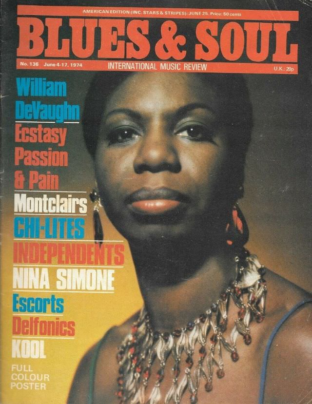
#2 Nina Simone, June 4-17, 1974
Bold block lettering shouts “BLUES & SOUL” across the top of this magazine cover, framing an unflinching, close-up portrait of Nina Simone. Her gaze meets the reader head-on, while the warm, slightly textured print quality and saturated tones root the design firmly in the visual language of 1970s music journalism. A jeweled necklace catches the…
-
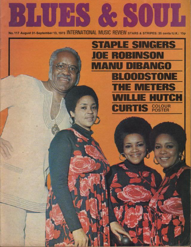
#18 The Staple Singers, August 31-September 13, 1973
Bold orange cover art from *Blues & Soul* sets the tone for late-summer 1973, pairing a confident studio portrait of The Staple Singers with headline typography that feels as punchy as the music. The group is posed close together—one man in a light-toned outfit beside three women in matching floral dresses—projecting family unity, stage polish,…
-

#34 Donna Summer, July 3-16, 1979
Bold pink lettering shouts “BLUES & SOUL” across a cool blue field, framing a slice of late-1970s music culture that’s equal parts glossy and streetlit. The issue is dated July 3–16, 1979, and billed as “The World’s No.1 Soul Music Mag,” with “& Disco Music Review” signaling how closely soul, disco, and nightlife aesthetics were…
-
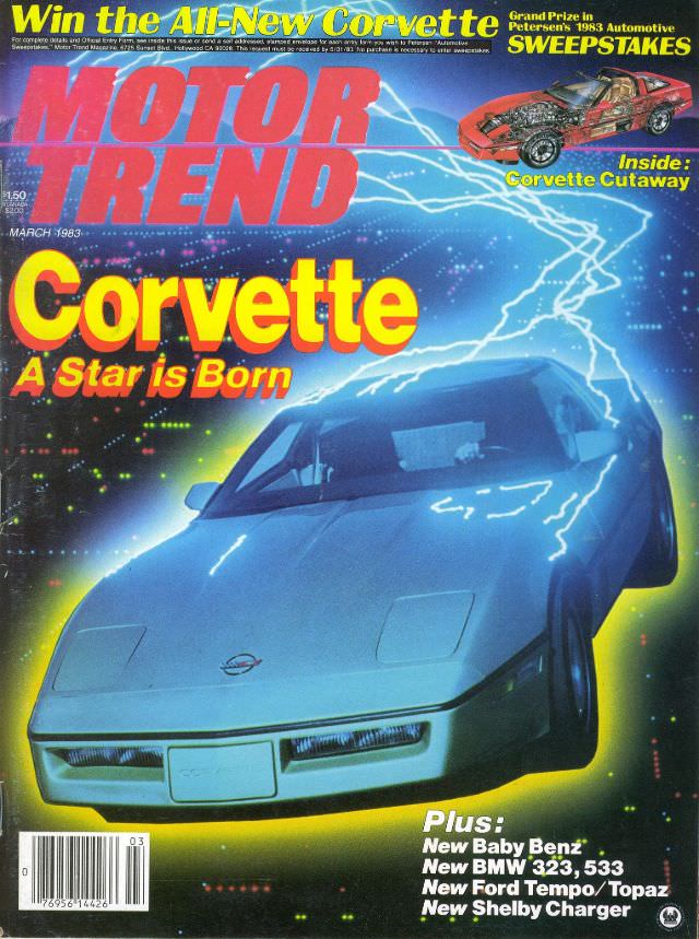
#13 Motor Trend, March 1983
Electric-blue lightning and a neon glow turn the cover of Motor Trend, March 1983 into pure automotive theater, with a sleek Corvette nose-first in the foreground and the bold promise: “Corvette — A Star is Born.” The oversized typography and sci‑fi palette instantly place it in the early-1980s moment, when magazines sold performance and progress…
-
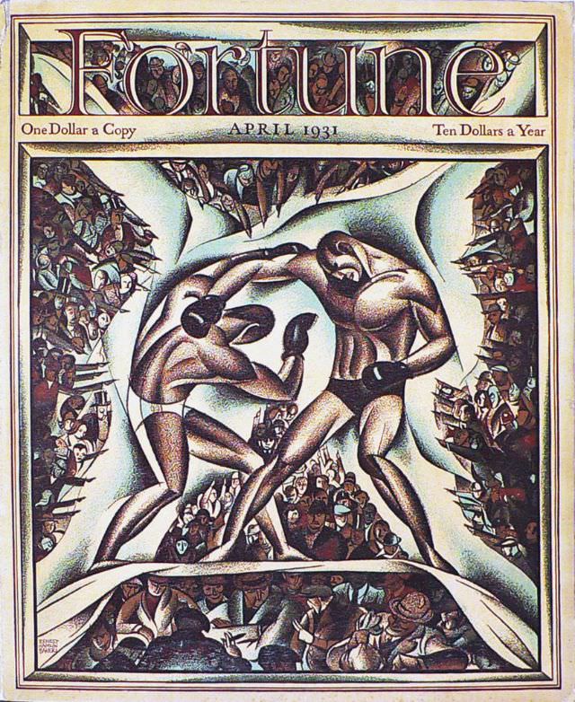
#2 Cover of Fortune magazine, April 1931
Bold lettering across the top announces *Fortune* and “APRIL 1931,” with the price points—one dollar a copy and ten dollars a year—framing the magazine’s aspirational tone. The cover art centers on two boxers locked in a fierce exchange, their bodies rendered in sculptural curves and shaded planes that feel modern and theatrical. Around them, a…
-

#18 Cover of Fortune magazine, December 1937
Fortune’s December 1937 cover leans into pure modernist drama: a cluster of skyscrapers rises like a single, faceted monument, its windows glowing against a deep blue field. The title masthead sits boldly at the top, while the cityscape below is simplified into sharp planes of light and shadow, evoking the sleek confidence of Art Deco…
-
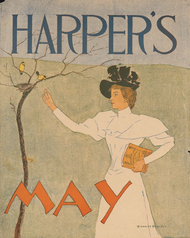
#12 Woman holding a magazine holding a hand out to two birds perched near a nest, Harper’s May, 1894
Harper’s dominates the top of the design, setting the stage for a graceful springtime tableau marked “MAY.” At center, a fashionably dressed woman in a crisp white gown and dramatic black hat extends her hand toward two small birds perched beside a nest on a bare, delicate branch. Tucked under her arm is a magazine,…
-
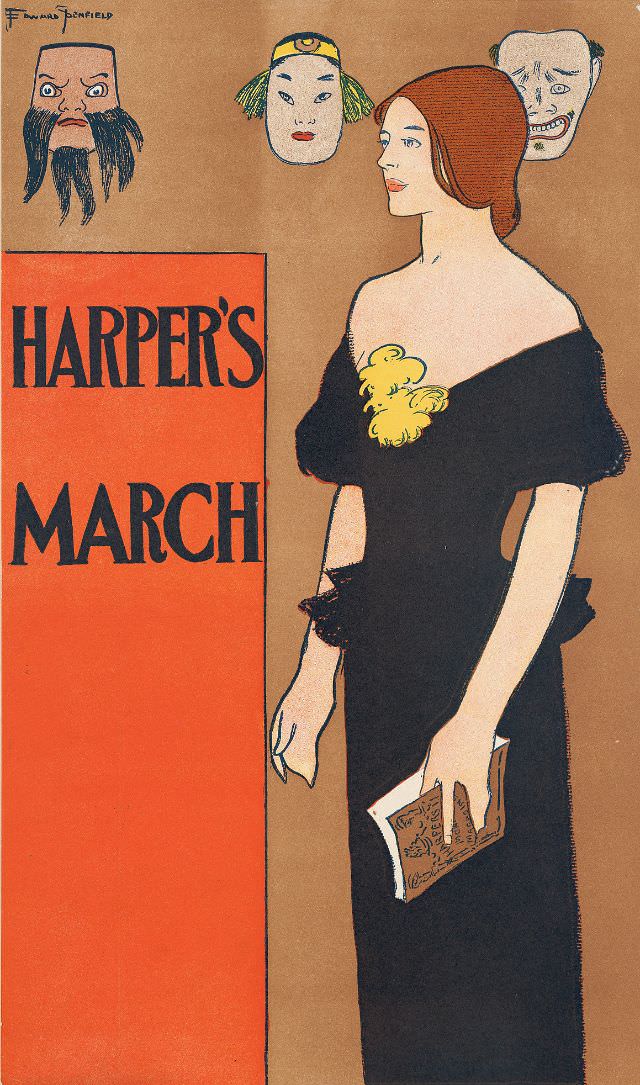
#28 A woman stands holding a magazine with three masks behind her, Harper’s March, 1896
Against a warm, minimalist background, a poised woman in a dark, off-the-shoulder gown turns in profile while holding a magazine at her side, her gloved hand and neat hairstyle underscoring a polished, late‑19th‑century elegance. The bold block lettering reading “Harper’s March” anchors the design like a poster, balancing fashion illustration with the graphic punch of…
-

#44 Stirring times in Austria described by Mark Twain in Harper’s March, 1898
Bold typography and a warm, restrained palette pull you straight into a magazine cover that announces “Stirring Times in Austria Described by Mark Twain” with unmistakable late-19th-century confidence. At left, an illustrated profile of Twain—white hair, prominent mustache, and formal suit—faces the headline, as if listening in on the political and cultural currents promised by…