Category: Cover Art
Dive into a gallery of vintage cover art from books, magazines, and albums. Discover how graphic design and illustration reflected the moods of their times.
These covers capture the essence of cultural evolution — from bold propaganda to elegant minimalism.
-
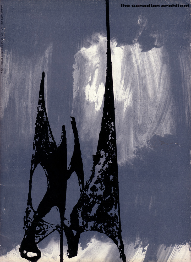
#4 The Canadian architect – September 1964
A stark, modernist cover dominates the September 1964 issue of *The Canadian Architect*, using bold silhouette and texture rather than literal depiction. Two sharp, spire-like forms rise from the lower edge, their black shapes pitted and irregular as if cut from weathered metal or inked with a rough brush. Behind them, a smoky wash of…
-
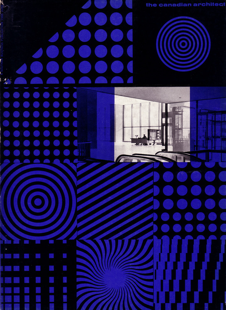
#20 The Canadian architect – June 1966
Bold optical patterns and a cool electric blue set the tone on the cover of *The Canadian Architect* for June 1966, instantly placing it in the graphic confidence of the mid-century modern era. Circles, grids, stripes, and spirals are arranged like a designer’s sampler, echoing the period’s fascination with geometry, repetition, and visual rhythm. Even…
-
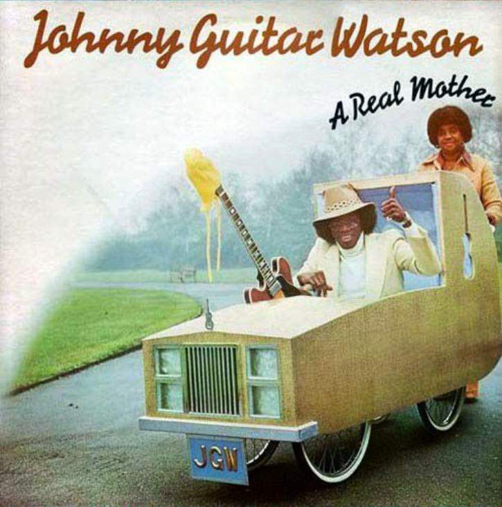
#9 So Bad, They’re Good: Vintage Album Covers That Will Make You Laugh #9 Cover Art
Johnny Guitar Watson’s name stretches across the top in swaggering script, setting the tone for a piece of cover art that’s impossible to ignore. The scene leans hard into playful excess: a gold, boxy custom ride glides along a quiet road while a guitar rises from the hood like a hood ornament gone rogue, complete…
-
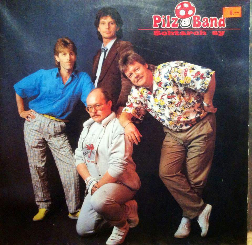
#25 So Bad, They’re Good: Vintage Album Covers That Will Make You Laugh #25 Cover Art
Four men pose against a moody studio backdrop while the bold, bubbly “Pilz Band” logo hovers above them like a neon sign from a vanished nightlife scene. The styling does most of the talking: patterned trousers, a bright blue shirt, a blazer-and-tie combo that tries for seriousness, and a loud printed short-sleeve that refuses to…
-
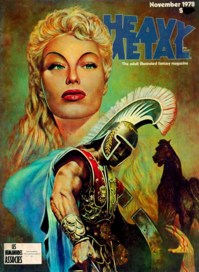
#16 Heavy Metal Magazine Covers: A 1970s Blast of Sci-Fi and Fantasy #16 Cover Art
A bold “HEAVY METAL” masthead crowns this striking cover, dated November 1978, where glossy, airbrushed glamour collides with sword-and-sandal drama. A towering blonde visage dominates the upper half, all sharp cheekbones and painted lips, staring past the viewer with the cool detachment of a futuristic pin-up. Beneath her, an armored warrior in a crested helmet…
-
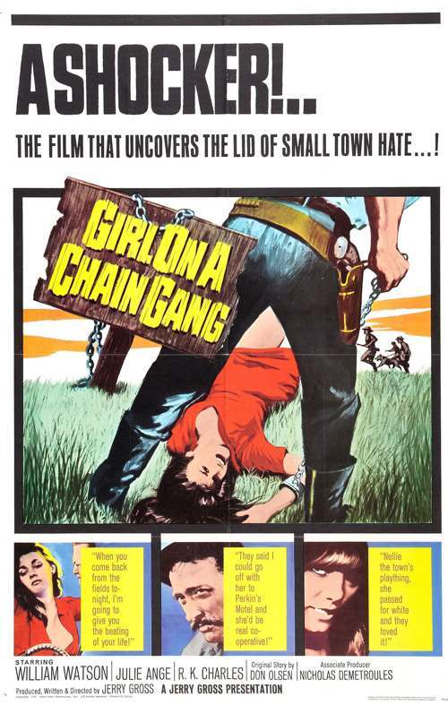
#7 The A-Frame’s Influence: How This Iconic Pose Continues to Shape Modern Fashion, Art, and Movie Posters #7
Bold, tabloid-style lettering screams “A SHOCKER!” across the top, setting a lurid tone that pulls you straight into the world of exploitation-era poster art. The composition is built to stop passersby in their tracks: thick outlines, high-contrast colors, and a headline-like promise of scandal that’s as much about selling a sensation as it is about…
-
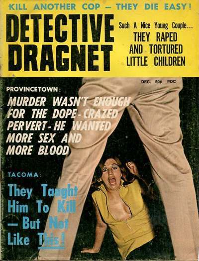
#23 The A-Frame’s Influence: How This Iconic Pose Continues to Shape Modern Fashion, Art, and Movie Posters #23
Sensational pulp cover design dominates the frame here, with bold, blocky lettering and lurid promises of crime, vice, and violence competing for attention. The title “Detective Dragnet” looms overhead while smaller lines stack up like shouted headlines, a classic strategy in mid‑century magazine art meant to stop a passerby cold. Even without a full narrative,…
-
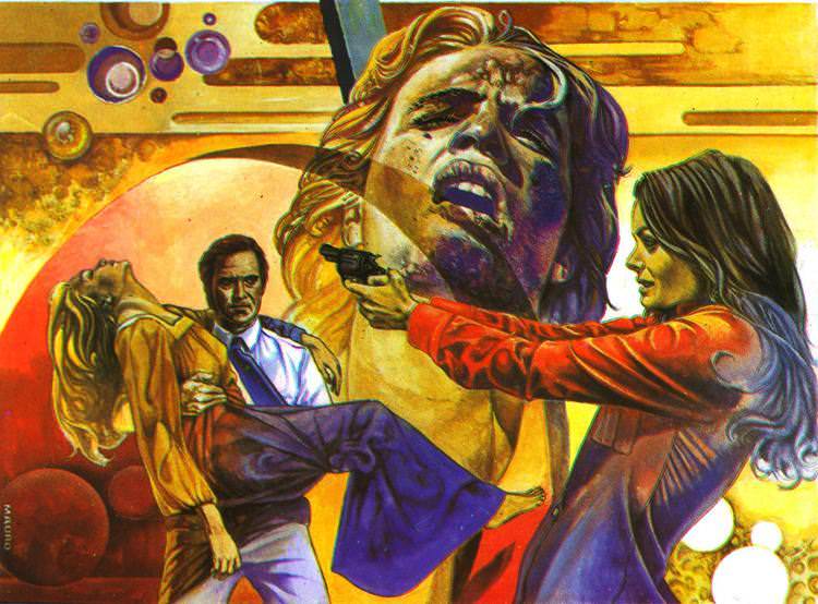
#16 Refuge of Fear (El refugio del miedo) (1974, Spain)
Painted in searing oranges and bruised purples, the cover art for *Refuge of Fear (El refugio del miedo)* (1974, Spain) leans into the heightened drama of Spanish genre cinema in the early 1970s. A looming, anguished face dominates the composition, its open-mouthed cry turning the background into an emotional landscape rather than a literal setting.…
-

#15 The Psychological Appeal of Women Running from Houses on Gothic Romance Covers #15 Cover Art
Two mid-century gothic romance covers face off here, each built around the same irresistible promise: a grand house that looks less like a home than a trap. On the left, bold block lettering and a cold, stormy palette frame a looming mansion while a blond heroine clutches herself in a pose that reads as both…
-
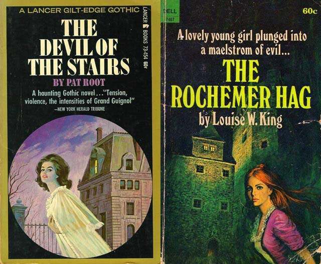
#31 The Psychological Appeal of Women Running from Houses on Gothic Romance Covers #31 Cover Art
Lurid color, looming architecture, and a solitary heroine in motion—these classic gothic romance covers lean hard into the moment just before the story turns dangerous. On one jacket, a woman in a pale, flowing dress flees past an iron gate as a severe mansion rises behind her; on the other, a red‑haired figure in a…