Category: Cover Art
Dive into a gallery of vintage cover art from books, magazines, and albums. Discover how graphic design and illustration reflected the moods of their times.
These covers capture the essence of cultural evolution — from bold propaganda to elegant minimalism.
-
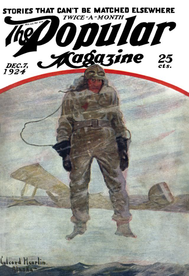
#18 Popular magazine cover, December 7, 1924
Bold lettering crowns the December 7, 1924 cover of *The Popular Magazine*, promising “stories that can’t be matched elsewhere” and priced at 25 cents. The layout is pure early-20th-century newsstand theater: oversized masthead, a clean date stamp, and a dramatic central illustration designed to stop passersby in their tracks. Even before you linger on the…
-
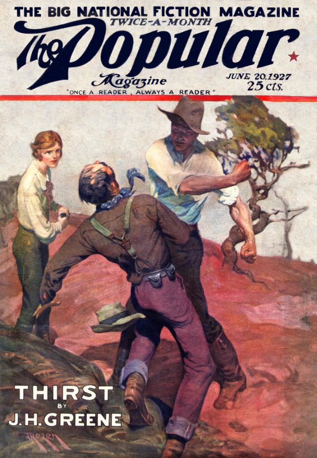
#34 Popular magazine cover, June 20, 1927
Bold lettering crowns the June 20, 1927 cover of *The Popular Magazine*, billed as “The Big National Fiction Magazine” and priced at 25 cents, promising drama before a page is even turned. The painted scene drops readers into a dusty, wind-swept moment where two men collide in a tense struggle, their bodies angled like a…
-
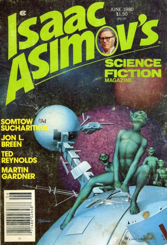
#5 Asimov’s Science Fiction cover, June 1980
Lime-green lettering shouts “Isaac Asimov’s” across the top of this June 1980 cover of *Asimov’s Science Fiction Magazine*, with the issue’s price and date tucked into the corner and a small portrait cameo set into the masthead. Against a deep, speckled starfield, the layout balances bold typography with classic pulp-era clarity, making the magazine instantly…
-
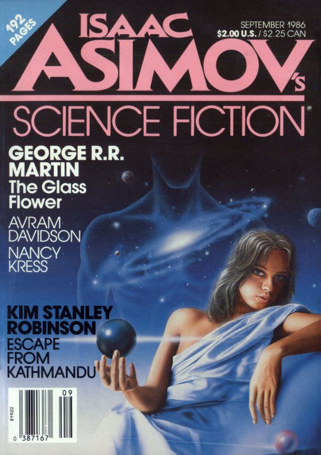
#21 Asimov’s Science Fiction cover, September 1986
Bold pink lettering announces *Isaac Asimov’s Science Fiction* while the September 1986 issue details—192 pages and a cover price of $2.00 U.S. ($2.25 CAN)—sit like period-perfect ephemera at the top edge. Beneath the masthead, the artwork opens into a starfield where planets drift across deep blues and a shadowy, human-like silhouette looms in the background,…
-
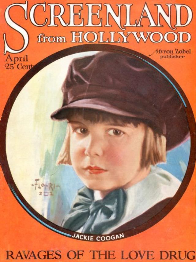
#2 Screenland magazine cover, April 1923
Bold orange framing and oversized lettering make the April 1923 Screenland magazine cover feel like a marquee frozen on paper, promising glamour straight “from Hollywood.” The design centers on a softly painted portrait set within a circular vignette, a layout that pulls the eye inward before it wanders back to the crisp, promotional typography and…
-
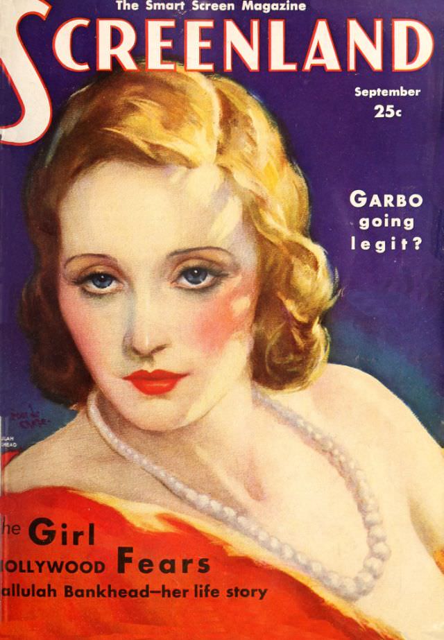
#18 Screenland magazine cover, September 1931
Bold, saturated color and a close-up painted portrait dominate the Screenland magazine cover dated September 1931, pulling the viewer into the glamorous world of early Hollywood. The sitter’s wavy blonde hair, porcelain skin, and vivid red lips are rendered with the polished elegance typical of studio-era publicity art, while the deep blue background makes the…
-
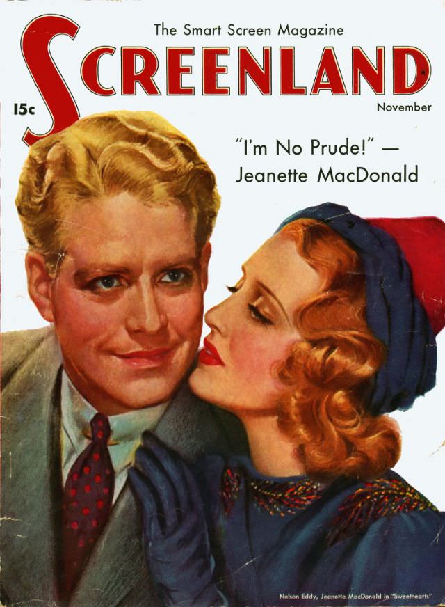
#34 Screenland magazine cover, November 1938
Bold red lettering spells out SCREENLAND beneath the tagline “The Smart Screen Magazine,” setting a confident, glossy tone for this November 1938 cover. A painted close-up of a smiling man in a suit and patterned tie fills the left side while a glamorous woman, her hair styled in soft waves and framed by a blue…
-
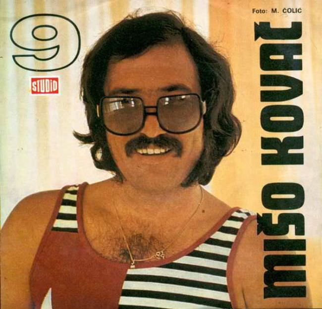
#15 The Ugly Truth About Yugoslavian Album Art in the 1970s and 1980s #15 Cover Art
A mustachioed singer stares out through oversized square glasses, smiling with the unguarded confidence of a studio portrait meant to sell a personality as much as a record. The tank top—half solid color, half nautical stripes—reads like a design compromise made at the last second, yet it’s exactly the sort of awkward boldness that defines…
-
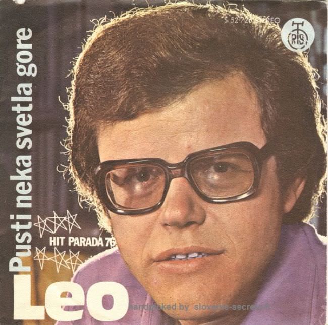
#31 The Ugly Truth About Yugoslavian Album Art in the 1970s and 1980s #31 Cover Art
A tight, full-frame portrait dominates the cover, pushing the singer’s face and oversized square glasses almost to the edge of the sleeve. The typography is blunt and loud—“Leo” in huge block letters, with “Pustineka svetla gore” running vertically—while doodled starbursts and a “Hit Parada” note try to sell excitement on a cramped canvas. Even the…
-
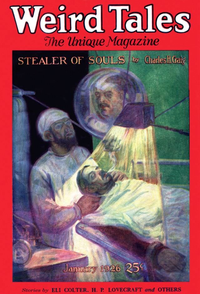
#7 Weird Tales cover, January 1926
Bold scarlet lettering shouts “Weird Tales” across the top of the January 1926 issue, a classic piece of pulp magazine cover art designed to stop a reader in their tracks. Beneath the masthead, the tagline “The Unique Magazine” promises strangeness, while the story title “Stealer of Souls” appears prominently, framed like a warning over the…