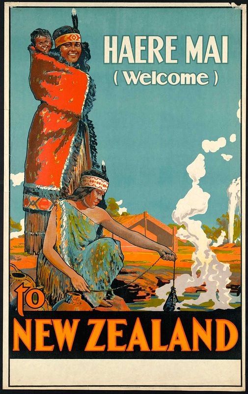
Bold lettering announces “HAERE MAI (Welcome)” above a richly colored invitation to New Zealand, where stylized figures, patterned garments, and a sweeping blue sky set an instantly memorable mood. The cover-art approach—part illustration, part graphic design—leans into high contrast and simplified shapes to read clearly at a glance, the way vintage travel advertising was meant to catch the eye from across a station wall or ship’s lounge.
Warm oranges and reds dominate the foreground while white steam curls upward, suggesting geothermal heat and the drama of the landscape. The scene balances human presence with place: traditional attire and expressive faces are paired with the suggestion of pools, earth tones, and distant structures, creating an image that sells not a single itinerary, but an atmosphere of welcome, spectacle, and cultural encounter.
As part of “Around the World in Posters,” this piece offers a window into how early travel cover art packaged destination branding into a few decisive elements—tagline, color, and iconography. For collectors, designers, and history-minded readers, it’s a vivid example of vintage travel poster design and tourism advertising, where typography and illustration collaborate to turn “New Zealand” into a promise as much as a place.