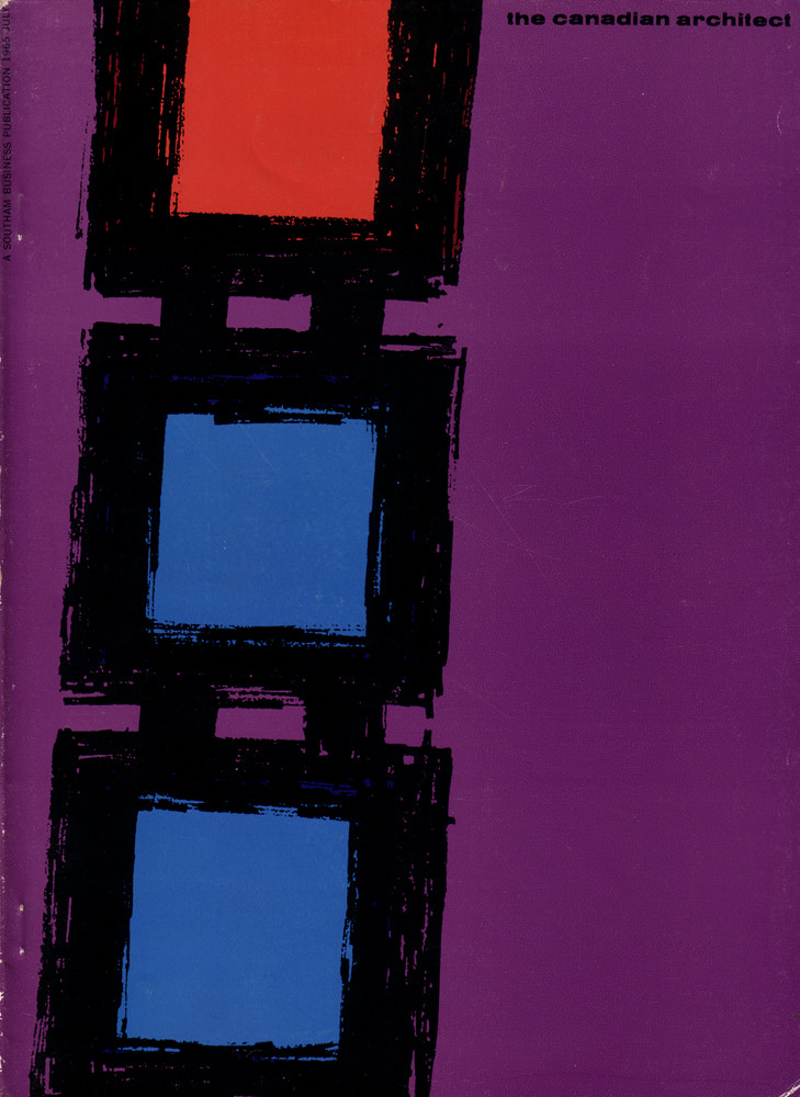
Bold color and spare geometry define the cover art for *The Canadian Architect* from July 1965, where three stacked rectangles—red above, two blue below—sit inside rough black frames against a saturated purple field. The brushy, almost calligraphic edges keep the composition from feeling mechanical, suggesting movement and texture rather than hard precision. Small type at the upper right reads “the canadian architect,” while a vertical line of publisher text runs along the left margin, anchoring the design as a period magazine cover.
Mid-century modern graphic design often borrowed the language of architecture—modules, grids, and repeating forms—and this abstract layout feels like a playful echo of window bays or structural openings. The strong contrasts and minimal elements reflect a moment when architects and designers embraced modernism’s confidence, pairing clean ideas with expressive printing techniques. Seen today, the cover reads as both a piece of editorial identity and a standalone artwork from the 1960s.
For readers searching Canadian architecture history, vintage magazine covers, or July 1965 design ephemera, this image offers a striking portal into the era’s visual culture. It’s a reminder that professional journals didn’t merely document buildings; they also communicated ambition and taste through typography, color, and composition. Whether you’re collecting architectural periodicals or studying modernist cover art, this issue’s design still feels fresh, graphic, and unmistakably of its time.