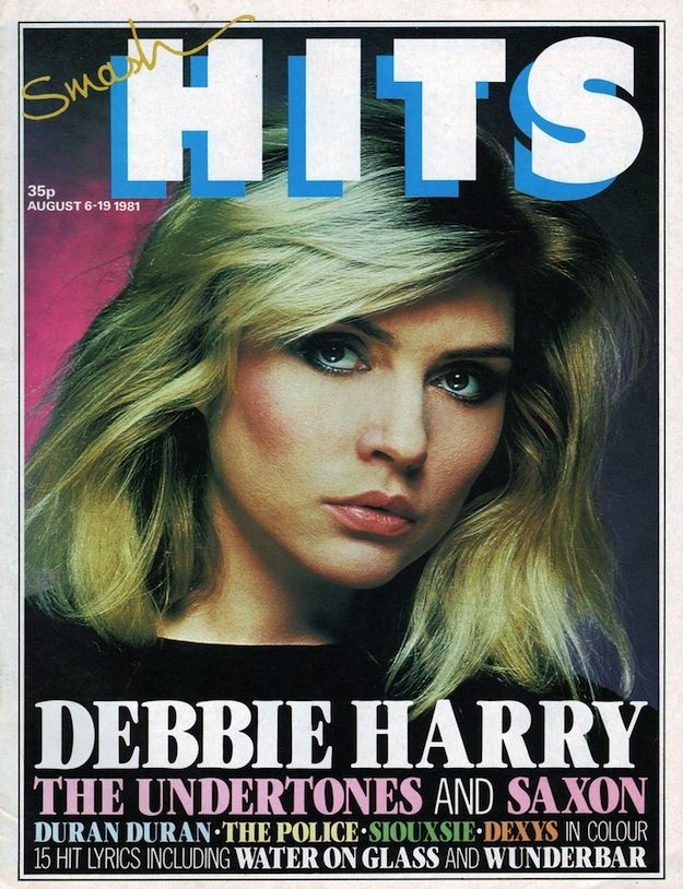
Bold, blocky “HITS” lettering dominates the top of the cover, immediately framing a close-up studio portrait with glossy, high-fashion lighting and a saturated backdrop. The design pulls your eye from the cool, sculpted makeup and feathered blonde hair down into thick, headline-style typography—an unmistakable 1980s magazine-cover rhythm built for quick recognition on a crowded newsstand. Even the small details, like the 35p price and the August date line, anchor it in the era of weekly pop papers and fast-moving charts.
Front and center, the cover spotlights Debbie Harry in a way that blurs the line between pop star and poster icon, using tight cropping and strong contrast to make her gaze the visual hook. Beneath her name, a dense stack of artists—The Undertones, Saxon, Duran Duran, The Police, Siouxsie, and Dexys—turns the lower half into a snapshot of the decade’s musical cross-currents, from new wave and post-punk to radio-friendly rock. The promise of “in colour” and “hit lyrics” sells the magazine’s famous mix: fandom, fashion, and practical pull-outs for listeners who wanted to sing along as much as they wanted to belong.
For anyone exploring Smash Hits magazine covers, this piece of 1980s cover art shows how typography, celebrity portraiture, and chart culture were engineered into a single, high-impact page. It’s a reminder that music journalism in the period wasn’t just reporting—it was packaging sound into style, using graphic design as a kind of visual chorus. Browsing covers like this reveals why Smash Hits remains a touchstone for collectors, designers, and readers chasing the bright, immediate energy of 80s pop history.