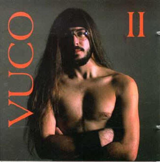
Stark, confrontational, and a little bewildering at first glance, the cover leans hard into an austere studio look: a shirtless long-haired figure with glasses, arms crossed, set against a flat grey background. Bold orange typography frames the portrait—“YUCO” running vertically at the left and a large “II” at the top right—creating an awkward balance between minimalist design and heavy-handed emphasis. That tension is exactly what makes so much Yugoslavian album art from the 1970s and 1980s so unforgettable, even when it’s trying too hard.
Under the surface, the so-called “ugly truth” isn’t simply bad taste; it’s the uneasy collision of limited resources, shifting trends, and a hunger for modernity that didn’t always translate cleanly into cover art. The lighting feels practical rather than glamorous, the pose reads more defiant than inviting, and the overall composition favors blunt impact over polish. In a pre-digital era where printing and layout choices could be unforgiving, this kind of design could turn into a visual statement—intentionally or not—about identity, attitude, and scene credibility.
For collectors and curious listeners, this image works as a compact time capsule of Yugoslav record aesthetics: raw portraiture, loud lettering, and a willingness to risk embarrassment for the sake of presence. It’s the type of album cover that can look dated, daring, or inadvertently comedic depending on the viewer, which is precisely why it keeps circulating online and sparking debate. If you’re digging into Yugoslavian music history, retro record sleeves, and 1970s–1980s graphic design, this piece offers a vivid starting point for the era’s messy, magnetic visual language.