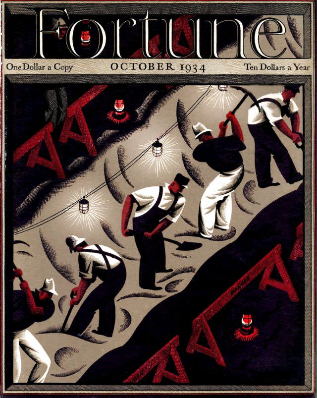
Bold typography and stark color blocks make the October 1934 cover of *Fortune* magazine feel immediate even at a glance. The masthead sits like polished metal across the top, with period pricing printed beneath it, anchoring the artwork firmly in the era of early business journalism. Below, the composition plunges into an industrial scene where human figures and machinery are rendered with confident, graphic simplicity.
Across a dark diagonal band, oversized “AAA” letters repeat like a stamped headline, turning a three-letter acronym into a visual force. Miners or laborers—shown with tools, helmets, and heavy work clothes—move through a tunnel-like space illuminated by hanging lamps, their bodies angled to the slope and rhythm of the work. The limited palette of charcoal blacks, gritty grays, and deep reds heightens the drama and suggests heat, strain, and the relentless pace of production.
As cover art, this *Fortune* magazine front page doubles as a historical snapshot of how industry and policy could be distilled into a single emblematic image. The design’s blend of modernist geometry and narrative detail reflects a time when magazines used illustration to interpret the economy as much as report on it. For collectors, researchers, and readers interested in Great Depression-era visual culture, the October 1934 *Fortune* cover remains an evocative piece of American print history.