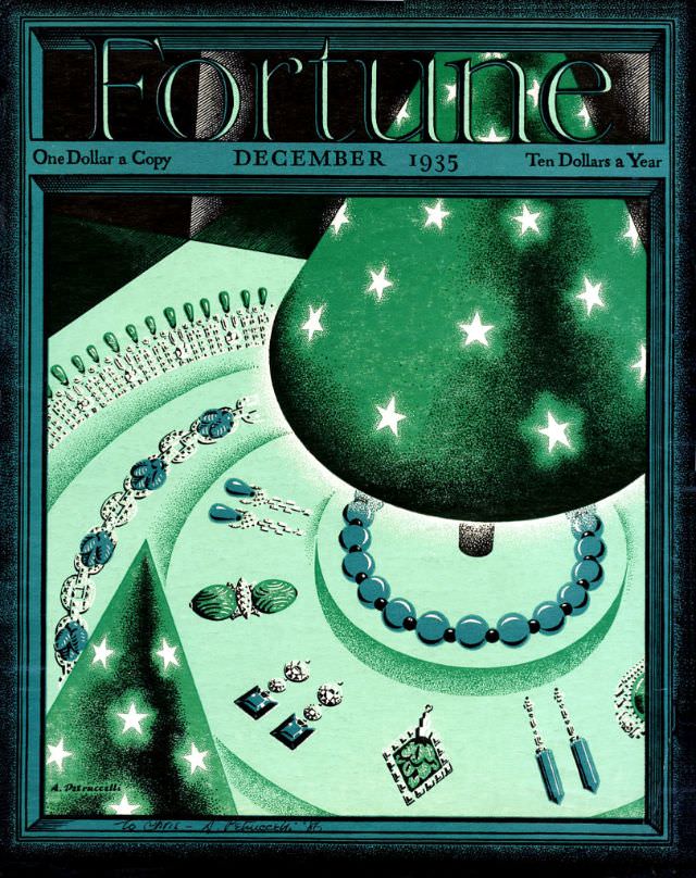
Emerald tones and crisp geometry give the December 1935 cover of Fortune Magazine a polished, modern mood, with the masthead towering above like signage on a skyscraper. The top line still reads like a slice of everyday economics—“One Dollar a Copy” and “Ten Dollars a Year”—placing the artwork squarely in the world of commerce and aspiration. Even before you study the details, the design signals confidence: sleek, upscale, and unmistakably of its era.
Jewelry is the star here, arranged with the care of a showroom display—rounded beads, dangling earrings, and glittering settings that catch the eye in miniature. A dramatic hat or dome-like form patterned with bright stars leans into theatrical glamour, while the angled composition suggests movement and abundance rather than a static still life. The limited palette and stylized shading evoke Art Deco influence, turning luxury goods into graphic symbols of status and taste.
As a historical magazine cover, this Fortune issue offers more than “cover art”; it’s a snapshot of how consumer desire was packaged and sold in the mid-1930s. The emphasis on refinement and sparkle hints at optimism and social performance, even when many readers were living through hard times. For collectors of vintage magazines, 1930s graphic design, or Fortune Magazine history, this cover remains a striking example of how business culture and visual elegance could share the same page.