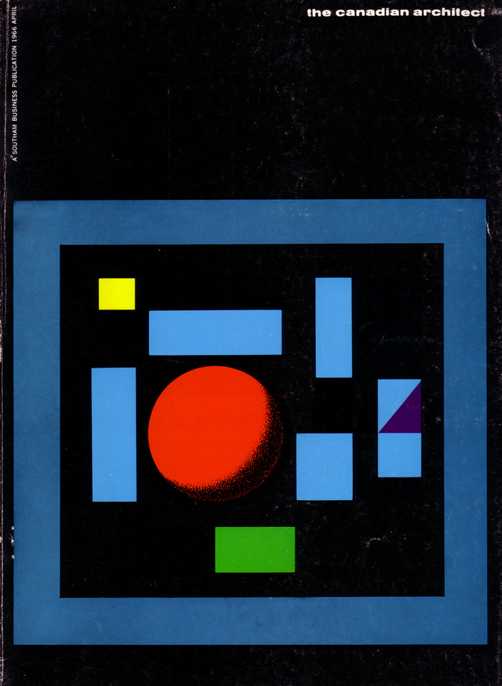
April 1966 arrives in bold, graphic form on the cover of *The Canadian Architect*, where a deep black field frames a crisp arrangement of colored geometry. A red circle anchors the composition, surrounded by cool blue rectangles, a sharp yellow square, a green block near the base, and a small purple accent that reads like a folded plane. Even before a single article is opened, the design signals mid-century confidence in clarity, structure, and modern taste.
The layout feels like a miniature plan—an abstract room diagram or city block—translated into pure shape and color. Hard edges and generous negative space echo the era’s fascination with modular thinking and standardized elements, while the thick blue border creates the sense of looking into a contained project world. Wear along the surface and softened scuffs in the dark areas remind us this is a working artifact of print culture, handled and stored long after its newsstand moment.
For readers, collectors, and designers hunting for Canadian architecture history, this cover art stands as a compact lesson in 1960s visual language: disciplined, playful, and unmistakably modern. It’s an ideal reference point for discussions of magazine design, architectural publishing, and the way abstract art helped sell new ideas about the built environment. Whether you’re researching *The Canadian Architect* April 1966 issue or simply drawn to retro graphic design, the image offers a striking portal into its time.